| Image |
Comment |
| 04/03/2006 09:25:34 AM |
Sunny Violinby annahComment: The color of the violin is bold and vibrant in the picture - and unfortunately that is the only thing that characterizes this composition. The background is distracting and offers nothing to the composition - it detracts. If you could have found a background that was one solid complementary color and smooth it would have improved this composition - as it is you have two background colors as well as the pattern of the wood that competes for attention with the main subject which gets drowned out. I think the pose of the model could have complemented the curves of that violin such that it would add to the visual interest of the composition. She already has the curves that mimic those found in the basic shape of the violin - you just needed to play it up a tad more. I would have had her in the same pose but oriented the frame to be vertical so that her full body would be in the shot. She would still cradle the base of the violin in the one arm, but her other arm would be casually 'thrown up' above her head with her palm open -like a dance move. The straight angle of the upraised arm would further invoke the comparison of the woman to the violin. The curves of the body matches the basic curves of the violin and the outstretched arm the neck of the violin. If you have the time and energy, I would encourage you to shot this composition again for it has great potential. |
 Photographer found comment helpful. Photographer found comment helpful. |
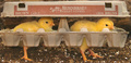
| 04/03/2006 02:32:31 AM |
The Great Escapeby TransitComment: Very, very cleverly done!!! I love these two yellow chicks marching along in their escape vechicle of a - egg carton case! These chicks have hatched and they have flown the coup - making good on their getaway in the very object that would have gotten their goose - er chicken cooked:-) Creativity is great, colors and composition are wonderful as well. Well done or should that be over easy:-) This composition must have taken quite a bit of patience given the two subjects that may have been difficult to work with. Again, great job on capturing this image. |
| Photographer found comment helpful. |
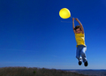
| 04/03/2006 02:23:31 AM |
Drift Awayby scalvertComment: Love those bold and rich hues of yellows and blues in this composition. The action of the child holding onto the yellow ballon as she 'drifts' up, up & away adds dynamic action to the shot and thus adds visual interest. There are a few elements that would move this photo from the realm of good to stunning. The first is get rid of the ground plane - it adds nothing to the overall shot and the dull green/brown colors detract attention away from the action and those beautiful hues of blue sky and yellows of your main subject. Shooting the photo from a lower angle where you are looking up at the subject would have removed the ground plane from the composition AND it would have given the illusion of height to the main subject - since we are looking at the child holding the yellow balloon from a lower angle it automatically would make the viewer believe the youngster is at a great height. |
| Photographer found comment helpful. |
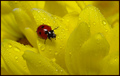
| 04/03/2006 02:15:28 AM |
See spot runby DustDevilComment: Bright and bold hues of yellows with that spot of red that adds real visual interest. I really like the vibrancy of the yellow in the color of the petals of this dew-kissed flower. Even though we do not see the fullness of the flower we do not need to to really appreciate the loveliness of the flower - just a part of the whole coveys the beauty and color. And to add visual spice to the overall composition we have that beautiful ladybug/ladybird taking a stroll along the petals. The red really pops off the page. The hues are vibrant, the image sharpness is sharp as a tack, and the lighting wonderfully illuminates the subjects. Great job, I expect this one will do very well. |
| Photographer found comment helpful. |
| 04/03/2006 02:00:13 AM |
Playtime in the Daffodilsby dwterryComment: Love those yellow daffodils and the composition in the background provides an interesting visual backdrop for this image. I like how you incorporated the playing statues in the composition because it really invokes the imagery of springtime & playtime. However there are a few elements here that can make this image go from good to astonding! First off there is a tad too much going on in the background that is distracting from the main focus' mainly the yellow flowers and the playing statues - those buildings and barren trees draw attention away and are not overall attractive to look at. Perhaps changing the angle would remove them entirely or at least remove most of it. Having the camera literally rest on the ground and angle it up would have given the illusion of us looking up at the heightened daffodils and the playing statues that spring forth from them. Lastly at that angle there would be more blue sky visible that would add to the visualization of an open meadow/field 'feel' even though a cathedral typed building would be present in the shot. The cathedral type building would not be/is not a detractor from the image overall - and could add even more visual interest if more of the top half of the building complete with spires was present (an easy remedied solution would be to take the photo from a lower angle like I mentioned. |
| Photographer found comment helpful. |
| 04/03/2006 01:49:35 AM |
Kill Billby LalliSigComment: Love the creative re-creation done on this shot. The yellows are bold and vibrant and really pop off the page. The model's look as she wields the katana is very ferel and she looks dangerous regardless of the weapon she holds. Some of the blade gets lost in the background, I would have liked more light to illuminate the blade - it would have shown off more of the silver of the steel and let us see not just the sharpness of her stare but her blade as well. Also I think it would have improved the picture a tad more if the full extension of the blade was included in the photo - the top portion of the blade is cut off. Overall good 'execution' (sorry about the pun, just had too:-) ) and this is a job well done. |
| Photographer found comment helpful. |
| 04/03/2006 01:43:39 AM |
R O S E by PhilosComment: Love the expression and the hand oh so gently resting on the chin conveys the idea of lost in daydreams look. The colors of yellow of her dress & the roses as well as the green background are bold and vibrant. Lighting on the subject is spot on and there is that healthy glow to her skin that makes this lady radiate charm and charisma. Very well done I expect this to do very well. |
| Photographer found comment helpful. |
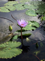
| 01/18/2006 07:58:16 AM |
Waterlilyby sulamkComment: I don't know if it was the time of day that is to be avoided or if it is the angle but there is a fair amount of reflective glare/sheen (not blatent but nonetheless it is there. The waterlilly is indeed very lovely but because the water is reflecting back more light that rich lovely hue of purple liliac color is a tad washed out. Changing the angle by kneeling down rather that a looking down shot would change the reflective quality of the light bouncing off the water. It could yield the result of getting a richer deeper color in the waterlilly and lillypads, not to mention give the surface of the water a more smooth mirrorlike effect. All these elements would help improve the image. That said it is a good shot but a change in angle (or even closing down the aperature setting for less light) would make the colors richer and water less reflective. |
| Photographer found comment helpful. |
| 01/17/2006 10:19:06 AM |
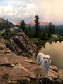
The Calm Afterby hideoutComment: This is the third time I have looked upon this image and I have to say that every time I see it I see the dog, Bodget, from the 1963 movie The Incredible Journey. When I see this lone dog I can't help but wonder where his other two companions, Lauth and Tao, are:-) I cannot help but see this dog traveling a long journey like that of in the movie to get back home. The composition and setting are very eye appealing. The only main critique I have on this photo is that the colors could be richer in hue - they look a bit washed out. Depending on the capabilities of the camera you could adjust the saturation & color as well as contrast levels in the camera OR you could do that in photoshop. |
| Photographer found comment helpful. |
| 01/17/2006 10:09:02 AM |
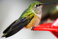
L'oiseau Vertby smartypantsComment: What a fabulous close-up of this hummingbird! Love how you can see all the wonderful details of it's plummage - and those shimmering greens are lovely to look upon. I know that it is difficult to capture these birds stationary but I am going to offer my suggestion anyhow. The stark white 'background' does nothing to complement this composition of the hummingbird. I do like that splash of red on the bird feeder for that adds a splash of color. The only thing that I can think of that you might have been able to do to eliminate the 'background' at the time of the shot is to have taken it at a slight angle (45 degrees to the subject) looking up such that the blue sky would then become the background. Then the blue sky would be a nicer complementary color to those wonderful greens pictured here....of course it would also depend on if there was a nice blue sky to be found on the day of this shot. |
| Photographer found comment helpful. |
Home -
Challenges -
Community -
League -
Photos -
Cameras -
Lenses -
Learn -
Help -
Terms of Use -
Privacy -
Top ^
DPChallenge, and website content and design, Copyright © 2001-2025 Challenging Technologies, LLC.
All digital photo copyrights belong to the photographers and may not be used without permission.
Current Server Time: 08/09/2025 08:25:33 AM EDT.