| Image |
Comment |
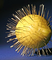
| 04/04/2006 09:28:48 AM |
S-H-A-R-Pby cheekymunkyComment: Not a prickly pear but a sour lemon whose taste appeal really pierces those taste buds. This is a very interesting composition that has potential. First off a richer deep blue (like a royal blue) would be a better background for it would it would compliment the yellow hue of the lemon not to mention make it pop visually. The blue here on the ground plane is a rather flat blue that lacks vibrancy. The lighting here is a bit harsh for you can see where it has "blasted out" some of the details on the top left half of the lemon - you can see more details in the skin (the pores) of the lemon that faces away from that harsh lighting. Showing the full lemon spiked with needles would also help with the composition - here you chop out some of the details on the far right hand side of the lemon. If you show us your full subject it makes the viewer appreciate it more. Lastly, the sharpness of this subject needs improvement. The needles and the lemon in the foreground should look as sharp as they are in the foreground. A smaller aperature setting (16 would be the best as long as you have the camera on a tripod to keep it steady while the shutter stays open for an extended time) would help with the depth of field and make things in the foreground and background appear sharp as a tack - or rather a needle as in the case here:-) |
 Photographer found comment helpful. Photographer found comment helpful. |
| 04/03/2006 10:01:52 PM |
Adonisby Rando D300Comment: A wonderfully detailed capture of this cockatoo (I believe that this is a cockatoo but I maybe mistaken). one can see the fine details in it's feather's beak, and eye. The dark background really makes the yellow hues of this bird visually pop. That splash of orange in it's feathery coat adds some interest and another strong vibrant color to the compostition. Square crop assists in keeping the eye's attention focused on the main subject. My only critique is that because the bird does not rest in the center of the frame it creates an imbalance of negative space in the top right hand quandrant. There is more negative space in the background in the top right hand half than there is in the bottom left hand half. |
| Photographer found comment helpful. |
| 04/03/2006 09:51:53 PM |
The Watcherby fotodudeComment: Those wise ol' eyes of this owl are definately captivating and boldly yellow against the dark backdrop. The stare is arresting. I think the composition could be strengthened if you increased the depth of field such that there is more sharp relief details to the beak and the feathers that surround this bird's face. |
| Photographer found comment helpful. |
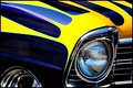
| 04/03/2006 09:46:10 PM |
Chevyby dahkotaComment: I like the bold hues of the yellows that are painted flames on this old classic car. The blues are a rich and deep color that really complements the yellows. I like how you composed the image but I think that you could have angled it slightly to add some dimension and interest to it. To add a little bit of visual interest and create the illusion of speed, you could have composed this such that the headlight is angled at a 45 degree angle to the lower right hand corner. This would add the illusion of motion by making us believe the car is racing away down past us not to mention it would angle those 'flames' that it would appear that they are racing away from the headlights/grille. Not to mention a slight change in angle orientation can add more visual interest rather than a straight on level shot. |
| Photographer found comment helpful. |
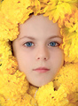
| 04/03/2006 09:38:14 PM |
Natural Beautyby JudiComment: Bold and vibrant hues of the floral arrangement adorn the young girls face. This makes and interesting portrait shot. The skin tones on her face are lovely with just a shade of rosy pink hue. The yellow hues of the flowers really and the pale skin really makes those blue eyes stand out and capture one's attention. However, there are some things that can move this composition from a good shot to an excellent one. First off, there seems to be white threads in the silk flowers or somthing white & threadlike in the bottom half of the photo and the right hand side. I know picky, picky:-) This detracts from the overall image by breaking up the yellow hues and it calls attention to itself as a flaw. Next, the model could smile for that would add to the composition in that it would show that she has a sunny disposition when juxtapositioned next to the stereotypical happy hues of yellow. Lastly there is something small and black seen on the left hand side of the composition. An ant or just a peaking of a black background through the yellow flowers? Nonetheless, it to calls attention to itself and detracts some attention away from the main focus which is this natural beauty surrounded by a field of yellow. |
| Photographer found comment helpful. |
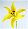
| 04/03/2006 09:25:14 PM |
A Spring Dayby CamComment: Clean, minimilistic and bold in presentation of this yellow flower. Sharp details can be seen and appreciated. The background is not a flat white that is stark and sterile but compliments the flower with soft shades of white. Square crop keeps attention focused on the main subject - the flower. Nicely done. |
| Photographer found comment helpful. |
| 04/03/2006 09:19:14 PM |
Sunshineby nikuserComment: Love the yellow/gold hues in this woman's headdress. It really compliments her smile and her skin. She has a lovely smile and this is a nice portrait. The biggest thing that is a detraction in this composition is that there is too much sheen on her skin. Sometimes it is hard to capture that warm glow of a person's skin and that is a challenge the photographer has to contend with. Perhaps diffusing the light source and scattering the light instead of a full force light shined upon the lady would cut down on the glare and bring out that warm glow of her skin tones. Also I think that the image is too closely cropped to her face. I think you could easily pull back a bit to include the curve of her neck and the show the full headdress such that it would compliment the portrait. Lastly, I think you could easily drop the thin yellow border for it really does nothing for the composition as a whole - in fact it is slightly detracting because it calls attention to the fact that the picture was cropped closer to her chin and the composition ends before it reaches that yellow border (her head appears to be floating above a thin black space that is a gap between her and the yellow border). |
| Photographer found comment helpful. |
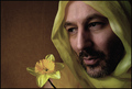
| 04/03/2006 09:05:02 PM |
Yellow Fellowby hanaeComment: Heh, do I detect a play on some of Librodo's work? Gone is the exotic lady adorned with the gauzy, delicate scarves/cloth. Here we have the strong male adorned with the 'heavenly' halo of a delicate yellow cloth around his head. The juxtapostion of manly strength of the subject to the soft delicacy of the cloth and the flower is comical and visually interesting. It helps hold the eye's attention. You did an excellent job of capturing the wonderful features of this man's face. The shadows and hightlight really compliment the subject as well as illuminate him perfectly. Love the slightly amused expression one can see in his lips as he seems to be stiffling a smirk. Now, the critiques I have on this piece. The background is a dull and unassuming brown that rather detracts from the image. A darker, solid background will help keep the focus on the main subject not to mention would make those yellow hues visually pop. A real flower would have been nice but the silk one would do - the sharpness could be a little better on the outter petals of the flower for they seem washed out and not sharp. Lastly, I think the composition would be better had the subject dropped his shoulder slightly so that it does not appear in the frame. It detracts attention a tad away from the flower and the model's face. |
| Photographer found comment helpful. |
| 04/03/2006 08:50:25 PM |
Casual Fridayby JutildaComment: A creative deviation from the typical flower shots. I like the unique approach here. The yellow tie really pops off of the skin and draws the eye in. Not only that, the curves of a subject's nude body also helps to draw the eye in as well. While flesh is bared it does not show everything so it still leaves something to the imagination for the male population and should not be overly offensive to the female population:-) Back to the technical critiques on this image, while the tones and vibrancy of the yellow hue of the tie is there the overall warm tones of the skin are not. One can see some of those rosy tones in the skin in the bottom half of the image but as you travel up the light source shines brightly on the top half of the skin such that it washes out (blows out through white glare/highlights) the warm rosy tones. |
| Photographer found comment helpful. |
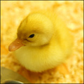
| 04/03/2006 08:39:58 PM |
Just Duckieby brizmamaComment: Love the sharp focus on the main subject - the head of this lovely little duck shows many fine details. We can see and feel the downy softness of it's fuzzy head. There is a slight twinkle in it's eye that makes us fall in love with it. Focus and details fall sharply the further away from the head that you get and because of that the composition suffers a bit. If the rest of the body was in sharp focus it would greatly help the composition. The other solution is that I think you could very easily get away with bringing the viewer in with a closer crop to this little fella. A composition where his head fills the frame would bring the viewer face to face with the downy cuteness of this little duckling not to mention play up that twinkle in the eye. |
| Photographer found comment helpful. |
Home -
Challenges -
Community -
League -
Photos -
Cameras -
Lenses -
Learn -
Help -
Terms of Use -
Privacy -
Top ^
DPChallenge, and website content and design, Copyright © 2001-2025 Challenging Technologies, LLC.
All digital photo copyrights belong to the photographers and may not be used without permission.
Current Server Time: 08/10/2025 03:43:35 AM EDT.