| Image |
Comment |
| 10/11/2006 09:15:08 AM |
AB-DUCK-TION by NaldComment: Oh! Bad pun!!! I like it:-) Anyways onto the critique. The composition is clean and simple in its presentation. The concept is executed perfectly - looking at your photo I can hear the five notes that are widely recognized in the Close Encounters soundtrack. Hmm, matter of fact, it might have been a nice subtle nod to the movie and the musical track if you had 5 blue lights instead of the 4 pictured here. I like the white spotlight that shines down on the duck for it makes one think of the light beam that is pictured as beaming up the ab-duck-tee. The only critique I have is that the spotlight creates such a heavy shadow under the beak. Mayhap if you had a smaller spotlight or penlight that you could have shined under the duck's beak it would have greatly reduced the shadow or eliminated it. To wrap up, wonderful composition and great concept: 9 |
 Photographer found comment helpful. Photographer found comment helpful. |
| 10/11/2006 08:56:33 AM |
Duck Shootby WillSnapsComment: I really like the idea behind this but because the duckie composes so little of the shot is not the main subject. It comprises maybe 3% of the image and so it gets lost in its environment. The main focus becomes the slide for it dominates about 70% of the composition - and it is excellently focused and lighting is good on the slide. Because the slide has become the main focus it makes me think of many of those well done, interesting, but overdone escalator shots I have seen at other art sites. I do like the angle that you composed with this shot. It adds visual appeal. This composition has such high potential but it lacks the main subject which should be more visible in the scene. One suggestion would be to have used duct tape on the bottom of the duckie and stuck it further down the slide such that it would make up 40% of the composition. In this way it would make the image visually appealing because it would appear, to the viewer, that the duckie is shooting straight for us! Everything else would remain the same but to keep a good Depth of Field such that the foreground AND background remain in sharp detail you would have to play with a higher aperature setting of anywhere from 8 to 16. I have to sadly say that this composition is just average BUT if the duckie was more of the central focus it had/has the potential to move into the above average category. |
| Photographer found comment helpful. |
| 10/11/2006 08:36:04 AM |
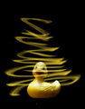
The Romantic Duckyby DjabordjaborComment: The composition is simple and clean in its presentation. It is visually eye-catching. The yellow hues really pop off of the dark black background. The yellow light swirls really add visual appeal to the composition - had it just been a picture of a duck on a black background it would not sustain visual interest past a first glance. A small speck can be seen just below the duckie, but that does not affect the overall score. Not sure how the title really relates to the composition other than perhaps that it may refer to that he has been striken by love such that his world is 'spinning'. If it is because he is stricken by love that his world is spinning then something else is needed in the composition to strengthen that connection. One example would be to include a female duck passing by and a red heart stuck on the duck with the spinning swirls. Aside from that this is an above average shot. |
| Photographer found comment helpful. |
| 10/11/2006 08:15:52 AM |
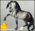
Take that!by zymaraComment: Focus, concept and lighting are all very good in this composition. I like how you captured some "action" happening between the rubber duck and the Breyer Horse. The stallion really looks like it is going to stomp on a flabbergasted duckie. The two main subjects really stand out from the clean and simple grey background. |
| Photographer found comment helpful. |
| 10/11/2006 08:10:24 AM |
Sony Vaio - like.no.otherby Nikolai1024Comment: Image is clear, sharp, and clean in composition. Lighting is excellent. I love how you have the duckies moving in formation out from the screen. Love the connection of the ducks to the background screen. On the screen is a background with wonderful trees and a river - exactly where one would expect to see a troop of real ducks swimming. The only thing that would improve the composition is if you had the background picture have a small rubber duck in it so that it the appearance of the ducks coming out of the screen is strengthened. 9 |
| Photographer found comment helpful. |
| 09/27/2006 09:05:01 AM |
Lines Linesby cryingdragonComment: I did not have time to participate in the voting of the challenge but I saw the thread and had a look see at your entry. First off the very bold colors and patterns of the kite really grab hold of the attention. Color clarity is wonderful. But once a viewer gets past the bold color and patterns is there anything else to the composition to hold the attention? In my opinion (others will differ), I don't think it does. But it does have potential. Your companion/competitor who took a similiar shot had an element of composition that played well with the title of the piece. "Tethered" had the crop come right up to the where the lines of the kite met AND it had them meet in the bottom left hand corner of the composition. Your crop has too much of the single string that meets up with the joined ones. I think a closer crop to that meeting point would improve the composition because it is one element that does not help strengthen the composition. The first look at your image I had this mental image of a great big eye - matter of fact with those leading lines that spread out from the kite to meet at a point made me think of those diagrams one had had to do in health class when learning about the parts of the eye and it's function. Hmmm, that concept could possibly help your composition if you titled it with something refering to an eye - that would have been yet another hook for viewer's to stop and take a longer look - showing/telling the viewer yet another way to look at something. I don't know if the next suggestion is feasible or not but perhaps if there was something else that could have been captured in the frame off to the right that the 'eye' could look at. For example, a bird, a plane, etc. - but not something so big that it would detract attention away from your main focus. One other thought on composition, if it were possible, would be to have this kite on the left hand side 'looking' to the right and another similiar kite on the right hand side 'looking' to the left such that they appear to be 'staring' at each other. |
| Photographer found comment helpful. |
| 09/15/2006 08:06:41 PM |
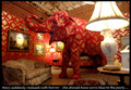
What not to wearby jblaylockraynerComment: I get the overwhelming sense that their is an elephant in the room:-) A very humorous and, of course, warped sense of humor that is Larson's style. Compositionally, the photo portion is really good with just one little flaw. The angle includes the roof line thus breaking up the scene of 'Mary' totally blending into the wallpapered room. Had the elephant been totally 'immersed' in the wallpapered portions of the room then the 'horror' of her 'mistake' would be even stronger. The other critique I have, and it is a small one, is that the text font is too cursive - it is not similiar in style to most of the Far Side's typical fonts or rather his writing. |
| Photographer found comment helpful. |
| 09/15/2006 09:48:56 AM |
...by timfythetooComment: :-D Very Far Side from the presentation of the concept, execution and the composition with caption included. Love the expression on Earl's face. He is very smug and pleased with himself! |
| Photographer found comment helpful. |
| 09/15/2006 09:32:08 AM |
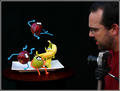
"Knock it off, I said! ... This is a still life!"by aimeethetooComment: Love the pipe cleaners and eyes you added to the fruit. Love how some of them are really active - one is doing a cartwheel while another seems to be doing a karate mid-air leap! Presentation of the concept is simple, clean, and very effective. I think the photographer/model could have furrowed his brow in anger more so the emotion is conveyed stronger by his facial expression without the help of the caption. One last observation, (and perhaps this is just my monitor)but the lens of the camera and the hair of the photographer blends in too much with the background. I think it is intrigal to the concept that the camera's shape be very visible to the eye and in this composition most of the lens body disappears into the background. Gamma correction, Brightness & Contrast or even a slightly less dark background would make the camera more distictive from the background. |
| Photographer found comment helpful. |
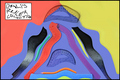
| 09/15/2006 09:21:12 AM |
Dali's Ruler Collectionby banmornComment: BHA-HA-HA-HA! Great presentation in this composition. Warped and twisted is the concept conveyed as well as a reference to a lot of Dali's work which is a warped perspective. With all the colors and twisted shapes it almost appears as an abstract. Not sure if a color or B&W presentation would have been better. One critique I can offer is that I think that the caption should have been normal block letters or at least made a tad more legible in the skewed form. |
| Photographer found comment helpful. |
Home -
Challenges -
Community -
League -
Photos -
Cameras -
Lenses -
Learn -
Help -
Terms of Use -
Privacy -
Top ^
DPChallenge, and website content and design, Copyright © 2001-2025 Challenging Technologies, LLC.
All digital photo copyrights belong to the photographers and may not be used without permission.
Current Server Time: 08/17/2025 06:40:30 AM EDT.