| Image |
Comment |
| 01/26/2007 10:15:15 AM |
Desert Flowerby aliquiComment: Truly gorgeous tones! I absolutely love the warm orange/reddish hues seen in this composition. Very simple and elegant presentation of the flowers in the bottom right corner. Focus is nice and sharp so that the viewer can drink in the details. Wonderful presentation and overall exceptional photo. Well done! |
 Photographer found comment helpful. Photographer found comment helpful. |
| 01/26/2007 10:08:36 AM |
Peppers in loveby Gaby_GComment: Simple, clean and effective minimalistic presentation. O.K. this shot really makes me pause and think how did the photographer managed to get the striped effect on the peppers. Methinks you did alot of physical work to 'paint' this scene;-) I find this very creative and visually interesting. The red and yellow tones of the peppers really pop off the white backdrop. I also like that the white backdrop is not a stark white but a soft white that fades up to a soft gentle gray which makes the photo very easy on the eyes to look upon. Well done! |
| Photographer found comment helpful. |
| 01/26/2007 10:03:14 AM |
Framedby cloudsmeComment: Lighting is very good, subject is in sharp focus, and it is a simple & clean minimalistic shot. While lighting is good I think it can be even better because of where the spotlight and the amount falls. I think that if the spotlight was more rounded and was more tightly encircled the white frame you would have the indroduction of secondary elements of interest - shapes. A circular spotlight and the square frame surrounded by a backdrop of darkness. A more circular spotlight that totally encircles (the top left hand corner of the frame disappears into the darkness) the main subject would make it stand out and pop visually even more. Now, the boy in the frame is perfectly illuminated but there seems to be something odd with his face. His face looks seperated into two halves almost like a Picasso. That is either due to a lock of hair had fallen across his face or because of a shadow falling at an odd angle. Hmmm, in an odd way the oddness of the face in the frame does arrest and hold the viewer's attention. So on the visual interest score you score high on this facet:-) |
| Photographer found comment helpful. |
| 01/26/2007 09:46:09 AM |
Lights Outby colorcarnivalComment: Black & White was an excellent choice on this composition! The two fingers reaching in a pinching motion and the lamp fob really pop out visually from the black backdrop. The white of the fob really stands out from the surrounding darkness so when the viewer looks upon the title and sees the fingers reaching out to turn off the light we get a sense of the action of the present AND what will be after the action - darkness will envelope the illuminated scene. After looking at this for several more moments I am struck by how my mind can instantly equates the illuminated lamb fob to that of a light bulb because the shape of the fob & the fact that light seems to be emulating out from it. Good job. |
| Photographer found comment helpful. |
| 01/26/2007 09:29:49 AM |
Tangerine Dream by bubeltrubelComment: Wow! Very bold reddish/orange hues on that flower that really pops off that black background. Focus is as sharp as a knife! I love how I can see all the lovely details of the flower from the 'folds' in the individual petals to the 'hairy' filiaments on the stem. Truly lovely shot! Simple, clean, and elegent minimalistic shot. |
| Photographer found comment helpful. |
| 01/26/2007 09:24:21 AM |
A Lonely Bouyby luddeComment: Without the title to clue us in the bouy is really lost in it's surroundings. There are so many other elements within this composition that it takes attention away from what you want us to see as your main focus. Minimal it is not - the sun and the reflection of the sun is what instantly captures and holds the viewer's attention - next it is the mist rising from the water and the tree line. The bouy seems an afterthought in a 'sea' of competing elements. Probably the mist rising from the water and the rising sun was cool (and it is very beautiful) that you wanted to include it in the shot. But what happened is these elements totally upstage your main subject and remove it from being a minimilistic shot that only contains a few or one main focal point. A better composition for a minimalistic shot would have been to zoom in on the lower quarter of the left quadrant. In that section you would only have the bouy, some waterlilies and if composed right a slight golden tone reflected on the surface of the water. The bouy could be position in the top right portion of the composition and only make up 10% to 20% of the shot - and it would still be considered minimal. A good shot that has some strong bones that need to be brought out in order to make this a minimalistic shot. |
| Photographer found comment helpful. |
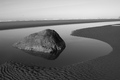
| 01/26/2007 09:06:12 AM |
6by JPRComment: I thought "6, what an odd title for a picture?" Then I saw it! The shape of the water with the rock making the center hole. It takes a great eye to see a pattern like that so kudos to you for spotting it. First impression (before I saw the 6) is that it is very minimilistic with the rock being the focal point of the scene. The critique I had for it was that the inclusion of the sky and horizon really detracts from the simple beauty in the forground. Yes, if ONLY you could crop it out such that the water, rock and textured forground made up the whole of the composition! But wait could there have been away to do it legally within the rules? I wonder if you had composed your shot where you had the camera high up and looking down at a 45 degree angle could you have gotten this shot of a "6" with just the water, rock and textured sand filling the frame. Mayhap there might have been a rock for you to climb to get to higher ground to achieve the looking down angle - maybe even a ladder if this was a planned shot (yeah, I know it is a crazy idea to bring a ladder to a beach:-) ) Hmmm, mayhap climbing on top of your car if the scene is close enough to the parking lot...just spitting out ideas that might help you achieve this same shot without the sky & horizon in it when you composed it in your viewfinder. I know tis 20/20 hindsight. Nonetheless this is a above average shot but without the sky & horizon in it, it would move into the exceptional category. 7 |
| Photographer found comment helpful. |
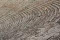
| 01/26/2007 08:52:09 AM |
Waiting the Showby JucaComment: I like your composition idea here and it certainly has high potential. The secondary subjects are interesting in that they provide the texture and interesting curved shape backdrop for you main focal point - the person sitting and waiting. The problem with your main subject is that between her/his clothes and the color tones of steps there is not enough contrast - she/he blends in too well with her surroundings. Had she/he sported clothes that had stronger contrast colors she/he would have popped visually from her/his background. Black, brown, yellow and white tones would not do because those tonal colors can be found throughout the stone steps. The color that really would have visually popped is red. |
| Photographer found comment helpful. |
| 01/26/2007 08:36:06 AM |
When The Wind Dropsby WildcardComment: Wow this almost has the visual look of some of those minimalistic vector art posters on travel or entertainment. Very simple and clean in presentation. The hazy yellow hues on the clouds in the background invoke the idea of a summer day. Coupled with the view of the sand, ocean, and windsurfer we get a very strong idea of a day at the beach on a hot summer day. The impression is very strong even though main element and supporting elements only make up 20% of the picture! Great job on this composition. My only critique is that the water surrounding the sand bar at the bottom of the picture detracts and takes attention away from the main focus and the supporting elements. That 'repetition' of water draws attention away from the ocean beyond. Framing the composition to have excluded that bottom sliver would have moved this from an 9 to a 10. Still it is a wonderful shot and should do very well. |
| Photographer found comment helpful. |
| 01/26/2007 08:07:07 AM |
The Fallenby idnicComment: The pink hue of the daisy really pops visually off of the solid black background. The position and pose of the flower is very emotive and plays in perfectly with the title. The flower seemingly droops - it not only has physically fallen to the floor but the pose of the flower invokes the idea that it is crestfallen/depressed. The focus is wonderful for you see all the fine details of the plant. My only critique is that I wish the "Face" of the flower was illuminated just a tad more so that those water drops on the petals stood out more prominently. Simple, clean, and elegantly minimalistic. 9 |
| Photographer found comment helpful. |
Home -
Challenges -
Community -
League -
Photos -
Cameras -
Lenses -
Learn -
Help -
Terms of Use -
Privacy -
Top ^
DPChallenge, and website content and design, Copyright © 2001-2025 Challenging Technologies, LLC.
All digital photo copyrights belong to the photographers and may not be used without permission.
Current Server Time: 08/18/2025 01:29:47 AM EDT.