| Image |
Comment |
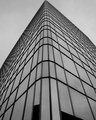
| 05/02/2007 08:28:50 AM |
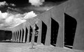
Office.jpgby weegi70Comment: I think you have a good eye for composition in this photo. The reason is your capture of shapes and how they play out. Love the lines, angle, perspective & shapes. You have the corner of the office building's point touch the top of the rectangular photo - thus cutting the sky portion up into two triangles. I was going to suggest that you could have had the point centered in the center so that you had two symmetrical triangles in the photo but the asymmetrical aspect of this I think is more appealing and adds interest. You have more shapes - the various sized rectangles of the building as they reach up to the vanishing point. A very geometric oriented photo. The thing that the photo suffers from is the lack of contrast in tones. Playing with levels in the color channel mixer or brightness/contrast should make the building pop out more from the gray tones of the sky. |
 Photographer found comment helpful. Photographer found comment helpful. |
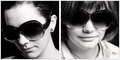
| 05/02/2007 08:16:55 AM |
one.by xantangummiComment: I don't think the one on the left is over contrasty - on my monitor the B&W tones really pop visually. Normally I like to see portraits that show the eyes, but the one on the left shows personality - the tilt to the head and the impression of giving the viewer a slight stare-down behind those sunglasses gives me the idea of a spunky and very opinionated lady. "Showing" or capturing some personality in a shot is good because it serves to draw a viewer in and hold their interest. The one on the right has good B&W tones but is not in as sharp focus as the left one. The top halve of the face is in focus with sharp details but the lower half seems a tad soft. |
| Photographer found comment helpful. |
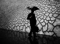
| 04/30/2007 09:08:22 PM |
crisisby boysetsfireComment: What an extraordinary find!!! I love how you waited for the man to step into the frame to add a human element to the background. I absolutely love the captured elements in this photo. The ironic juxtaposition of the man holding the umbrella while it rains and the mural showing the cracked & parched earth in the backdrop makes for a powerful visual statement and symbolism. I really like how you cannot see the face of the man because the anonymous nature makes it all the more easier for one to inject themselves into the picture & more readily be open to the message you are trying to convey. The tonal ranges in this photo are absolutely fabulous! It really pops off the page and draws you in. |
| Photographer found comment helpful. |
| 04/30/2007 08:59:09 PM |
Day 1 - Evby jonfrommkComment: The contrast needs a little more work to make it pop visually. As it stands now the tonal range is flat with not much tonal difference between the elements in the shot. Playing with curves and/or levels would help make this portrait shot really pop. I like how you composed the shot so that we see only half of the model. It adds interest to the portrait. We look closer at the half of the face we do see to look for personality/characteristics but we wonder about what the other half would show. You could let us see more of the man if you bring us closer to your subject. By that I mean a closer crop - a square crop where his whole face fills up the right half of the crop. As it stands now I think there is too much 'empty' space in the composition that adds nothing to the overall composition. |
| Photographer found comment helpful. |
| 04/30/2007 08:36:45 PM |
Strongby RetroesqueComment: I really like the play of shapes and objects in this scene. The tonal ranges are good. As good as the composition is I think the arrangement can be stronger with a different angle. IMHO I think the composition would be stronger if you moved position to show us the little tree 'contained' in the freestyle arch shape of the building. Symbolically I would read that as nature being 'contained' or struggling to break free of the man-made structure to reach up to the sky above (which would be the backdrop of the image). |
| Photographer found comment helpful. |
| 04/26/2007 03:43:04 PM |
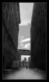
lonelyby sevilduvarciComment: Love the mood captured here. The buildings are dark and gigantic - they seem to be pressing/closing in on the small & lone figure in the scene. The lone figure stands there isolated with buildings towering over him - almost swallowing him from sheer size. I see this as a conceptual piece commenting on the irony of how we can live in a large city/metropolis but yet can get lost and alone in it. I like how the middle third of the photo is light (things are illuminated) while the right & left thirds of the photo falls or is shadow. Again it adds to the feel of being closed in/isolated in/quartered off. The bridge is symbolic too. We only see a slice of it here - seemingly cut short because of the buildings. The bridge can be seen as symbolic of being able to get to places of reaching beyond a limited boundary. Here it does not offer the possiblity to escape from a boundary limitation. It does not offer the ability to cross. It is limited or cut off in it's visible span. Thus a visible 'road' that would allow the individual to escape/to travel 'out' of his/her confines of 'building bound' loneliness to open skies & friendly faces goes/leads nowhere. Wonderful street capture. |
| Photographer found comment helpful. |
| 04/23/2007 12:49:29 PM |
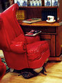
Honey, I Think We Have a Bug Problemby BeeCeeComment: Bwaaahaahaaahaahaa! This is a really funny shot. Love the title and how it plays into the composition!
First off, you mention it needed editing. Is that because of the lighting that you needed to use levels and brightness/contrast? Some time back a DPCer posted a link to this neat site that shows you the results of lighting at any given angle : //www.photoworkshop.com/public/3D_rooms/lightcage/index.html
Any light you can use, USE! Be it a desk lamp, spotlight lamp, regular lamp or several it will help to illuminate the scene and limit or eliminate the need for editing.
Second, I do like the composition but might I suggest two little embellishes to the scene to make it better? I see the title as someone who has leapt out of the chair and run screaming from the room to tell their significant other about the bug problem, "Honey! I think we have a bug problem!" As such the magazine would be lying face down on the floor and the coffee mug would lie shattered on the floor with the spilled coffee splattered. |
| Photographer found comment helpful. |
| 04/23/2007 10:26:34 AM |
With Wings Dragons Do Flyby CNovackComment: Originally posted by KarenNfld:
Can you explain how you got the 1 pixel grey border almost all the way around? I can't figure that out. |
Huh, I had not noticed that Karen. Now that you mention it, it is rather odd. I would attribute it to the large original file being resized down in one stop to 640X480.
I went back to the two photos that I captured that are 7 seconds apart and virtually identical. The first one, I resized from the original file size of 3264 x 2448 down to 640x480 and did not get that 1 pixel border. The second shot that is virtually identical I resized and got that 1 pixel border. I did the test resize several times and got varying results that are driving me crazy. My photo was validated during the voting but I am now writing to the SC on this 1 pixel artifact border issue.
Edit: Doh! When trying to replicate a problem one should:
Don't overthink.
Make sure you get a good night's sleep.
Make sure you are following ALL the steps you did in EACH & EVERY test :the missing factor that was not applied to all tests was the one time sharpening.
RESULT: Resizing down from 3264 x 2448 to 640x480 then sharpen will result in that 1 pixel wide artifact border.
Message edited by author 2007-04-23 12:07:46. |
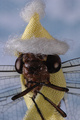
| 04/16/2007 12:59:33 PM |
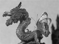
Spring Blizzard Evolutionby notesinstonesComment: Oh MY...the creativity in this one is great! It also made me smile:-) Love the attention to detail and the details in this one. Lighting and focus are fabulous. I can see the details of the hairs on the dragonfly's legs! Love the hat and scarf you adorned on your model...I wonder how happy the dragonfly was with the get-up:-)Oh and the legs ('arms') of the dragonfly 'appear' to be wrapping around the scarf & it's body as if it is shivering and seeking to warm itself up - it's that attention to detail that helps make this shot an above average one. |
| Photographer found comment helpful. |
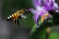
| 04/16/2007 12:53:15 PM |
In Flight by darnokComment: First off, you fabulously captured details in the bee! Great capture in the freezing the action of the bee in mid-flight. Lighting is very good and the colors in the photograph are wonderfully vibrant. |
| Photographer found comment helpful. |
Home -
Challenges -
Community -
League -
Photos -
Cameras -
Lenses -
Learn -
Help -
Terms of Use -
Privacy -
Top ^
DPChallenge, and website content and design, Copyright © 2001-2025 Challenging Technologies, LLC.
All digital photo copyrights belong to the photographers and may not be used without permission.
Current Server Time: 08/24/2025 05:00:52 PM EDT.