| Image |
Comment |
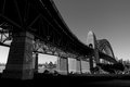
| 05/14/2007 09:18:01 AM |
day 10by FirstyComment: Love the way you framed your composition with the tall, imposing bridge sweeping/slightly curving from the top right of the photo off into the 'horizon' of the Sydney cityline in the background on the left middle of the photo. And as a lovely added visual bonus, you see the distinctive Sydney Opera House off in the distance framed between the two 'supports' of the bridge!! Definately not the typical presentation of the Opera House but certainly a unique and dramatic one. |
 Photographer found comment helpful. Photographer found comment helpful. |
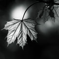
| 05/14/2007 09:10:29 AM |
Day 9 - Maple Leafby ArtysteComment: Oh GREAT use of natural lighting!!! Love how the light plays on the Maple leaf and throws into detail all the textures and lined segments of the leaf. You have some strong tones and contrasts here that are come to light with very dramatic visual appeal. Love the square crop because it keeps the attention focused on the leaf. I was about to suggest that you could even crop closer but I think that little bit of negative space to the right and bottom suits the composition well. I think it works and should stay mainly because the negative space is the dark background that really throws the naturally lit maple leaf into dramatic contrast. |
| Photographer found comment helpful. |
| 05/14/2007 09:05:06 AM |
Day-10by SandyPComment: Wow, Sandy! The tones and contrasts on that longhorn is very dramatic and the fur/hair contrasts really pop out and visually jump at you in the B&W presentation. Details are wonderfully sharp. Love that sparkle in this bull's eye's and the I can't crow enough about how how dramatic the contrast on it's light & dark fur looks stunningly good in B&W. |
| Photographer found comment helpful. |
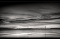
| 05/14/2007 08:55:48 AM |
Sunsetby TechoComment: Wow! What a stunning capture with the long exposure. Those beautiful clouds really create a dramatic impact to this waterscape photo. Mood is very serene and relaxing in this composition. The bridge off in the distance really adds some nice visual appeal. Nice capture, I don't have any suggestions on how to improve this image. It is just lovely to view. |
| Photographer found comment helpful. |
| 05/13/2007 03:02:47 PM |
8by mia67Comment: Holy cow! Look at all the lovely details on this butterfly from the curled proboscis to the segements of the wings! Wonderfully composed where we see the entirety of the butterfly in an up close and personal view. You bring us right up to the main subject and show us all of it's winged beauty. Wonderful job in tones and contrasts for the range is quite dramatic and eye-catching. |
| Photographer found comment helpful. |
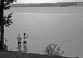
| 05/13/2007 02:59:11 PM |
Fishingby ElaineComment: The contrast & tones in this composition appear a bit too flat - more grey shades are present than any dynamic ranges of whites,greys, and blacks. Playing with Brightness/Contrast levels and well as clarify and channel mixer could help increase the dynamic range and really make it pop. Also I like the subject of the composition captured here but your main subjects swim and get lost in their environment. Don't be afraid to get closer to your main subject - bring the viewer in show us more of your main subjects - these two fisherman. Getting closer to your subjects would have also changed the angle to a more level eye level with your subjects not to mention include more of a level horizon of where the water meets the land and land meets the sky. It is taken at a vantage point of looking slightly down and as such because of that angle and lack of proximity to your main subjects we feel removed from the action because we are observing the scene from far away and high above. |
| Photographer found comment helpful. |
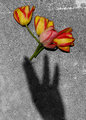
| 05/13/2007 02:50:32 PM |
The Flower Fairy (Day 8)by colorcarnivalComment: The selective desat. really helps the colors of the flowers pop off the page. I like the composition in which the shadow of the hand(s) reach and the tips touch the bottom stems of the tulips. To me it projects the action of "just reaching a little more", a little more....got them! And that is a wonderful little story to go with the picture. I trust the 'flower fairy' made another visit today;-) - Happy Mother's Day! |
| Photographer found comment helpful. |
| 05/13/2007 02:44:05 PM |
B&W - Day 9by mkComment: For someone not knowing "1/12 of a thing about lighting" or photographing models you did a OUTSTANDING job here! Reading your description (and taking a quick look at your gallery) that you don't do portraiture much I am astounded that you don't do more. Truthfully this is very, very professional work on par with what you see in fashion magazines. Your sister is a very photogenic model with very lovely and captivating eyes that really reach out and make eye contact with the viewer. That slight smile you have captured here also pulls us in. Sometimes I see it akin to the smile a passing stranger may give you one generally cannot help but to smile back. Other times I see it as a knowing smile of something mysterious to us but known just to her - kind of like that little smile on the Mona Lisa that always has us thinking 'what the heck is she smiling at or about?!?!". Going to the technicals: the lighting here is fabulous! It compliments the skin tones of your model and brings out the tones & contrasts of her hair. Focus is wonderfully sharp the eyes are the first thing to reach out and grab you. Love how you frame the composition closely around her face - where it keeps the viewer's attention focused on your main subject. |
| Photographer found comment helpful. |
| 05/13/2007 02:26:05 PM |
Desolationby noranekoComment: I like how you popped the whites by use of overexposure for it really compliments the textures & shapes in the sand as well as the shadowplay of the plant that cuts through those 'sand lines' But while the photo does wonders with calling our attention to those details it is less than complementary to the sky which looks a bit too washed/blown out (I don't know what this looks like in color but I suspect it might look really great but in the B&W the lighter tones in the sky look blown out). |
| Photographer found comment helpful. |
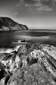
| 05/13/2007 02:20:14 PM |
I Must Go Down to the Sea Againby KarenNfldComment: Wow! Love the textures of those craggy rocks and that they provide a 'natural' leading lines that lead our eyes to look 'up' to the horizon to see the beautiful ocean, mountain range, and sky beyond. Love the dynamic tonal ranges in this composition. The thing that keeps me spellbound is those rock textures and the wonderful gleam/sparkle that dances on the ocean surface. I can hear the sounds of the surf and feel the ocean breeze when looking at this photo. |
| Photographer found comment helpful. |
Home -
Challenges -
Community -
League -
Photos -
Cameras -
Lenses -
Learn -
Help -
Terms of Use -
Privacy -
Top ^
DPChallenge, and website content and design, Copyright © 2001-2025 Challenging Technologies, LLC.
All digital photo copyrights belong to the photographers and may not be used without permission.
Current Server Time: 08/19/2025 04:48:18 AM EDT.