| Image |
Comment |
| 09/22/2007 09:13:29 AM |
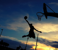
Larus' "Given To Fly"by senor_kasperComment: Wow! Absolutely great composition capturing the moment of 'flight' as this basketball player soars to slam dunk that ball into the hoop! While the player is in silhouette (as opposed to the original) the clarity of his poise and the details of the outlined shapes (including the ball) is wonderful! Love the colors of the sky - there are nice rich tones in the sunset seen here. While I realize that it would be impossible to fully remove those posts seen in the background of your frame (unless the other side of the court is clear of the posts) I do have one easy remedied suggestion to improve the composition. I think it would FURTHER increase the visual impact of the photo if the there is only ONE hoop visible in the shot. This would invoke the idea of the location being a lone court where this basketball player shoots the hoops. Off to the far right hand corner we see another basketball hoop. Cropping out the bottom portion containing that hoop to just right above the top of the hoop is the easy solution. |
 Photographer found comment helpful. Photographer found comment helpful. |
| 09/21/2007 10:04:33 PM |
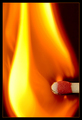
Tribute to gaurawa's "1400°C"by LimboComment: Wow! Wonderful details in the match head! And the colors are absolutely STUNNING. Love the bold and vibrant hues of the orange and yellow tones. Love the curves we see in the shape of the flame - it undulates and sweeps upward. My only critique on this composition is that I wish you did not crop it so close. You cut off the bottom and top portion of this flame. Including the flame flare in it's entirety would phenomenally increase the visual impact of your photo. |
| Photographer found comment helpful. |
| 09/21/2007 09:52:39 PM |
"Deja Vu" of a briliant idea. The painter, thanks ibkcby RUEDISCHMUTZComment: You did a good job on emulating the original. I like how you differ yours with having the painter in bright & bold color on the desaturated side while painting the scenery with color. In this way the painter really stands out from the scene and becomes a more visibly important element within the painting of the scene. Good job in matching the shape of the roller in that portion of the 'painting' where it looks like the roller just went over it. There is one element that I wish one or both compositions had in the photo to increase the visual impact: one or several paint cans. |
| 09/21/2007 09:43:48 PM |
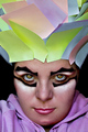
Tribute to aimeethetoo's 'Cirque de Stickee Notes'by JeniYComment: Absolutely love the colors in this composition! The colors are vibrant and bold much like what one would expect in a Cirque de Soleil performance. Love the make-up job for it also helps invoke the idea of your model being a Cirque performer. Lighting is wonderful for skin tones are great and the model is evenly lighted throughout the composition to showcase all the lovely details. Even the color of the eyes with the higher saturation and catchlights make her look magical and mysterious. I gotta hand it to you and Aimeethetoo for having the utmost in patience is arranging the sticky notes into a 'feathered' crown. Well done! |
| Photographer found comment helpful. |
| 09/21/2007 09:35:27 PM |
Cheers! (original by pidge, 2006)by NuzzerComment: Wow, image clarity, details, and composition are all spot on. Great presentation! This is a very close emulation of the original. The only critique I have is that the wine in the glass looks flat. It looks more black which is not characteristic with red hues of a deep burgundy or red wine. Perhaps shining a spotlight or adding another light source to shine specifically on the glass with showcase some of the lovely red hues in the wine that are not present in this composition. Adding that punch/touch of red in the wineglass will really help improve the visual appeal of the image. |
| Photographer found comment helpful. |
| 09/21/2007 09:29:13 PM |
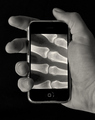
Evolve IIby ZeppKashComment: Great job in lighting, tones & contrasts and level of details in this composition. Love how you really made the effort to have the finger bones match up closely to the position of the fingers holding the device. My only suggestion on how to improve the visual impact of this photo is to introduce some color into it to give it more punch. The original had the x-ray illuminated in an electric blue tone. Adding that color similar to that tone into your composition would give it a bit of variety in making that portion stand out from the regular B&W tones of the rest of the image. Adding color to a portion of the image that is a main element or feature will immediately call the eye's attention to it. |
| Photographer found comment helpful. |
| 09/21/2007 09:19:52 PM |
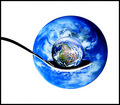
The Whole World On A Spoonby imagesbytlpComment: Wow! Way to go on a really close match to the original. Lighting, colors, and details are wonderful! My only observation on this is that the difference between the two is that your sphere looks like the whole globe in entirety while Techo's looks like a reflected vision of the globe through an 'eye' resting on the spoon. Not sure which I like better both are really good but for different reasons. Yours gives off more of the world resting on the spoon ready for the eye to 'feast' on. Techo's gives us a reflected vision of our eye looking at another eye showing it's vision of the world. |
| Photographer found comment helpful. |
| 09/21/2007 09:12:10 PM |
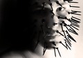
a fear of being touchedby rodgers_leComment: Kudos to you for attempting what I am sure must have been a very challenging composition! You captured some nice details in the face, the expression, and the 'nails' extruding out from the face. As always, lighting is key in effectively illuminating your subject to showcase all the elements and project a mood. While I do like that there is the deep shadows off to the left because it looks like he is emerging from the safety of the darkness to face the world with his 'defensive' mask - it obscures quite a bit of details on the left side of his face. By evenly lighting the whole face you will heighten our awareness of this subject's fear of being touched by showing his 'defensive' mask in it's entirety. Lastly I think the choice of long nails or screws doesn't work to well with them showing as sticking straight out from the face. Because of the weight distribution and their length a few look like they are drooping or in danger of falling off. A shorter nail length and a larger head surface on the nail (like what you see in the original) would work better for them to stick straight out and appear more menacing. Nonetheless good job here. |
| Photographer found comment helpful. |
| 09/21/2007 08:59:37 PM |
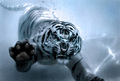
Underwater Deja Vuby Breeee123Comment: Wow, really nice capture of this tiger! A Very nice emulation of the original. The left paw is extended up and with the ferocious look on the tiger's face it looks very much like it is coming to attack us. Look at that dangerous look on his face! While this IS a wonderful capture there are a few areas that need some improvement to REALLY make this image POP. First, is the timing of the capture...there is something odd about the nose of this big cat. It looks like it is mashed up on the glass - and now that I look closely that left paw looks a bit darker than the rest of the cat as well possibly because it too is pressed to the glass. I could be totally wrong about the pressed glass issue but if I am right than than the timing is everything. I know that timing must be hard as well as getting the focus just right but I think if you captured the big cat in more free floating water it would look better. Next the sharpness is not even across the whole of the main subject. Again, I know it must be a challenge to effectivately capture this big cat when you are shooting against a glass cage filled with water backdrop. I cannot see the stats listing the photo info but checking what jblaylockrayner had it was an aperture: f8, ISO: 800, and shutter: 1/2500. The high aperture setting is key because the higher the aperture the greater DOF you will get. The front paw all the way back to the tail should be in sharper focus. You may need to play with shutter speeds to get the right exposure due to whatever the lighting conditions may be. Lastly, the blue color cast just doesn't compliment the image as a whole. Yes, it does show that this is taken underwater but you want the tones and contrasts to really pop and the blue cast appears a bit flat. Playing around with the contrasts to the image should make the differences between the light and dark areas really pop. Converting it to B&W Methods of B &W conversion or a adding a duo/tri/quadtone look How to create Duo/Tri/Quadtone Images could really make this big cat *spring* off the page. |
| Photographer found comment helpful. |
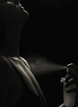
| 09/21/2007 08:38:29 PM |
Fragranced II - Tribute to Sahkoby -Bec-Comment: A very nice emulation of the original. Love how both capture the spray of perfume with great clarity. While this is a great emulation there are two things that I think can be improved to increase the visual 'wow' of the image. First is the lighting. Always a tough thing to master but the lighting can help set the mood by illuminating all the right elements. The whole mood of both compositions is for the feel to be steamy, sexy, and a bit erotic without revealing much. While the lighting illuminates the spray, the perfume bottle and the curves of her face and neck it fails to fully accentuate the curves of her chest. The other element that contrasts in color tones can increase not only the dynamic range of the photo but the visual wow of the photo. The original has a white bra while your recreation has a dark one on which does not contrast at all with the rest of the dark tones in the photo. Adding that punch of contrast is greatly increase the visual impact of the photo. |
| Photographer found comment helpful. |
Home -
Challenges -
Community -
League -
Photos -
Cameras -
Lenses -
Learn -
Help -
Terms of Use -
Privacy -
Top ^
DPChallenge, and website content and design, Copyright © 2001-2025 Challenging Technologies, LLC.
All digital photo copyrights belong to the photographers and may not be used without permission.
Current Server Time: 08/19/2025 01:50:24 PM EDT.