| Image |
Comment |
| 10/10/2005 12:26:12 PM |
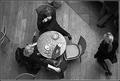
Coffeeby sigrun_thComment: Good composition and crop, too bad for the legs above the woman at the top of the frame, perhaps a slightly less tight crop on the top would attach them to a body a little more (the one in the upper right corner is perfect). Like the motion blur on the woman walking, in contrast to the people sitting still at the table. Emotes the struggle between rushing and resting.
Good conversion to B&W, though color probably would have been good too... Maybe just a hair overexposed? (The highlights seem blown out on the cups and saucers on the table...)
Nice capture. |
 Photographer found comment helpful. Photographer found comment helpful. |
| 10/10/2005 12:02:30 PM |
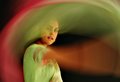
Dance of Colorsby librodoComment: The blur of the model's arm is disturbing. I realize there's no good way to get blur of the fabric without bluring the arm, but the arm blur is way too distracting... sorry. |
| Photographer found comment helpful. |
| 10/08/2005 04:29:04 PM |
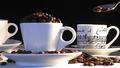
Perfect - Good Coffee, Good Musicby kari1Comment: Wow! Gorgeous shot! I love the high contrast of the cups and the black background, I love the shiny spoon, I even love the little halo on the spoon. My only gripe is that the shadow on he left side of the cup in the foreground is a little too dark... just a smidge of fill light, even from something like a desk lamp (or a smidge less light on the rest of the shot and a slightly longer exposure) would give a LITTLE detail in those coffee beans on the left. Also, the details of the coffee beans, especially the ones on the table, seem to be suffering from JPEG compression or some other digital noise. Neat Image would have rescued that, I think.
But those two little gripes don't detract too much from this otherwise stunning photo. Great job, and should place in the top 20. |
| Photographer found comment helpful. |
| 10/08/2005 04:22:36 PM |
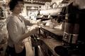
Postcards to Peruse at While Waiting for Your Javaby chefsamComment: Desat/Sepia works well for this photo. Compositon is very good and focus and exposure are right on. On the bad side, the bottom shelf suffers from what is probably lens distortion from a wide angle shot. When you're using a wide angle lens on something with straight lines it's usually better to keep the lines away from the border of the photo a little so it's less noticable. There's also a distinct shadow on the left side of the photo.
Overall a nice photo, though it's on the edge of being linked to the challenge, IMHO... this scene doesn't scream out "COFFEE SHOP" to me. Good job though. |
| Photographer found comment helpful. |
| 10/08/2005 04:18:51 PM |
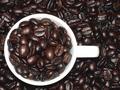
Espresso Abundanceby neophyteComment: Neat! I like the high contrast of this shot. Everything seems to be in good focus, but there are, in my opinion, too many highlights on the coffee beans. Less harsh flash and a longer exposure would have probably cleared that up and helped a lot. Overall a very nice job! |
| Photographer found comment helpful. |
| 10/07/2005 10:55:58 PM |
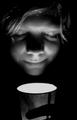
The Sence of Smellby liebeComment: The entire shot is slightly out of focus, which is really distracting for me. Otherwise an interesting shot, but I'm not sure I like it. I get the idea, but something's off to me. |
| Photographer found comment helpful. |
| 10/07/2005 10:48:49 PM |
San Quirico d' Orciaby GordonComment: First thought... "Wow." This is a really good shot. The motion blur adds a sense of life to the sot. The desat gives it the feel of a slightly older or more rustic place... All around well done. |
| Photographer found comment helpful. |
| 10/07/2005 10:45:36 PM |
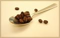
spoon of perksby shadowComment: A nice crisp macro shot. I like the coloration of the background, and even the border works for me. The composition is spot on too. Nicely done. |
| Photographer found comment helpful. |
| 10/07/2005 10:43:05 PM |
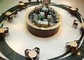
Nut Brown Coffee Kioskby enticingComment: Cool perspective! The composition and/or crop seems a little bit off... Maybe if the kiosk was a little more to the right or left, instead of nearly dead center. I also might have cropped out the moving legs at the top of the frame, or at least waited until the people were gone. A good effort and better than average photo. |
| 10/07/2005 02:52:44 PM |
Study Nightby dw_photoComment: Very sharp and great detail. Focus, crop, and DOF, are all great. Technically a 10.
The entire picture seems to have a reddish cast though, like you applied a touch of sepia or something. I don't think it adds anything to this picture, because everything else about it (sharpness and focus) indicates newness and clarity. Leave the pages of the book white and we're in business here.
The scene also lacks action though, I wish there was some steam rising from the cup, some opened creamers strewn around the table, or an ash tray with a half-dozen smoked butts or something to give this scene a little more LIFE.
Over all though, a good effort, and better than average. |
| Photographer found comment helpful. |
Home -
Challenges -
Community -
League -
Photos -
Cameras -
Lenses -
Learn -
Help -
Terms of Use -
Privacy -
Top ^
DPChallenge, and website content and design, Copyright © 2001-2025 Challenging Technologies, LLC.
All digital photo copyrights belong to the photographers and may not be used without permission.
Current Server Time: 08/04/2025 06:37:25 PM EDT.