|
|
|
Showing 411 - 420 of ~593 |
| Image |
Comment |
| 11/04/2005 08:35:25 AM | |  Photographer found comment helpful. Photographer found comment helpful. |
| 11/04/2005 08:35:01 AM | |
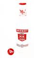
| 11/04/2005 08:34:15 AM | Invisibly Transparentby joezlComment: I understand the concept, but this is just too blown out for me to really like it. It looks like the labels are just floating in mid-air. The tranparency is lost, as the bottle really looks invisible. | | Photographer found comment helpful. |
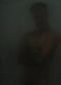
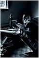
| 11/04/2005 08:32:51 AM | TranzMeby kenskidComment: Much too dark. A flash unit (even just a little bit) behind the door with the model would have made this much better. I'm not saying he has to be perfectly lit, but this is too far towards dark. | | Photographer found comment helpful. |
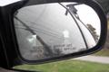
| 11/04/2005 08:31:18 AM | Time, Interruptedby Car54Comment: Technically very well done, but I don't see transparency, only reflection... | | Photographer found comment helpful. |
| 11/02/2005 10:09:55 PM | Noice townby gisliComment: Greetings from the Critique club!
My first impression when I saw this photo: It looks like a post card from the 1950's.
Relation to the challenge: The grain is obvious here and is essential in the "message" of the photo. 100% relevant to the challenge. The grain itself is very well done.
Composition: The photo is very well composed. I like the fence lines, they really draw you into the photo. I'm 50/50 on the foreground, it's stark and empty, which can be good and can be bad. It leaves you to contemplate the mountains here, which I think were the real point of this picture. Finially, I really like how the mountain trails off to the horizon on the right side.
Technique: I don't mind that the highlights in the mountain are blown out, or nearly so, but I do think there's a lack of contrast in them. Maybe if you had brought down the levels a little bit you'd get some definition back in them.
Post processing: No indication of what you did, but whatever it was it was done well. There's nothing too sharp, glowing, or anything else.
Overall Impression: It's well done, but it's not spectacular. It would have gotten a 6 or so from me during the challenge voting. Well done, but needs a little more work to really pull out the emotions. Finally, I agree with the commetner who mentioned the title. //www.dictionary.com is a great free, online dictionary. Anything obviously wrong with the title is going to loose a point in my voting.
I hope this critique was helpful and I would really appreciate a PM from you, letting me know if it was helpful. Also, if you have any suggestions on how to give a better critique I'd appreciate it! :)
Good luck in your future challenges!
---Andrew | | Photographer found comment helpful. |
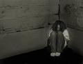
| 11/02/2005 09:32:37 PM | Bewareby LadeeMComment: It achieves its mission, but I've learned that in most cases, brighter and happier images will score much higher than sad, dark images. Indeed, when I look at this photo I get sad, which isn't a fantastic emotion when you're scoring photos.
Don't get me wrong, it's great to make someone feel something, but if you're asking them to rate the photo on a scale of 1-10 then you want them happy when they do it.
That said, this challenge in particular almost demanded a dark and gritty image, and yours delivers. I didn't vote on this challenge, but this probably would have gotten a 5 or 6 from me. Why?
I don't like the "spotlight" effect around the girl. It seems to emote the opposite of the intended emotion, halos and "stepping into the light" make me think of hope, joy, etc.
The photo also lacks contrast. It's overall very flat. Maybe some light pants, or something. There's just so much wall and it is all the same grey which gets rather boring, and is very close to the "color" of her jeans.
It's not a bad picture, by any stretch, and a 5.2 isn't bad, but you probably would have gotten a 6 from me if there was more contrast, and maybe even a 7 if I really felt it.
Hope this helps. | | Photographer found comment helpful. |
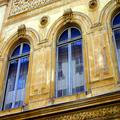
| 10/31/2005 12:36:41 PM | Windows in Franceby carinaComment: For me this does not meet the challenge. Yes, windows are transparent, but in this case the viewer is not looking through them, but instead there is a reflection in them. Better for the "reflections without mirrors" challenge than this one. However, it is a very nice picture (i love the blue and the brown/orange), so that saves you from a '1'. | | Photographer found comment helpful. |
| 10/24/2005 04:53:35 PM | Clutterby TranquilComment: Agree with the other two commenters, this is THE most underrated photo of the challenge. Don't dispair, there's at least three of us out there that love your work. | | Photographer found comment helpful. |
| 10/23/2005 07:16:08 PM | First Lightby BudComment: My prediction for a ribbon. Nicely done, though a little too strongly violet for my taste. | | Photographer found comment helpful. |
|
Showing 411 - 420 of ~593 |
Home -
Challenges -
Community -
League -
Photos -
Cameras -
Lenses -
Learn -
Help -
Terms of Use -
Privacy -
Top ^
DPChallenge, and website content and design, Copyright © 2001-2025 Challenging Technologies, LLC.
All digital photo copyrights belong to the photographers and may not be used without permission.
Current Server Time: 08/05/2025 10:22:15 AM EDT.
|