| Image |
Comment |
| 12/01/2005 11:55:33 AM |
Katha the little girl.jpgby nolockComment: Personally I'm very distracted by the yellow fabric around her head in the background. It looks like she has some kind of headdress on or something, even though I know that's not true.
I also think it's too soft... Her face should be in sharper focus, but that's just my preference. A lot of people like softer focus in portrats. |
| 11/30/2005 12:48:19 AM |
A Simple Loveby ArtysteComment: You know, the more I browse the work of the experienced photographers on this site, the more I realize that GOOD photography isn't about light, but it's about shadow.
You have captured something here that is really incredible. Your mastery of light, (and the lack of light) is evident. Added to favorites, adding you as a favorite photographer, and I look forward to whatever entries you grace us with in the future. |
 Photographer found comment helpful. Photographer found comment helpful. |
| 11/29/2005 11:47:55 PM |
Transparent Buildingby NekoNitaComment: I wouldn't worry too much about your place... this was a rather high scoring challenge overall. A 4.6 isn't bad at all for a first entry. It takes a little while to figure out what works here.
I think it's a good picture. Not great, definatley not horrible.
My argument for getting rid of the motion blur, either with a crop, or with faster shutter speed, is that it detracts from the point of the photo, which is the transparency of the first building. You don't want people being distracted by the cars. If you had cropped that out then you could have metered the exposure for the building and lightened the whole thing up a little bit.
Just my $.02 :) |
| 11/29/2005 11:31:16 PM |
Snake Eyesby racwComment: Lacks critical focus on any subject. Also, did you mean to enter this into odd? 5 chips, 1 on each die... |
| 11/29/2005 11:30:18 PM |
|
| Photographer found comment helpful. |
| 11/29/2005 11:29:29 PM |
|
| 11/29/2005 11:28:53 PM |
|
| 11/29/2005 11:28:30 PM |
smooth and even tastingby Steveo77zComment: I don't care for the lighting here, I think you could have used a little more light to better develop the edges of the can while still maintaining the moody feel. Also, the highlight at the bottom of the can is distracting... sometimes moving the object around in relation to the camera and to the lights can move or remove those highlights.
It's also barely related to the challenge... photos that stand on their own without needing the title to link them to the challenge are usually much better off. |
| 11/29/2005 11:26:19 PM |
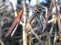
Seed Podsby tedwardComment: The jumbled background is very distracting... Two seed pods don't make a very interesting study, at least not as they are here. |
| 11/29/2005 11:25:29 PM |
Catsby KristalComment: Just grabbing two of something doesn't make a very compelling entry. The cats themselves are cute, but not incredibly cute. The hand in the lower right is distracting. The shot is sharp and well focused, and the lighting is good. |
Home -
Challenges -
Community -
League -
Photos -
Cameras -
Lenses -
Learn -
Help -
Terms of Use -
Privacy -
Top ^
DPChallenge, and website content and design, Copyright © 2001-2025 Challenging Technologies, LLC.
All digital photo copyrights belong to the photographers and may not be used without permission.
Current Server Time: 08/05/2025 01:02:19 AM EDT.