|
|
|
Showing 321 - 330 of ~593 |
| Image |
Comment |
| 12/14/2005 08:50:37 AM | Double Cheese!by laindComment: Technically, it lacks overall sharpness.
Artistically, it fails to "tell a story" or otherwise hold my interest. |  Photographer found comment helpful. Photographer found comment helpful. |
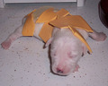
| 12/14/2005 08:49:54 AM | Puppy in a blanketby confusedComment: This is just a supremely odd idea, and not very visually appealing. I mean, why cover a puppy in cheese? The puppy looks so young that I feel bad that he was taken out of his mother's care for this shot. Finally, technically speaking, I would prefer more Depth Of Field so that at least the puppy's head was in focus. | | Photographer found comment helpful. |
| 12/14/2005 08:48:24 AM | | | Photographer found comment helpful. |
| 12/14/2005 08:48:15 AM | | | Photographer found comment helpful. |
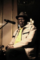
| 12/14/2005 08:47:23 AM | Bazilian Samba Singerby ThiRodriguesComment: I have no idea what this has to do with Cheese, unless his shirt is made of it. He's not mugging for the camera in the standard "say cheese" pose... so I don't know. |
| 12/14/2005 08:46:22 AM | You Can't See the Cheese Because It's in the Mouse That I Ate...by sacsComment: It's a good concept, but there are a few things wrong with this photo:
1) There's a blue cast to the whole thing.
2) The background is odd and doesn't add anything to the photo.
3) The lighting is poor.
4) There are sensor dust spots in the upper right corner.
I think this concept needed a little more development to make a better photo. | | Photographer found comment helpful. |
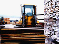
| 12/09/2005 04:21:12 PM | Lumberby ragamuffingirlComment: ::: Critique Club :::
Greetings from the Critique Club!
First Impression - the most important one:
There's a lot going on here, and the exposure and lighting just seem 'off.'
Composition:
This is a tough call. The picture lacks any distinct focal point and seems 'busy.' I don't know what you, the photographer, want me to look at in this picture. There's a stack of wood on the right, a big forklift, another stack of wood in front of me, and some interesting patterns in the background. This near-overload of objects all in clear focus makes my eyes dart about, trying to find something specific to settle on. When you're taking a picture with strong lines its best if the lines 'lead' the viewer's eye to a particular focal point. The lines in your photo don't do that and it causes the viewer to scan around the photo a lot.
There's also a distinct tilt, from the left to the right, in everything except the stack of wood in the extreme foreground. A tilt like that makes the viewer feel like they are on a listing boat. :) A simple rotational crop in Photoshop could have cleared that up.
Subject:
Marginally "Industrial," at least in my opinion. To most people the word "industrial" conjures up thoughts of steel and sparks, not wood. Wood is thought of as a 'living,' or 'earth' thing, which is in conflict with the emotional connotation of 'industrial.' The inclusion of the loaders helps some, but isn't enough. If you look at the top 20 in this challenge, they are all about metal, steam, manufacturing, etc.
Technical (Colour and light):
The yellow of the loader is a nice bold and strong color, but the rest of the photo looks very washed out. Raw lumber isn't a very colorful thing to begin with, I suppose, but the photo lacks overall visual intrest. There's also a significant problem with lighting in this shot. The stack of lumber at the right foreground is over-exposed, as is the sky, however the rest of the shot shows varying degrees of underexposure. I think if you had shot the scene at a diferent time, when the sun was behind you, it would have helped on several levels, reducing the light levels in the sky, adding some light to the stack of wood on the loader and the front of the loader itself. You also could have considered using a small amount of fill flash to try to brighten up some of those shadowy areas.
Also, as a general rule, it is to your advantage to use the whole 640 pixels that DPC allows in your picture. Make it as big as possible to avoid loosing detail.
Summary:
This is only your second challenge entry, so don't dispair. It takes a little while to figure out what appeals to the voters here. You've got a good eye for what scenes to photograph, now you just need to work on the technical aspects. Don't be afraid to use the forums here for tips on how to shoot a particular scene.
Finally, I'd like to ask you to consider "critiquing the critique." A lot of effort goes into these critiques, and I enjoy learning how I can do them better. Does what I said make sense? Is it way off base? Did I enlighten you? Offend you? Please let me know via a private message what you think of this critique, so I can give better ones in the future.
Thanks, and good luck at DPC!
---Andrew |
| 12/09/2005 01:57:10 PM | Carverby GeneralEComment: ::: Critique Club :::
Greetings from the Critique Club!
First Impression - the most important one:
The composition is awkward... I've never wanted to be so close to a ham. :)
Composition:
I think this is the weakest point of this photo. A fatty ham hock isn't something that I've ever really wanted to inspect in detail. As another commenter noted the plate in the upper right corner is distracting. I do like the lines of the table, they add grounding to the photo. I also would have gotten a brand new knife (even if it is just a $5 wal-mart special) so that it was nice and shiny. I also wouldn't have put the knife in and out of the ham, there's fat on the blade, which is kind of "oogy."
Subject:
The idea itself is a good one, and germane to the challenge. It's traditionally the man's place to carve the holiday feast. I just think this idea could have been presented in a far more photogenic way.
Technical (Colour and light):
The light falls off significantly on the right side of the picture. Actually, the more I look at it, the light falls out above the ham; really, it's the underexposure of the knife that bothers me. The color is nice and "pops," but it seems a little warm and orange-ish, perhaps the white balance was slightly off? The sharpening is right on, not too sharp, no strange artifacts.
Summary:
This seems like an "opportunistic" shot to me. You were there, getting ready to carve the ham, and said, "Wait, let me take a picture!" DPC rewards those who work hard at getting the shot, and that reflects in your score. I've looked through your past challenge entries and I think your shots fall into two categories: some that score really well, that you've put some thought into, and some which don't score so well, that look like you just snapped a picture because you were there. As long as you don't expect too much from the latter category, then that's fine.
Finally, I'd like to ask you to consider "critiquing the critique." A lot of effort goes into these critiques, and I enjoy learning how I can do them better. Does what I said make sense? Is it way off base? Did I enlighten you? Offend you? Please let me know via a private message what you think of this critique, so I can give better ones in the future.
Thanks, and good luck at DPC!
---Andrew | | Photographer found comment helpful. |
| 12/07/2005 05:27:35 AM | Industrial Bronzeby fotomann_foreverComment: Didn't vote this challenge, but would have given it a 9.
Two things keep it from a 10 in my book...
1) Would have liked to see more detail in the hair.
2) The commenters are right, the expression in her face is awful.
Pity that more don't get it. I would ask if it was "worth it" for Van Gogh to cut off his ear, but they'd probably say no to that too... with a consenting adult who is aware of the risks what's the problem? And put clothes on her and you've got Rosie the Riviter. The nude adds 1000% impact to me.
A GREAT shot, something for you to be very proud of. Worthy of my favorites list, anyway. :) | | Photographer found comment helpful. |
| 12/04/2005 10:12:15 PM | Suits Meby BrenbComment: It's cute, and I get it, but...
Maybe it's too cute. I'm not sure exactly what the problem here is, but it's just not a strong contender in this challenge for me. | | Photographer found comment helpful. |
|
Showing 321 - 330 of ~593 |
Home -
Challenges -
Community -
League -
Photos -
Cameras -
Lenses -
Learn -
Help -
Terms of Use -
Privacy -
Top ^
DPChallenge, and website content and design, Copyright © 2001-2025 Challenging Technologies, LLC.
All digital photo copyrights belong to the photographers and may not be used without permission.
Current Server Time: 08/06/2025 01:34:02 AM EDT.
|