| Image |
Comment |
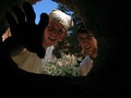
| 01/27/2007 06:38:12 AM |
::adventure::by fjgodyComment: I felt like I should have liked this image better; it's a good concept, and it's carried off well, with sufficient lighting to see both faces. It didn't grab me, though, perhaps because the focus on both faces is soft, and the lower background really cluttered it up for my eyes (having both faces against the blue sky may have worked better for me, but it might also have been too stark). |
| 01/27/2007 06:26:14 AM |
Lunch at the recording studioby FedericoComment: I wasn't sure what to think of this (I'll bet you're getting that a lot on this image). Looking at it simply from a technical perspective it's okay, though the white is not consistent throughout (it looks a bit yellowish in spots and a bit pinkish in others). Really, though, it just speak to me as an image. |
 Photographer found comment helpful. Photographer found comment helpful. |
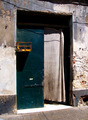
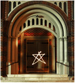
| 01/27/2007 06:19:44 AM |
The entrance keeperby LeooComment: I really like the subject matter here, but the over-exposure and lack of focus on the rough stones/bricks to the right of the door really distracted me, as did the dark spot at the upper right of the shot. A closer framing of the shot and darkening the whole by a couple of stops might have helped it for my eyes. |
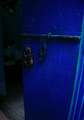
| 01/27/2007 06:16:25 AM |
blue doorby nate2006Comment: I liked the blues in this image, but found the lock a bit dark, and the murky things inside the room distracting. A more extreme angle (so that you don't actually see into the room), with a bit more brightness, might have improved it for me. |
| 01/27/2007 06:14:59 AM |
A Lovely Entranceby CrazyStripesssComment: While I "got" this image, it didn't do much for me as an image. Technically it's okay, and I like the shadows and plays of light, but overall composition doesn't win me over, though I'm not sure what I would suggest that you do differently. |
| Photographer found comment helpful. |
| 01/27/2007 06:13:20 AM |
Opening Day Coming Soonby jkieperComment: This image is very well done technically, with good blues in the sky and generally sharp lines (though the bat on the right may be a bit out of focus) throughout. I didn't really care for the subject matter or the composition, though; the green structure behind (for lights? press boxes) is distracting, and what I see of the entrance doesn't really interest me as an entrance (personal preference, of course!). |
| Photographer found comment helpful. |
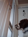
| 01/27/2007 05:56:52 AM |
The Waitingby reddishgirlComment: I like this concept, and I like the low angle. But, I wanted more depth of focus as I looked at it; the dog is either out of focus or far too soft, but the door handle is also out of focus, so I wasn't quite sure where I should be looking. White balance also seems a bit off to me, so the whites are a tad out of sync to my eyes (compare the door to the wall behind the dog). |
| Photographer found comment helpful. |
| 01/27/2007 05:50:52 AM |
Portalby MichaelCComment: I didn't know what to think of this, but from an image perspective it didn't do much for me; shadows, coloring and focus vary from the right columns to the left, and while it looks like some kind of long exposure, I wasn't sure what was being said or why it was done this way. |
| Photographer found comment helpful. |
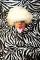
| 01/27/2007 05:49:32 AM |
Now how did I get in here, ribbit, ribbit... ...by tolovemoonComment: This didn't do much for me; there are light reflections on the ball (on part of the frog), there are focus problems (I'm not sure where the focus is), and I think I would have liked the composition better if it was either dead center or more off-centered. I also wasn't sure what was being said by the picture (beyond the straight forward title), so it didn't really speak to me as an image. |
| Photographer found comment helpful. |
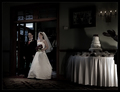
| 01/27/2007 03:30:46 AM |
"Ladies and Gentleman, Mr & Mrs...."by CutterComment: The strong focus on the cake, the soft focus on the bride, and the blurry groom really hurt this image for me. Lighting was also a problem, with the shadows making the whole thing look like a rather grim occasion to me (which I'm guessing it wasn't). |
Home -
Challenges -
Community -
League -
Photos -
Cameras -
Lenses -
Learn -
Help -
Terms of Use -
Privacy -
Top ^
DPChallenge, and website content and design, Copyright © 2001-2025 Challenging Technologies, LLC.
All digital photo copyrights belong to the photographers and may not be used without permission.
Current Server Time: 07/18/2025 11:35:05 AM EDT.