| Image |
Comment |
| 10/05/2005 03:33:44 PM |
and a Slice of Cake please!by biggood53Comment: Interesting shot, quite nicely done and then majorly spoilt by the verticals not being vertical. Just makes you work look sloppy which from the care taken to set up the lighting, its not. |
 Photographer found comment helpful. Photographer found comment helpful. |
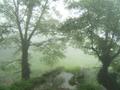
| 10/05/2005 03:31:53 PM |
Trees in Fogby gbosComment: Greta image ... terrible submission for coffee shop. It's getting a 1 not because its a bad picture but because it shows complete disregard for the challenge process |
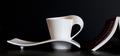
| 10/05/2005 03:29:23 PM |
Refillby greignerComment: Simple and effective. The shadow is especially significant as it should be denser nearer to the cup yet that's where it bleaches out. The result is an art feel rather than a photographic treatment. Very well done |
| Photographer found comment helpful. |
| 10/05/2005 03:26:03 PM |
|
| Photographer found comment helpful. |
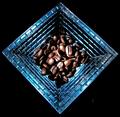
| 10/05/2005 03:24:02 PM |
coffeeby tcmartinComment: This is an interesting idea and a lot of work has gone into it. If the intention of the message is "dirty and used" then your post-production needs to generate that. As it is, the greyscales are smooth and even with no noise. As a result, the message is lost and the image sort of fails to have the impact that is lurking there |
| Photographer found comment helpful. |
| 10/05/2005 03:21:08 PM |
The Morning Nebulaby Beach_melComment: So simple yet so effective. I believe that this demonstrates the strength of good composition. The light is smooth, low and interesting and the overall effect of the black areas gives the image its strength |
| Photographer found comment helpful. |
| 10/05/2005 03:18:11 PM |
|
| Photographer found comment helpful. |
| 10/05/2005 03:15:20 PM |
A Simple Lifeby joyseeComment: Ok, this is interesting. Love the shapes, this image *does* love the almost B&W and the simplicity is attractive. I can't make up my mind about the composition, something is "off" a little but I can't decide what that is. The book is a key element in the contrast of shapes so its not that although I feel the cup may be too centreed in frame. A major niggle though (looses at least a point) is that you haven't rotated the image to get your horizon level. |
| Photographer found comment helpful. |
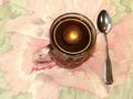
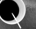
| 10/05/2005 03:11:14 PM |
coffe at tableby maryaresComment: It's hard to find v ery much attractive here. There are possibilities for this image but ti does raise some questions first. Why B&W? Coffee thru a straw? Wat message is trying to be communicated? Try this again with some side light, good depth of field and maybe if you want black and white, boost the contrast up to try for some dramatic effects |
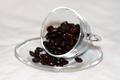
| 10/05/2005 03:06:51 PM |
Solid coffeeby olipallComment: This is quite centred and the depth of field is just too shallow |
| Photographer found comment helpful. |
Home -
Challenges -
Community -
League -
Photos -
Cameras -
Lenses -
Learn -
Help -
Terms of Use -
Privacy -
Top ^
DPChallenge, and website content and design, Copyright © 2001-2025 Challenging Technologies, LLC.
All digital photo copyrights belong to the photographers and may not be used without permission.
Current Server Time: 06/25/2025 07:28:08 AM EDT.