| Image |
Comment |
| 10/06/2005 10:56:28 PM |
Children in Sapaby letuananhComment: The comlimentary colours challenge is about
"use TWO complementary colors to compose your photograph"
This is more than 2 colours and whilst is is a fine photo, I cannot score it any higher than 3 |
 Photographer found comment helpful. Photographer found comment helpful. |
| 10/06/2005 10:02:03 PM |
I used to be green too, you know !by maessengerComment: The comlimentary colours challenge is about
"use two complementary colors to compose your photograph"
This is more than 2 colours and whilst is is a fine photo, I cannot score it any higher than 3 |
| Photographer found comment helpful. |
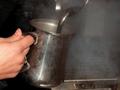
| 10/06/2005 08:05:49 PM |
Steamin'by GoscheComment: I like the idea here as the subject has the ability to do wonderful things with light but this treatment is just slightly unappealing |
| Photographer found comment helpful. |
| 10/06/2005 08:04:35 PM |
|
| Photographer found comment helpful. |
| 10/06/2005 07:59:16 PM |
|
| Photographer found comment helpful. |
| 10/06/2005 07:57:29 PM |
|
| Photographer found comment helpful. |
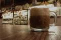
| 10/06/2005 07:54:51 PM |
Sugar Packetsby DiComment: Its a pity you couldn't wring more DOF out of this because the sugar sachets just don't look like the right point of interest. |
| Photographer found comment helpful. |
| 10/05/2005 05:43:48 PM |
Thinking Of Youby cools98Comment: ::: Critique Club :::
We love our kids like nobody else and we love our kids photos like nobody else can. So don't be surprised that it didn't blue. Having said that, this is a great image for the card!
Firstly, he has that wonderful far-away expression (probably thinking "has she finished yet?" ... LOL). The desat of the colour also works. It gives the image a sort of meancholy look which I feel is very appropriate to the subject and challenge. In terms of a commercial card, kids sell. So for all sorts of reasons, yes the image did deserve to score higher. That it didn't I believe is not a reflection on what it would sell like.
If there is any fault I can find with it , it might be in the lighting. It is well lit, maybe too well lit. I suspect you used the on-camera for some fill? The result often of this is a flattening of an image because all the shadows are gone. If its not fill flash then it is maybe half a stop overexposed.
To ribbon? I dislike the option of having to create a wow factor just for the sake of a score when you already have something that does the job it set out to do. I would try a little thirds in the composition whcih would mean moving him down and right in frame until the gross between his eyes fell on the top right thirds intersecting lines.
Brett Message edited by author 2005-10-06 01:57:57. |
| Photographer found comment helpful. |
| 10/05/2005 05:20:02 PM |
Friendshipby John WhiteComment:
If you can't be bothered providing information, comments and feedback on your photo, I can't be bothered critiqueing it. Message edited by HBunch - Removed Critique Club Status. |
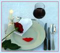
| 10/05/2005 05:15:27 PM |
Invitation for dinnerby RUEDISCHMUTZComment: ::: Critique Club :::
Immediately you open this image, it communicates quality. t's a quality setting and it's a quality photography. As soon as you open it, it's obvious that a lot of time and care have gone into making it. I frankly don't understand why it scored low 5's.
The comments are valuable in seeing what bugged people about it. You went for the flat light look and got it but what that cost you was definition. This is just the sort of image that you need an igloo for. That's the effect you were after but didn't have the tools to do it. The igloo is just a bigger version of the egg shell. You can make one out of silk or bedsheets. If you get a nice even round shape and pump your light in from outside, you get that overall lighting affect that you were looking for - and it's much more controllable.
With this kind of shot, you are allowed to cheat too you know. The wine looks a bit dull and flat and contributes to the image looking that way too. Most food photography doesn't use food. Ice cubes are plastic, ice cream is cornflour, gravy is gelatine etc etc. In this case, you could have used water first in the glass and then just dripped some wine into it until you had a balance of colour and light glow. I appreciate you were working against the sunrise, so you have to do this before hand and experiment a little.
Like some of the commenters I too find the colourings clash a little. The green plate and the blued tabled cloth don't sit well together. Perhaps a stark white plate would have worked better as a strong contrast to the black handles and almost black rose leaves.
Brett |
Home -
Challenges -
Community -
League -
Photos -
Cameras -
Lenses -
Learn -
Help -
Terms of Use -
Privacy -
Top ^
DPChallenge, and website content and design, Copyright © 2001-2025 Challenging Technologies, LLC.
All digital photo copyrights belong to the photographers and may not be used without permission.
Current Server Time: 06/25/2025 11:25:42 AM EDT.