DPChallenge: A Digital Photography Contest You are not logged in. (log in or register
 
Browse Settings
Currently viewing:
Registered UserKiwiShotz

Show comments:

Per page:

Order:

Comments:


Comments Made by KiwiShotz
Pages:   ... [179] [180] [181] [182] [183] [184] [185] ... [279]
Showing 1811 - 1820 of ~2789
Image Comment
Bite Me!!!!!!!
10/15/2005 02:39:05 AM
Bite Me!!!!!!!
by Judi

Comment:
That's funky
Photographer found comment helpful.
Home Base
10/15/2005 02:15:56 AM
Home Base
by grahamp

Comment:
::: Critique Club :::
Ok this will be confuzzling. A kiwi critiqueing a kiwi who is calling Sydney home base? They haven't annexed us as the 8th State yet ... mate :)

First Impression:
Too busy and confusing with several elements competing for attention. The commenters have gone for this also. The sky is attractive and probably the most powerful element in the shot. The scoring is pretty good for this image as it had possibilites yet to be unleashed.

Composition:
You've probably got it by now - the composition hasn't really worked. The question is, where does it work? Unfortunately, it seems to work best when you loose all of the foreground tarmac area. When you do that, you then get stuck with the horizontal tailplane so you end up having to crop that out too. Actually it can be done and may be better - or just a different shot.

Just as an exercise,

Colouring:
The filtering (polarising?) or post-production on the sky and buildings is a great effect. There's a solidity and depth to those areas in contrast with the brightly lit vertical tailplane that really appeals. My feeling is that this aspect of the image is what pulled in the scoring points.

Overall
The idea had possibilities and to be fair, within the confines of airside security, you don't have a lot of options in where you can compose a shot from. It probably could have been enhanced with some brutal cropping although it's hard to throw away precious parts of your shot.

Brett
First Light
10/15/2005 01:13:54 AM
First Light
by idnic

Comment:


I think it's only fair that if you ask for someone to spend some time with your image and critique it, that you in turn take the effort to supply the shooting details and as much information as you can about the setup and capture.

I would love to have spent some time on this image but fair's fair.

Message edited by HBunch - Removed CC status.
My Secret Garden
10/15/2005 12:52:45 AM
My Secret Garden
by Jaimeson

Comment:
::: Crtitique Club :::

First (and most important) Impression:
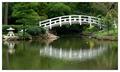
What a serene, peaceful and competent image this is. Japan comes to NC and it takes a photographe with a good eye to capture that and complete the illusion that it really was taken in Japan.

Subject:
It meets the challenge, you're sharing with us a place in your world that touches you. The task once you have the location is to communicate that feeling to others. Your commenters all got it. They respond and acknowledge that serenity feeling, it means they were involved. That is the first step to a good image, one that touches people with an emotional response. Your Ansel Adams quote in your profile says it all - so many people miss that.

Composition:
You have positioned the major element of the bridge in the thirds position, vertically and horizontally where it instinctively appeals to the viewer. In addition, the whole frame has the bottom-left to top-right visual flow which is also a comfortable image structure to viewers. It's impossible to say without trying it whether dropping the whole image in frame so that the bottom spec of bridge reflection sat at the base would improve the balance even more. I doubt it and you probably tried it anyway. Yes, the lantern does draw your eye to it and it's not on thirds which is why I suspect you have had comments about it. Having said that, I also suspect that the image is really 'flat' without it. My eye actually gets drawn to the tree beside it and I keep wanting to see the top of it. Iguess that's why I was wondering about the lowering of the image in frame.

Colouring:
This image has such a pleasing balance to it that its difficult to say that it could be better. It could be different but that may not be any better. The green cast of the water just fits the overall image so well. The green on green works well and then the yellows, whites and lantern just supply the perfect compliments to it.

Lighting:
The flat light of the overcast day does two things. First is gives the whole image that soft eggshell feeling with no highlights or deep shadows. Secondly it adds to the mood of the image. It is probably the light that gives it that serenity feeling.

To get to Ribbon?:
It probably never would because it's not a spectacular way-out image and is not designed to be. Not every image has to have a wow factor. Images are communications of a theme, story or feeling. A wow factor just for the sake of it is often inappropriate. This image has the serenity and calmness feeling. As such it would be happily used by a picture editor in a magazine article to convey that feeling.

Be proud of this shot, it works perfectly to communicate a very specific message.

Brett
Photographer found comment helpful.
Over by Randall Road
10/14/2005 10:52:29 PM
Over by Randall Road
by eugene

Comment:

I would very much like to critique this image but can't.

If a Photographer clicks the critique box asking for someone to spend a lot of time analysing the image, then the very least the Photographer can do is to take the time to comment on their work and to share with others the process and technicalities of the shot.

I am delighted to share with those that also share.

Message edited by HBunch - Removed CC status.
Remember The Gift
10/10/2005 05:25:05 PM
Remember The Gift
by glad2badad

Comment:
Great take on the challenge and well photographed as well. I particularly like the double light source. The darkness of the wine is the only problem with the image as I 'm sure you've already worked out
Photographer found comment helpful.
The Beauty of Nature
10/10/2005 12:58:33 AM
The Beauty of Nature
by AlexSaberi

Comment:
Surely there must be *some* challenges that can't be answered with a nice landscape. I think this is one of them - 1
Transluscent Lakescape
10/10/2005 12:17:51 AM
Transluscent Lakescape
by Simonjw

Comment:
Another kiwi top 5 :) Way to go Simon!
Photographer found comment helpful.
Fairly Fun
10/09/2005 11:41:57 PM
Fairly Fun
by Tammer

Comment:
The comlimentary colours challenge is about

"use TWO complementary colors to compose your photograph"

This is more than 2 colours and whilst is is a fine photo, I cannot score it any higher than 3
Photographer found comment helpful.
Fall Watercolors
10/09/2005 08:37:58 PM
Fall Watercolors
by admart01

Comment:
The comlimentary colours challenge is about

"use TWO complementary colors to compose your photograph"

This is more than 2 colours and whilst is is a fine photo, I cannot score it any higher than 3
Photographer found comment helpful.
Pages:   ... [179] [180] [181] [182] [183] [184] [185] ... [279]
Showing 1811 - 1820 of ~2789


Home - Challenges - Community - League - Photos - Cameras - Lenses - Learn - Help - Terms of Use - Privacy - Top ^
DPChallenge, and website content and design, Copyright © 2001-2025 Challenging Technologies, LLC.
All digital photo copyrights belong to the photographers and may not be used without permission.
Current Server Time: 06/26/2025 05:23:52 AM EDT.