| Image |
Comment |
| 03/25/2004 09:11:52 AM |
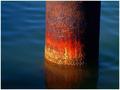
Rusted Over Timeby JPRComment: I love this shot. Beautiful colour saturation makes the different shades of orange pop out. Simple composition is also great. |
| 03/25/2004 09:08:12 AM |
Piercing Glareby xcharrierComment: Good use of DOF. Head turned slightly one way or another could have been more interesting. Looks like it may have been slightly over processed by looking at the left side of the picture. |
 Photographer found comment helpful. Photographer found comment helpful. |
| 03/25/2004 09:03:36 AM |
Orange by Orangeby hughletherenComment: Nice clean image. Hard to make a phone interesting. Maybe if it were shot from a different angle. Or a tighter crop to show the Orange logo lettering more clearly. Certainly would make a good product or stock shot as is. |
| Photographer found comment helpful. |
| 03/25/2004 08:44:17 AM |
reflectionby nomoreschiComment: I see an orange hue in this picture but not much else. Compostionally I don't find it appealing or intriguing. If the mirror was framing an interesting subject it might be effective. |
| 03/25/2004 08:29:15 AM |
Purpleby addiBangsiComment: What I see here is an image that looks like it was sepia toned and I'm stretching to say it may have an orange tone. Compositionally it is interesting and certainly abstract, to me at least; I have no clue as to what it could be or it's significance. I didn't take away full marks for colour. 3 |
| Photographer found comment helpful. |
| 03/25/2004 08:20:19 AM |
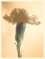
Carnationby #1 Bronco FanComment: Unless my monitor is way off (which I'm sure it's not) this is no where near orange, other than the colour cast which arguably could have an orange hue. Compositionally it is OK but I think more negative space on either side would have been better; enough at the top; nicely off-center. Focus seems a little soft but that could be the preception due to the colour cast/hazy effect. This could probably be removed for the most part with Levels and unsharp mask. 2 |
| Photographer found comment helpful. |
| 03/25/2004 08:10:18 AM |
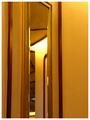
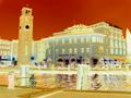
Hotel Sunby annapiComment: Compositionally a good shot. The hue/levels thing or whatever you did with it to give it a orange tone doesn't flatter the image. Some people like the effect and sometimes it can be a nice touch but to me in this instance it is over done (I've done it myself - didn't work for me either) 2 |
| Photographer found comment helpful. |
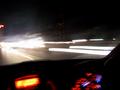
| 03/25/2004 08:04:19 AM |
Music loverby leon00Comment: I tried this once, camera shake due to vibrations of the car are impossible to control. That really doesn't doesn't do anything for your picture. I'm not sure what you were going for here but compositionally, I think, I would remove about 1/4 from the top of the picture. And if you want to capture your lit dash and moving traffic you'll have to pull over to the side and set your tripod up on the shoulder and shoot in through the car. 2 |
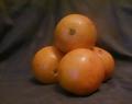
| 03/25/2004 07:52:07 AM |
ulgy orangesby maisiebComment: Yeah they are ugly. The composition is so-so; 'filling the frame' is one way to make it more interesting maybe. You have colour cast in the shot which can be taken out using Levels in Photoshop(or other editting software). Softer/diffuse/indirect light would have caused less glare on your subject. Oh yeah, one other thing.....your subject was specifically mentioned in challenge outline has one of the items not to shoot. Sorry. 1 |
| 03/25/2004 07:39:33 AM |
MMMMMMMMMMMMMMMMMMMMMMby GOLNAZZZComment: Was this a deliberate attempt at thumbing your nose at the challenge guidelines? If it was, that's your perogative. You'd would have to be legally blind not to see that it's out of focus; it almost seems intentional. And even though totally out of focus, it looks suspiciously like a member of the fruit family that was stricken from the challenge. If you didn't understand the challenge or are actually legally blind, I apologize. 1 |
| Photographer found comment helpful. |
Home -
Challenges -
Community -
League -
Photos -
Cameras -
Lenses -
Learn -
Help -
Terms of Use -
Privacy -
Top ^
DPChallenge, and website content and design, Copyright © 2001-2025 Challenging Technologies, LLC.
All digital photo copyrights belong to the photographers and may not be used without permission.
Current Server Time: 08/09/2025 02:25:30 PM EDT.