| Image |
Comment |
| 03/03/2005 10:02:25 PM |
|
 Photographer found comment helpful. Photographer found comment helpful. |
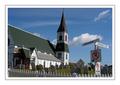
| 03/03/2005 09:58:52 PM |
by NonageComment: "The corner of Don't Park and No Parking at any Time." Looks like Trinity, am I correct? Message edited by author 2005-03-03 21:59:12. |
| Photographer found comment helpful. |
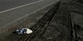
| 02/28/2005 09:32:24 PM |
IMG_2470web.jpgby autoolComment: I see the point you are trying to make with the shot Dick. But at first glance it's not easy to see what the object is; first when I looked I mistook it for roadkill. On a billboard I don't think it would have the impact that you had intended because motorists wouldn't have the luxury of time to figure out that it's a destroyed soccerball and make the connection to your title. I do like the concept though, I just think for a billboard it had to be "hit them over the head with it" obvious. Technically, the leading lines are useful in showing abandonment of things like organized sports in this day and age. |
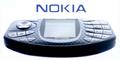
| 02/28/2005 01:05:51 PM |
Nokia N-Gageby KonadorComment: More DOF for this type of shot would have worked better. I think shallow DOF would be lost on most motorists. Not only that, you are advertising so you want to present the most undistorted / clean image of your product possible. Great concept nonetheless. |
| Photographer found comment helpful. |
| 02/28/2005 01:01:48 PM |
|
| Photographer found comment helpful. |
| 02/28/2005 12:58:13 PM |
Back To School Targetby TommyMoe21Comment: I think white would have been a better choice for a background colour, mainly because the gray you used is almost the same as the gray of the site and it tends to blend in rather than stand out. Otherwise a good shot. |
| Photographer found comment helpful. |
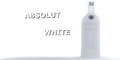
| 02/28/2005 12:48:00 PM |
Absolut Whiteby milo655321Comment: I like your idea. Three things I see that could dramatically improve your image: 1). More DOF to make the text on your BG sharper 2). balance you composition by moving the bottle further from the text 3). a touch more contrast on the bottle so that the Absolut Vanilla is more visible. |
| Photographer found comment helpful. |
| 02/24/2005 07:38:32 PM |
Brothersby ImagineerComment: Incredible. You gotta start giving us details on how you acheive such great images. Please. ;) |
| Photographer found comment helpful. |
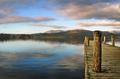
| 02/24/2005 12:33:43 PM |
Windermere Jettyby ImagineerComment: Very pretty Jon. You should be giving classes. Heck Drew and Langdon should be paying you to do tutorials. I have to say you are one of the best here.
Cheers,
Owen |
| Photographer found comment helpful. |
| 02/23/2005 08:30:01 AM |
|
| Photographer found comment helpful. |
Home -
Challenges -
Community -
League -
Photos -
Cameras -
Lenses -
Learn -
Help -
Terms of Use -
Privacy -
Top ^
DPChallenge, and website content and design, Copyright © 2001-2025 Challenging Technologies, LLC.
All digital photo copyrights belong to the photographers and may not be used without permission.
Current Server Time: 08/02/2025 09:41:38 PM EDT.