| Image |
Comment |
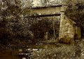
| 10/27/2005 09:12:25 AM |
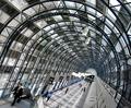
RR Bridge @ Indian Rockby SJCarterComment: In my opinion where you have so much going on in this image colour would work better to show the separation between the elements. Maybe at the same time bumping up the vegetation colours a little. |
 Photographer found comment helpful. Photographer found comment helpful. |
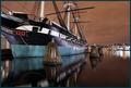
| 10/24/2005 11:03:05 AM |
|
| Photographer found comment helpful. |
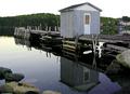
| 10/19/2005 07:44:15 AM |
The Wharfby hysmorComment: That looks like a NODECO sticker on the door of the shed. I'm guessing somewhere along the highway between Long Harbour and St. John's. I would have guessed there would be more Autumn colours in the trees though, being taken in the last week.
Composition is good with the diagonal placement of the wharf and use of leading lines. The eye is drawn to the bouy and then back again through the composition. One thing I see is lack of crispness in the image. A little USM would work wonders here. Hope this is helpful. |
| Photographer found comment helpful. |
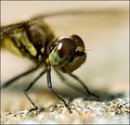
| 09/30/2005 06:49:19 AM |
bugslife.jpgby MAKComment: WOW. Some kind of shallow DOF you got going on there. I'd bump up the saturation a little in the master channel and use a little less USM (see a hint of jaggies on the antenna). Also maybe consider cropping out the foreground because it draws the eye away from the fly. Otherwise great capture. |
| Photographer found comment helpful. |
| 09/29/2005 01:32:52 PM |
Psalm 108by jpochardComment: Great use of that negative space you had in this shot. A very well thought out inspirational poster and a very lovely shot. This shot would probably have more mass appeal if it were more generic in nature and not geared toward a religious group; I do realize that this was probably created as a result of your own convictions and my comment is a essentially moot point. |
| Photographer found comment helpful. |
| 09/28/2005 06:53:01 PM |
Leading To Big Businessby StrikeslipComment: Great shot Slippy. I added it to my favorites and you to my favorite photographers. And I didn't do it in protest because some people are making such a big deal over your stunt. ;) |
| Photographer found comment helpful. |
| 09/27/2005 02:02:02 PM |
My Nephewby donfanaticComment: A little too far off center for Rule of Thirds unless the twig in the childs hand is the main subject. Otherwise a nice natural expression. More flash fill would have brightened the child somewhat to overcome the bright trees in the background. |
| Photographer found comment helpful. |
| 09/27/2005 01:57:55 PM |
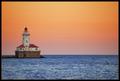
"I never saw the sea..."by fotodudeComment: Just a touch right in the frame to put your light right at the intersection point would make this a stronger composition. This looks like a long exposure shot at f/22 or close, judging by the dust spots I'm seeing above the lighthouse. I feel your pain. |
| Photographer found comment helpful. |
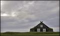
| 09/27/2005 01:54:28 PM |
Little House on the Prairieby NazgulComment: Severe haloing and grain in this shot. I do like your composition however even if your subject could stand to be a little more left in the frame. |
| Photographer found comment helpful. |
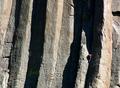
| 09/27/2005 01:51:20 PM |
Almost Thereby SonifoComment: Your subject should be more to the left of the frame to better meet the challenge. The texture of the rock and the contrast is pleasing though. Message edited by author 2005-09-28 00:43:24. |
Home -
Challenges -
Community -
League -
Photos -
Cameras -
Lenses -
Learn -
Help -
Terms of Use -
Privacy -
Top ^
DPChallenge, and website content and design, Copyright © 2001-2025 Challenging Technologies, LLC.
All digital photo copyrights belong to the photographers and may not be used without permission.
Current Server Time: 08/02/2025 07:22:24 AM EDT.