| Image |
Comment |
| 06/03/2003 11:24:03 AM |
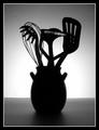
Silouette des ustensilesby orussellComment: Originally posted by inspzil:
O - I admit I'm one of the ones who marked down for originality in this challenge. I think if you could've done something a little different with the lighting on this one, It would've helped. And its not at all because I think the lighting is bad on this one, just maybe not had it the same across the whole picture. I picture this in my head with the bright light in the middle and substantially darker on both sides, like putting some kind of "v" directly behind the vase so that the light on both sides of it was diverted, so it wasn't quite so intense. Maybe if you could've made it where it looked like the light was coming OUT of the vase it would've done more for me. Just thoughts though. Its really a solid picture as is. Bob |
Bob,
These are the kinds of comments that make a photographer strive for something better.
Thanx,
Owen |
| 06/03/2003 09:19:24 AM |
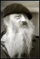
Oldtimer by kiwinessComment: To capture that much detail at 30m and get the background out of focus like that is amazing (to me anyways - I have a crap camera...lol). That's some piece of equipment you have. Also, really good eye Kiwi.
Congrats,
Owen |
 Photographer found comment helpful. Photographer found comment helpful. |
| 05/29/2003 06:07:47 PM |
|
| Photographer found comment helpful. |
| 05/28/2003 09:31:11 AM |
Evolveby VipermikeComment: Great shot Mike. Congrats. The clarity of your work is second to none. I've gotta say, you are one of my favorite photographers here and Valor in particular is one of the best shots I've seen here. Is there a tutorial for that shot? |
| 05/28/2003 09:23:03 AM |
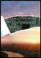
Neck Plug: Interface Detail by GordonComment: Was trying to figure out what you used for your reflecting surface. Thought it might have been some sort of weird mutated bowling ball or something...lol Who would have guessed it was a slotted spoon...duh. Nice work. Congrats!! |
| Photographer found comment helpful. |
| 05/26/2003 08:52:33 AM |
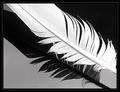
Birds of a feather by JeanComment: Great shot. A less battered feather would have made a killer shot. Just my opinion. The clarity of the shot is exceptional. 7 (I haven't seen an 8 yet this challenge) |
| 05/26/2003 08:46:51 AM |
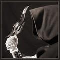
Looks Can Killby magnusComment: Great concept and setup. Too bad you couldn't get your background and hood a little darker. You can see the wrinkled backdrop and the lint on the hood is also distracting. It's been my experience at DPC that people really pick up on the little things. I guess I gotta follow suit. Cheers. 7 (could have been an 8) |
| Photographer found comment helpful. |
| 05/26/2003 08:35:18 AM |
Black & Copper Baroqueby amonteforteComment: Great shot. Too bad you didn't "doutone" it. Sepia wouldn't have worked as well as B & W in this case. Why did you not convert to B & W is my only question? You entered the wrong pic didn't you? Too bad. Sorry. 5 |
| 05/26/2003 08:29:10 AM |
In Her Roomby progersctComment: As a duotone the pic meets the criteria. As a portrait, your model is obviously very pretty. What is distracting about this shot is the "knowing" look on her face. It looks too posed. If she had been "a thousand miles away" in her mind, the shot would have been killer. 6 |
| 05/26/2003 08:19:22 AM |
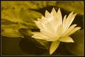
Serenityby paganiniComment: I like sepia but I think plain B and W would have been a better choice for this particular shot. The yellow/green cast I don't like. 6 |
| Photographer found comment helpful. |
Home -
Challenges -
Community -
League -
Photos -
Cameras -
Lenses -
Learn -
Help -
Terms of Use -
Privacy -
Top ^
DPChallenge, and website content and design, Copyright © 2001-2025 Challenging Technologies, LLC.
All digital photo copyrights belong to the photographers and may not be used without permission.
Current Server Time: 08/06/2025 09:30:05 AM EDT.