| Image |
Comment |
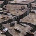
| 01/21/2006 07:54:10 PM |
Too Little, Too Lateby alfrescoComment: Impressive set-up and a really great shot. Very inspiring. Sure fooled me! Message edited by author 2006-01-21 19:54:45. |
 Photographer found comment helpful. Photographer found comment helpful. |
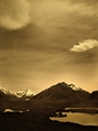
| 01/21/2006 07:30:26 PM |
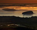
Tasman Glacierby larryzComment: Hint of an interesting landscape but the colour makes it look flat. Why the choice of sepia tones? |
| 01/21/2006 07:28:33 PM |
Gladiolaby dassilemComment: There's a hint of a pretty picture but it's quite flat in luminosity and colours. You could perhaps try applying auto-levels and contrast to see the difference and push up on the colour saturation just a little. |
| Photographer found comment helpful. |
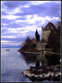
| 01/21/2006 07:25:57 PM |
Chateau Sur L'eauby madhatterComment: Quite an interesting composition but the colour balance needs work. Looks like it's a little too heavy on magenta and blue. Seems rather dark overall as well. |
| Photographer found comment helpful. |
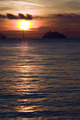
| 01/21/2006 07:20:59 PM |
Saucy Sun Riseby fitmpdnsthtrComment: This picture could have been quite nice without the over-saturated rings around the sun. As an important element to your whole image, overall voting would be based on that. |
| Photographer found comment helpful. |
| 01/21/2006 06:57:51 PM |
RIley's last dayby cmeierComment: Sorry for the loss Chris. You've captured him beautifully. He doesn't seem sick at all. (Know how it feels - been there a long time back but never forgotten.) |
| Photographer found comment helpful. |
| 01/21/2006 06:45:28 PM |
Frame Continuumby luv2photoComment: This is a really cool perspective and composition! And yes, certainly agree with you abt how hard it can get for managing DoF with a P&S. :) |
| 01/21/2006 06:16:52 PM |
Sunrise on Frenchmans Bayby NeilComment: This is beauuuuutiful! Absolutely love the red/amber tones. But yes, I would take out some of the foreground. I think the upper layer is stunning enough! |
| Photographer found comment helpful. |
| 01/20/2006 06:38:39 PM |
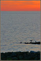
landfall-IMG_2470.jpgby Bear_MusicComment: Love the minimalist approach here with just a "little bit" of bird to add interest(if we can call it that), playing up instead the contrast of natural textures and colour between rocks, sea and sky. True piece of art! |
| Photographer found comment helpful. |
| 01/20/2006 09:37:11 AM |
The Newport Bridgeby amsterComment: Composition is not bad but what spoils it for me is the very strong blue tint overall. |
| Photographer found comment helpful. |
Home -
Challenges -
Community -
League -
Photos -
Cameras -
Lenses -
Learn -
Help -
Terms of Use -
Privacy -
Top ^
DPChallenge, and website content and design, Copyright © 2001-2025 Challenging Technologies, LLC.
All digital photo copyrights belong to the photographers and may not be used without permission.
Current Server Time: 08/08/2025 05:31:38 PM EDT.