| Image |
Comment |
| 02/15/2006 06:05:52 PM |
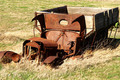
Living Memoryby lkn4truthComment: Wonderful picture. The shadows and rust against the grown dead grass really makes this shot. Nicely done. |
 Photographer found comment helpful. Photographer found comment helpful. |
| 02/15/2006 06:04:17 PM |
|
| Photographer found comment helpful. |
| 02/15/2006 06:03:22 PM |
|
| Photographer found comment helpful. |
| 02/15/2006 06:02:59 PM |
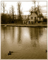
Rustic calmby elee3009Comment: Beautiful, love the use of sepia with the bare trees. Nicely done. |
| Photographer found comment helpful. |
| 02/14/2006 12:11:01 AM |
Blue Dropby alexvoloComment: Greetings from the Critique Club
I like the idea, the shapes made create a very nice abstract. The lighting is a bit harsh from the middle to the left but perfect on the right side. The shadows made on that side are very interesting. The color makes this true to challenge but is just a tad flat. I think the biggest thing that throws me on this picture is the lack of main subject, my eyes keep dancing around trying to pinpoint what it is you want me to see. With all the curves and lines made, it really creates good motion but it doesn't lead anywhere. I believe for this challenge and these voters, its a bit too abstract (and a great one at that).
|
| 02/11/2006 12:51:43 PM |
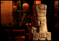
The Sentryby sajinComment: Greetings from the Critique Club
Very interesting picture. Good texture and lighting. The shadows seem to accentuate the texture well, good position. The one thing that really bothers me about this is the background. Other than the obvious brighter shine directly behind the statue, my eyes seem to go straight for that vase in the middle. I think with the light reflecting on the pillar directly behind the statue and then to the left onto the vase and continues to the shade, its very distracting from your subject. Its almost a leading line away from your subject. With advanced editing, I believe you can select all but the statue and darken it to that there is less competition. I like the similar color hues but it doesn't help with this background set up. I don't mean to sound so negative because I really like your subject. With a little bit more editing, I think it would really power up this picture. |
| 02/11/2006 10:48:56 AM |
Caiby KitaComment: Greetings from the Critique Club
Very good composition here Kita. I think the comment concerning it looking centered is due to the fact that his upper body begins in the center, although his head is off center, it may have been tricky for some to see the difference. The lighting is pretty good, a bit too much on his neck and cheek. I like the color of his shirt and yes, even with wrinkles. That is what many busy boys end up in, It seems to really add to his expression. His arm serves as a nice line leading the viewers eye to his wonderful expression. You've really captured a beautiful expression here. Looks like he is really focusing on what he wants to do next and maybe a little frustration and boredom too. I don't see it being out of focus as one commenter mentioned, his face has a good softness about it that really brings out his character. Overall, I think you did a fine job at this profile picture. There is good use of space and rule of thirds. The positioning may not have worked well in this challenge but it is appealing and technically right on track.
|
| Photographer found comment helpful. |
| 02/11/2006 12:58:10 AM |
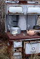
The Monarchby linda12201Comment: Wonderful picture of this old stove. Love the grass blades overgrown on the front and the clean dishes on top. |
| 02/11/2006 12:56:59 AM |
|
| Photographer found comment helpful. |
| 02/11/2006 12:56:54 AM |
Smashedby JulieGComment: Good picture. I like the harsh lines made but the edges of broken glass. Nice simple colors really compliment each other. |
| Photographer found comment helpful. |
Home -
Challenges -
Community -
League -
Photos -
Cameras -
Lenses -
Learn -
Help -
Terms of Use -
Privacy -
Top ^
DPChallenge, and website content and design, Copyright © 2001-2025 Challenging Technologies, LLC.
All digital photo copyrights belong to the photographers and may not be used without permission.
Current Server Time: 07/31/2025 04:57:48 PM EDT.