| Image |
Comment |
| 05/27/2006 06:47:04 PM |
Selfby DigiFotoBuddyComment: CTCP2 Gunnsi
First impression: Happy guy, good shot!
Pros:
Good focus, good contrast, good lighting.
Cons:
The background is not clean, a bit to red :-), the shadow distracts.
What could be done better:
Go a bit further from the wall to get rid of the shadow.
Nothing else to say, overall a really nice portraiture. |
 Photographer found comment helpful. Photographer found comment helpful. |
| 05/27/2006 06:41:05 PM |
Ninja Lenscaps from Canonby blackenedwhiteComment: CTCP2 Gunnsi
First impression: To much light on the (is it a) "lemon" !!!
Good focus on the bottom of the Lenscap but IMO a bit narrow focus making the top of the lenscap OOF.
The frame is nice, works well with the (is it a) lemon.
What can be better?
Dim the lights on the (is it a) lemon.
Fix the DOF. |
| Photographer found comment helpful. |
| 05/27/2006 06:34:56 PM |
Queen of the Laundry Pileby margiemuComment: CTCP2 Gunnsi
First impression: Great shot. Good idea and well executed.
You are at the right place in the picture. Good colours, focus fine and crisp.
What could you do better?
Maybe place the camera a bit more to the left and pointing it more to the right to get the vertical lines a bit more vertical!
Congratulations on over 6 finish. |
| Photographer found comment helpful. |
| 05/27/2006 06:28:48 PM |
down timeby margiemuComment: CTCP2 Gunnsi
First impression: Nice and crisp, good focus and good title.
What can be better?
IMO crop a bit from the left. Lighting a bit harsh, maybe not wear white or dim the lights a bit. |
| Photographer found comment helpful. |
| 05/27/2006 06:25:48 PM |
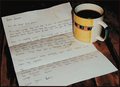
Memoriesby OddfrogComment: CTCP2 Gunnsi
First impression: I want a coffe :-) and Why are there so many coffe stains? Dull colours. Nice idea, well executed. Good focus.
What can be better?
Brighter colours, fewer coffe stains on paper, use NeatImage to get rid of grains.
|
| Photographer found comment helpful. |
| 05/27/2006 06:20:53 PM |
The Trouble With Daisyby RebeccaComment: CTCP2 Gunnsi
First impression: Beautiful picture, lovely colours, perfect focus, crisp and clear.
What can you do better?
Stand a bit further from the wall to skip the shadow, the wall could be whiter in the left (your right).
I gave highest 8 in this challenge. Three pictures and this was one of them. IMO this picture should have scored better.
|
| Photographer found comment helpful. |
| 05/27/2006 06:01:14 PM |
Virtudes Angelicalesby yankoComment: CTCP2 Gunnsi
First impression: Beautiful angel with a church in the background.
Looks like there is a lot of NeatImage.
Good things:
Lines draw you to the center of ghe subject. Good colours. Everything seems so pure and soft.
What can be done better:
Seeing what place you ended in, there is probably not much :-)
Maybe cropping the light in the bottom left away. It destracts a bit.
Congratulations on your top ten score.
|
| Photographer found comment helpful. |
| 05/25/2006 08:22:54 PM |
|
| Photographer found comment helpful. |
| 05/25/2006 01:42:07 PM |
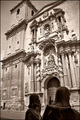
St. James arriving to the templeby alexgarciaComment: From CTP2 Gunnsi
First impression: Beautiful church, somebody standing in the way of it and what is that building in the left?
What is good?
1. Focus, contrast and light are all good.
What can be better?
1. I am not sure it was a good choice to make it B/W, I miss the blue sky.
2. Maybe skip a bit of the left of the church and trying to have the statues a bit higher and more to the right.
3. Use fill flash on the statues. |
| Photographer found comment helpful. |
| 05/25/2006 09:32:21 AM |
|
| Photographer found comment helpful. |
Home -
Challenges -
Community -
League -
Photos -
Cameras -
Lenses -
Learn -
Help -
Terms of Use -
Privacy -
Top ^
DPChallenge, and website content and design, Copyright © 2001-2025 Challenging Technologies, LLC.
All digital photo copyrights belong to the photographers and may not be used without permission.
Current Server Time: 06/18/2025 04:16:51 PM EDT.