|
|
|
Showing 951 - 960 of ~1485 |
| Image |
Comment |
| 02/17/2003 06:21:30 PM | Rhythm Red, Beat Blackby dan_pendletonComment: Excellent rhythm and lighting. Think I would have prefered a different colour background, the colour and lighting of this one is a bit uneven. Great shot! |  Photographer found comment helpful. Photographer found comment helpful. |
| 02/17/2003 06:17:51 PM | | | Photographer found comment helpful. |
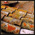
| 02/17/2003 06:15:12 PM | Rooftopby jjbeguinComment: Excellent composition and patterns, perhaps a little less sharpening....but I like it this way too! | | Photographer found comment helpful. |
| 02/17/2003 06:13:50 PM | escapeby tomzinhoComment: I like the repitition here, perhaps I would prefer it with the street and people cut off, concentrating on just the building. |
| 02/16/2003 11:56:55 PM | ... and the sharpener wins!!by CreativeFlyPhotoComment: 5 mins before the deadline! Quick Critique is better than nothing!!
Content-Composition
Your composition is great, with the sharpener in one corner and the pencil leading from another corner down to the bottom left. Perhaps I would prefer not to have all the little bits around the pencil, I think that the main sharpenings are good enough.
Technical
Your use of DOF is very creative here, excellent focus on the tip of the pencil, rendering the rest quite soft.
Lighting looks great, atiny highlight at the back but the shallow DOF helps to conceal it.
My Opinion
Great shot, OK doesn't really move me, but with this simple composition, you have done a great job! | | Photographer found comment helpful. |
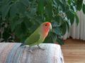
| 02/16/2003 10:00:15 PM | HURRY!! I can't hold this pose much longer.by margieComment: Critique Club
Your comments on this picture seem to have covered everything, so perhaps I can sum them up.
1)Focus is perfect on the bird, lovely detail.
2) Colour saturation is great, the birds colours look lovely and the green of the plant sets him off nicely.
3) The background is a bit distracting, I see two possibilities here, one of them would be to have a closer shot, with only the bird and plant, you could either crop or get closer. The other option, if your camera allows it, would be to use shallower depth of field, for example using an aperture of f2.8 or f4 might be better, this would render the background as a blur and then put more attention on the bird and get rid of the obvious curtain.
4) Lighting is beautiful, very soft and natural.
5) Perhaps cover the sofa with a white sheet, to get a more simple foreground and bring more attention to the bird.
I am quite impressed with this picture, perfect timing! I have a parakeet and it is impossible to get him to stay still long enough to take a picture. Good Luck in the next challenge. | | Photographer found comment helpful. |
| 02/16/2003 06:12:46 PM | Homework? What homework????by snsComment: Critique Club
Composition-content
Your dog is gorgeous!! As many of your comments said, perhaps the dog is a little close to the camera, a little more space at both the top and the bottom would set him off nicely. The off-centred composition is good, with good eye contact.
Background
Through the use of flash the background has gone nice and dark, which complemets his colours well. The carpet is a little distracting. Perhaps an outdoor shot would have been nice, set against some grass, with limited DOF turning the grass into a blur. Personally, I love to see animals outside running free, there is always a glint in their eyes and more expressive when they are running free!
Technical
Perhaps the DOF with the f2 is a little limited, I think that it could be nicer to have more of the dog in sharper focus. The flash is a little bright and colours have been washed out a little. Perhaps natural daylight would have been more flattering. Personally, I find flash pretty hard to use, it is pretty harsh, perhaps bouncing the flash would have softened it a little.
My Opinion
I am a sucker for dogs, especially labradors, so I love it! Good Luck in the next challenge! |
| 02/15/2003 10:38:20 AM | Beach, Sun, Sand and Silhouetteby PaigeComment: Critique Club
Composition-Content
I really loved this picture, it has such a warm and peaceful atmosphere.
I love the angle that you have used, with a cross section of both the darker part of the beach, the sunlit beach, ocean and sky. There is a lovely balance between these components. The solitary man walking into the picture perfects the composition.
Technical
Lovely lighting here, with a well controlled sunset, the highlights are not too bright. It looks like you boosted the yellow on this, which adds more warmth. Perhaps a tiny bit more contrast could have been used, especially on the sea. However, to be honest, I really like the soft colours.
My Opinion
I think that the only thing I would change about this picture would be the title. I think that "Solitude" would have been fitting and would have suited the very peaceful feeling attached with this. Maybe a nice simple border would have set it off. I really like this picture, great shot. One to be framed and put on the wall. | | Photographer found comment helpful. |
| 02/15/2003 10:27:43 AM | Gotcha!by ebrantiesComment: Critique Club
Yes, photography is an art and hopefully moves people and touches them, but we have a choice in how to do this, creating a beautiful and maybe boring picture in some peoples eyes , or going for the shock value.If going for the shock value, you have to do it well, so that it can stand up to all critisims, then there is a picture worthy of discussing. Unfortunately as I see it, your picture is lacking in any appeal. I went to a photography exhibtion in Tokyo showing the after effects of the nuclear bombs in Hiroshima, now these pictures were certainly not beautiful but they moved me and documented an event in a both bold and sensitive way. Your picture is lacking in this conection with both the subject and the audience. Sorry, but this is my opinion and some obviously disagree with it.
Technique
1) picture is very dull in colour, lacking in both contrast and tone.IMO
2) Focus is too soft on the cat (maybe not a bad thing)IMO
3) Background is unappealing, both in colour and focus.IMO
4) composition- too much space around the cat,with the cats head almost hitting the side of the picture.IMO
5) On the positive side, the way that you have cut the cat in half, is clever and convincing and I would be interested in knowing how you did this.
I know that what I have said is kind of strong and you can take it with a pinch of salt if you desire. You had plenty of comments fromû@people that found this amusing,so your picture does have appeal to some, but you were unlucky and got me to do you critique, an animal lover! Message edited by author 2003-02-15 10:52:19. |
| 02/13/2003 09:40:02 AM | | | Photographer found comment helpful. |
|
Showing 951 - 960 of ~1485 |
Home -
Challenges -
Community -
League -
Photos -
Cameras -
Lenses -
Learn -
Help -
Terms of Use -
Privacy -
Top ^
DPChallenge, and website content and design, Copyright © 2001-2025 Challenging Technologies, LLC.
All digital photo copyrights belong to the photographers and may not be used without permission.
Current Server Time: 08/21/2025 11:45:57 PM EDT.
|