My New Tatooby
AnachroniteComment: Critique Club
Composition-Content
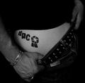
Now this one really deserved to win! Something we can all relate to and the best DPC fanatic picture I have seen on this site! Really got me lauging! I love the composition of this, really looks like someone just got a new tattoo and showing it off to their friends. Great simple composition, with the hands perfectly placed and the dark clothing, the jeans just showing enough detail but without distracting from the point. "Cheeky" but no crude!
Background
I like the way that the black T.shirt has faded into the background, creating negative space and once more allowing the viewer to concentrate on the interesting part! Perhaps the highlights from the belt on the left, behind the arm, could have been covered up, a minor detail.
Technical
You had a few comments that the lighting was a bit dark, personally I think that the lighting is pretty good here, with the skin being evenly lit, with no blown out parts. The lighting is strongest on the DPC logo which is good cause it brings attention to it, not that anyone could miss it! Focus seems spot on, with the Logo in sharp focus but the hand on the right slightly softer.
My Opinion
I think that this is a great shot, perfectly fits the challenge, definitely gets a few laughs and is technically well done. Just a shame that it wasn't in the top 3. B/W issues, bare skin issues, who knows? I think that this should be the new DPC advertisment. Anyway, hope that this helps yo and Good Luck in the next challenge.