| Image |
Comment |
| 10/17/2005 10:23:06 PM |
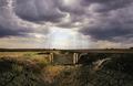
Looking Through The Cloudsby KitaComment: While the sunrays are nice in thisshot and the dried ground is a cool foreground, I think like the other view of this scene within this challenge (titled The Storm) a littl better. I think the other shot does a bit better job of showing the big sky view of the area. JMO. |
 Photographer found comment helpful. Photographer found comment helpful. |
| 10/17/2005 10:19:25 PM |
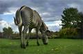
Stripedby Joey LawrenceComment: The results of the GTA GTG!! Excellent wide angle view. The contrast of the B&W stripes against the colour realy is cool. There are a couple of spots in this image that look strangly blurred (around the back feet, along the edges and top of the tree). Is this blur from processing or captured in camera or wind? At any rate, I really like the shot ... a good composition! |
| Photographer found comment helpful. |
| 10/17/2005 10:15:25 PM |
New Dayby redmoonComment: I think this might have been a nice wide angle, but the resulting unfocused view doesn't work for me. JMO. |
| 10/17/2005 10:13:42 PM |
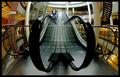
Going Downby PanoComment: Way cool an very creative. I never would have thought of something like this! The wide angle gives an unnatural length to the escalator which reminds me of how much I HATE being in malls The human touch on the escalator adds to that feeing for me. Excellent shot. Good luck. |
| Photographer found comment helpful. |
| 10/17/2005 10:08:47 PM |
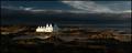
Calm Groundsby TUBORGComment: Despite the crop to give a pano look to this shot, it still stands as an outstanding photo. The contrast f the white building against the dark environment is very nice. Good work. |
| Photographer found comment helpful. |
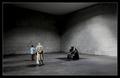
| 10/17/2005 10:07:17 PM |
Contemplationby e301Comment: Simplisic beauty. I like the balance and the the vast elook of the space the wide angle view gives this shot. The rom has depth with this view. Excellent work! |
| Photographer found comment helpful. |
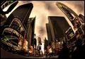
| 10/17/2005 10:05:56 PM |
Times Square, 2005 by pawdrixComment: Very striking image. Wonderful use of the ish-eye. Nice composition with the 2 large buildings making a nice framing of the square. I like the processing very much for an added dramatic impact. |
| Photographer found comment helpful. |
| 10/12/2005 04:38:31 PM |
lonelyby DetrelasComment: Not really sure what I'm seeing here. The contents of the frame are really dark and I feel that is a problem. Also, the dead flowers are taking all my attention and I don't feel that it is good for something that is not in focus to take up most of my attention. JMO. |
| Photographer found comment helpful. |
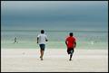
| 10/12/2005 04:34:36 PM |
Freedom Personified!by abhishekComment: A nice enough snapshot. Overall composition could be improved with a less symmetrical shot. Also, the horizon is not level ... a pet peeve of mine for shots with water. The challenge fit is not very strong in my opinion. |
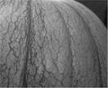
| 10/12/2005 04:32:58 PM |
Veins of timeby KivetComment: I see what you're trying to do here. Technically, I feel that this photo could be improved. The lighting and contrast, to me, seem week. Overall, the image appears flat to me and I find that my eye is wandering around the image looking for a strong central subect. JMO. |
| Photographer found comment helpful. |
Home -
Challenges -
Community -
League -
Photos -
Cameras -
Lenses -
Learn -
Help -
Terms of Use -
Privacy -
Top ^
DPChallenge, and website content and design, Copyright © 2001-2025 Challenging Technologies, LLC.
All digital photo copyrights belong to the photographers and may not be used without permission.
Current Server Time: 08/20/2025 08:16:30 AM EDT.