| Image |
Comment |
| 07/29/2010 03:16:30 PM |
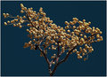
I like them for breakfastby Yo_SpiffComment: I don't think this was a "boring subject". I like your eye for things. Probably the small canvas DPC offers let you down more than anything. It does make the BG people small and insignificant. If you had too much going on on the right, however, it would detract from the subject. The sky is awesome and I love clouds like this. Do you use any Wide-radius USM on your shots? You have to watch for halos, but it might provide just a bit of contrast kick to the clouds (and you could mask whatever you didn't like). I usually start around 25/40/3. Give it a try. |
 Photographer found comment helpful. Photographer found comment helpful. |
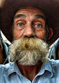
| 07/29/2010 03:13:00 PM |
The Old Timer by Yo_SpiffComment: I'm going to try not to pick all high scoring shots to comment on because that is too easy, but I just had to say I really enjoyed this one when it came up. The guy is such a iconic image and I appreciate that among the top finishers this gives us feelings of contentment, hope, and happiness with life. I think it's his eyes which appear to be opened slightly wider than normal. |
| Photographer found comment helpful. |
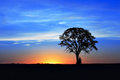
| 07/29/2010 03:10:08 PM |
The crack of dawn by Yo_SpiffComment: This is one of those images the "substance" people hate. But that's not what we're going for here. We're going for the art of color and form. You did a very good job, obviously, as reflected in the score. If I were to tweak it, I would have cloned out the brush or tree or whatever that is at the bottom of the trunk. This image is about simplicity and so detail like that is a downside, not an upside. Composition is great and you did well in your sharpening. I tend to oversharpen stuff like this and it usually looks worse. |
| Photographer found comment helpful. |
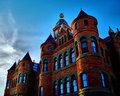
| 07/29/2010 03:07:27 PM |
Old Redby Yo_SpiffComment: Let's start around a 5.5 image. That's a good place because it is an image with promise that let us down. I see you were hoping for more on this one too. The choice of subject is good. A very interesting building. Your composition is at least not straight on, but it is a bit static in that there is little or no context for us (sometimes that can't be helped and I don't know what's there that I can't see). The HDR is a good choice because it allowed you to keep detail in the sky, BUT I see two problems. One, and I'm pretty sure you know this now, your colors are crazy. I'm all about saturated colors, but not when they look unnatural. We've hit that point here. Two, the clouds in the sky are too lopsided. You have half a blue sky and half with clouds. I think that generally degrades the image and sometimes you just have to sit and wait until you get a better balance. |
| Photographer found comment helpful. |
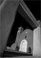
| 07/29/2010 03:00:34 PM |
Old Adobeby CoryComment: I like this shot. The B&W processing is well done and the black sky adds to the depth. It is nicely contrasted by the white door. The overall composition provides interest and the image takes advantage of the power of diagonal lines to provide dynamics. I think you did well on this one. The only downside I see is it seems the most in-focus portion is the column on the left rather than the church itself. |
| Photographer found comment helpful. |
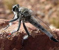
| 07/29/2010 02:57:33 PM |
Robber flyby CoryComment: IIRC you use your own hommade macro so I won't comment on the technicals of the shot, but I will give you the advice to think of your insect as a model. We almost always want to see the model's face and especially their eyes. Sometimes that rule can be broken, but not too often. So while we get some detail here of an interesting fly, we wish it were turned towards us. |
| Photographer found comment helpful. |
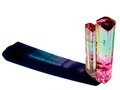
| 07/29/2010 02:54:52 PM |
Watermelon Tourmalineby CoryComment: I wanted to comment on this one because we have a picture to compare composition to. This one is better because the higher angle provides some depth to the crystal. The white background might be too stark. I have often just completely blown BGs out like this and I've started to see the benefit of almost blowing it out, but not quite. It makes for a bit less of a feeling of "floating in white space" and grounds the image. |
| Photographer found comment helpful. |
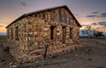
| 07/29/2010 02:51:51 PM |
Time, wind, rain, sun, and nuclear blastby CoryComment: This shot caught my eye because I think you did well with your composition and using the wide angle to distort the cabin. The trees in the background both help and hurt. It is nice to have something else for the eye to see, but trees like that often wind up all jumbled and muddy, especially at these small canvas sizes. You did well to control the sky and your processing overall is very good. |
| Photographer found comment helpful. |
| 07/29/2010 02:47:58 PM |
To wherever the wind will carry youby CoryComment: I've liked to start in the middle of people's scoring to find the pictures that have promise, but let us down. This is a good example where you could possibly use a trick I've learned. I think what is letting the picture down is the crop. You are in a middle ground which hurts. Either we want more space on the sides to provide context (or even negative space) or you want to crop it so that the branches actually leave the canvas. This provides more dynamics to the composition. Finally I would have increased the f-stop to allow for a deeper DOF. Having the right side OOF does not help the picture. |
| Photographer found comment helpful. |
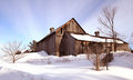
| 07/28/2010 11:39:59 PM |
Barn@Chelsea.jpgby RayEthierComment: Ooh. Wonderful sky. In some of your pictures you should goof with duplicating the layer (assuming you use photoshop) and then selecting "multiply" and masking it off to the sky either with a gradient or trying to follow the edges. It will darken the sky, provide contrast, and saturation. This image may work well with that. You choosing to allow the snow to blow out in the foreground is a good one. No needed detail is lost and it provides a nice luminance to the photo rather than having gray (but detailed) snow. |
| Photographer found comment helpful. |
Home -
Challenges -
Community -
League -
Photos -
Cameras -
Lenses -
Learn -
Help -
Terms of Use -
Privacy -
Top ^
DPChallenge, and website content and design, Copyright © 2001-2025 Challenging Technologies, LLC.
All digital photo copyrights belong to the photographers and may not be used without permission.
Current Server Time: 08/25/2025 08:49:04 AM EDT.