| Image |
Comment |
| 08/05/2010 11:18:00 PM |
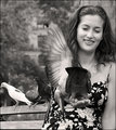
Union Sqby DeniseComment: Since you were so patient with me, you get a bonus comment. The girl caught my attention in this image. She's beautiful, of course, but the flapping wings also provide a very interesting element. It's too bad about the main bird in the image which probably ultimately ruins the shot. It suffers from the old adage "too much ass, not enough face". :P |
 Photographer found comment helpful. Photographer found comment helpful. |
| 08/05/2010 11:15:53 PM |
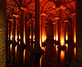
Cisterneby DeniseComment: Great location, BUT you've blown the red channel quite a bit. I've found that most digital sensors have the most trouble with the red channel and it is easy to saturate. Your image suffers because of it. Because the image is so shifted to the red spectrum, the sensor essentially has about 1/4th the number of effective megapixels (because each pixel is 1 red, 2 green, 1 blue dots). Almost all your information is in the red channel and I bet the blue channel, for example, is almost black. Do you shoot in RAW? |
| Photographer found comment helpful. |
| 08/05/2010 11:11:47 PM |
The Grist Millby DeniseComment: Another nice subject. You do have a nice eye. Here, though, I find a problem I have seen a lot which is cropping so tightly the subject can't breathe. Now, I don't know what is not seen and sometimes you are forced to crop, but here I would like some negative space on some side. Personally I almost always prefer the space on the left, but different picture work differently. |
| Photographer found comment helpful. |
| 08/05/2010 11:09:58 PM |
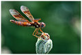
Mr. Dragonflyby DeniseComment: I chose this one because I love macros. This is well done. Dragonflies are so large it's often hard to get everything in the DOF. You chose well to keep the eyes in focus. Like any portrait, the eyes are the windows to the soul, even if they belong to a bug. The bokeh is nicely done as well. |
| Photographer found comment helpful. |
| 08/05/2010 11:08:15 PM |
Love is in the air.by DeniseComment: A cute scene. Your conversion to B&W is nicely done. The grass becomes a nice tone to offset the subjects. I personally like selective desat (although others don't). However, one trick is to partially desaturate the color itself. Here it looks like you have the red boosted as much as possible. This isn't necessary since the rest of the color is B&W. Maybe consider a -30 saturation or so. |
| Photographer found comment helpful. |
| 08/05/2010 11:05:48 PM |
Nubble Light's golden windowsby DeniseComment: I like to start in the 5.5 section to find a picture that has promise but somehow didn't stack up. However, I like this picture quite a bit. It's an iconic lighthouse scene (albeit without water) and I think you composed things well. The sky is probably what let you down, but actually I don't mind it. While it's mainly white, it does possess a gradient and that can work. The lighthouse also doesn't get lost and remains defined. Frankly I think this image deserves higher than the score it got. |
| Photographer found comment helpful. |
| 08/04/2010 08:09:03 PM |
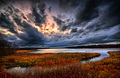
Overtureby NeilComment: I only looked at the comments after I formulated what I was thinking and see Bear called you a Bear-clone. I have to agree this looks like his special little location. Was it? Anyway, I didn't remember this was your Masters' entry. I do still think the colors are a bit overdone, but this is a sky to die for. Have you ever thought about starting a cloud library where you can take shots to superimpose in the BG or landscapes? I've toyed with it but wish I had a location close to my house that allows a pretty unobstructed view of the horizon. You could sort by direction, time of day, etc. Anyway, a sky like this is pure photographic gold. |
| Photographer found comment helpful. |
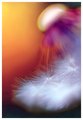
| 08/04/2010 08:06:00 PM |
Sunpressionism by NeilComment: Despite the artifacting, the colors here and softness of the seeds is wonderful. I absolutely love the transitions from yellow to orange to dark. The crop also lends a very dynamic feel with strong diagonal lines and allowing the subject to escape the frame. |
| Photographer found comment helpful. |
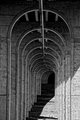
| 08/04/2010 08:04:36 PM |
Cascadeby NeilComment: I like doing shots like this, but have you noticed that even a few inches off the center of the image, or having the lens just off parallel will skew the shot. I can see the arches naturally curve to the right eventually, but I also see that right away the spine of the arch isn't perfectly vertical. If you can get the camera positioned just right to have that straight up and down, I think it transforms the shot somewhat. |
| Photographer found comment helpful. |
| 08/04/2010 08:01:56 PM |
Autumn Rocks by NeilComment: This is going to be difficult since you already know what you are doing. Instead of commenting on technicals (which you don't need), maybe I'll just freeform some impressions. This one jumps out at me as a nice scene. I miss those Adirondak autumns. The idea that the waterfall is so non-prominent works well. It's almost an afterthought to the glowing tree on the left. The image also has so many levels and layer of space. Love it! |
| Photographer found comment helpful. |
Home -
Challenges -
Community -
League -
Photos -
Cameras -
Lenses -
Learn -
Help -
Terms of Use -
Privacy -
Top ^
DPChallenge, and website content and design, Copyright © 2001-2025 Challenging Technologies, LLC.
All digital photo copyrights belong to the photographers and may not be used without permission.
Current Server Time: 08/25/2025 01:10:04 AM EDT.