| Image |
Comment |
| 01/03/2008 02:32:27 AM |
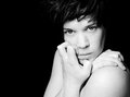
Carrie....Week 1 of PAWby njsabsComment: this really is a nice one to start off!
and like you said; the typical American girl.
Love the lighting and the techniques you used here :) |
 Photographer found comment helpful. Photographer found comment helpful. |
| 12/29/2007 07:41:31 AM |
|
| Photographer found comment helpful. |
| 12/29/2007 06:53:52 AM |
Zero_edit.jpgby BradComment: yup, that looks much better! Message edited by author 2007-12-29 07:41:40. |
| Photographer found comment helpful. |
| 12/28/2007 08:32:34 AM |
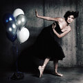
Balloonsby hannekeComment: Originally posted by joynim:
Her breasts are funnily squashed in this one! |
lol! |
| 12/25/2007 06:14:22 PM |
The Magic of Christmas!by susiComment: oooh susi, that looks like he walked straight out of the coca-cola-commercial!
very very beautiful!
merry christmas! |
| 12/25/2007 06:08:50 PM |
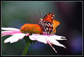
IMG_2974small.jpgby SamDoe1Comment: hey sam! love the fresh colors in your photo, maybe a tad overexposed on the leafs of the flower imo. the DoF in the background is perfect, love the colors and softness there.
focuspoint seems to be a little bit in front of the butterfly? maybe use a bit of a smaller aperture, to be sure the focus is ok. |
| Photographer found comment helpful. |
| 12/25/2007 06:03:24 PM |
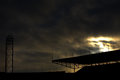
Olympic Stadium by Meda4Comment: I have the feeling some photoshop worked with you here; the clouds don't seem to fit? especially at the poles at the left bottom. ah well. took me a while to figure that out. you'll see it turns out to be wrong!
anyway, I love the clouds at the back of the stadium. The building itself isn't very interesting for me (no soccer-fan). Maybe crop a little from the top, since that's almost all dark and not too interesting or.. uh.. *een toevoeging* for the photo.
maybe clone the tree out in the almost center of the photo to get a real smooooth photo ;) |
| Photographer found comment helpful. |
| 12/25/2007 05:52:34 PM |
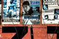
Boxingby BAMartinComment: some suggestions of my side:
the risk you take with text in your photo is that you're gonna read it. using a smaller DoF and making the text less easy to read, it wou;ldn't distract as much as it does now. also try to compose the wire at the bottom a bit better, for example one whole wire in the middle, 2 halfs at the side.
if you want to keep the posters the point to focus on, make the wire OOF and maybe try to compose the photo so that the posters are on it full.
the colors in this photo are pretty cool, looks vintage-like. |
| Photographer found comment helpful. |
| 12/21/2007 01:04:14 PM |
6by hannekeComment: thanks for the comment mr, i still have time to edit the photos a little bit, so I'll take this tip with me! |
| 12/07/2007 06:38:12 PM |
|
| Photographer found comment helpful. |
Home -
Challenges -
Community -
League -
Photos -
Cameras -
Lenses -
Learn -
Help -
Terms of Use -
Privacy -
Top ^
DPChallenge, and website content and design, Copyright © 2001-2025 Challenging Technologies, LLC.
All digital photo copyrights belong to the photographers and may not be used without permission.
Current Server Time: 08/01/2025 11:24:51 AM EDT.