| Image |
Comment |
| 01/05/2008 06:52:17 PM |
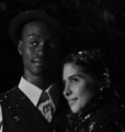
Michael and Rachaelby JBHaleComment: oh my, this looks like they just walked out of a christmas-movie!
2 things to make this perfect imho:
- lighten the whole photo a bit up, it looks a little bit on the dark side..
- clone the left-bottom thing out (oh, now I see it's his shirt), to make it perfect.
:) |
 Photographer found comment helpful. Photographer found comment helpful. |
| 01/05/2008 06:44:41 PM |
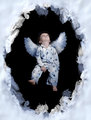
D E S C E N D E Dby Art RoflmaoComment: this looks like Anne Geddes, in a "Village Burning"-way, haha.
Not exactly my thing (a bit too sweet), but I think you did allright. the only thing that's bothering me a little bit is the fact that he's looking up a bit too much, and you're looking into his nose.
afterall, for the audience you made this for, it's nice! |
| Photographer found comment helpful. |
| 01/04/2008 01:49:12 PM |
peaceby briantammyComment: the lighting looks very good here, allthough overall it could be a little bit lighter.
I might have cropped the photo a bit different, but that;s a matter of taste.
anyway, I think you did a good job. she looks cool! |
| Photographer found comment helpful. |
| 01/04/2008 01:35:01 PM |
Who me ?by JedusiComment: this looks like a nice start with your new lights! her expression is great!
hope you don't mind giving you some tips:
- try to move your light a bit. Right now the light is almost from straight forward (you can see the reflection in the pupils) andthat way you can change the reflection and the atmosphere (shadow / light) in the photo.
- I'm not sure what brollies are, but the light is a bit harsh. If that's what you were after, then it's great, but using a softbox really softens the light and gives more atmosphere.
I hope these were helpful! |
| Photographer found comment helpful. |
| 01/04/2008 01:27:45 PM |
feeding.jpgby SheryllComment: this is such a precious moment. I like it that you used b/w for it and the crop.
well done :) |
| Photographer found comment helpful. |
| 01/04/2008 01:16:17 PM |
Francesby TezComment: I love the crop in your photo, it's different and I like that. Also the light is great, in combination with the colors, you just have a wonderful photo!! |
| Photographer found comment helpful. |
| 01/04/2008 01:14:39 PM |
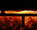
Fire-1.jpgby dssagent88Comment: hmm, I think you made the right decision not to enter this one in the fire-challenge (did you enter another one?)
You said it was a bit boring in the comment-thread, and well, I have to agree with you. Ok, the bottom part is a bit interesting, but it doesn't hold my attention really long. The horizontal line makes it also a bit interesting. But the top-part (black) just doesn't do it for me.
I'm curious what photo you entered in the challenge! |
| Photographer found comment helpful. |
| 01/03/2008 03:52:08 PM |
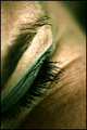
Eye Contactby BradComment: not boring! The details are very good.
I do think it could use a bit color-management to brighten up everything. |
| Photographer found comment helpful. |
| 01/03/2008 02:38:30 AM |
Chicken Shooter by StrikeslipComment: blue? oh my! maybe you can swap with sherwin to keep your reds in line? ;)
just kidding. congrats!! |
| Photographer found comment helpful. |
| 01/03/2008 02:37:15 AM |
|
| Photographer found comment helpful. |
Home -
Challenges -
Community -
League -
Photos -
Cameras -
Lenses -
Learn -
Help -
Terms of Use -
Privacy -
Top ^
DPChallenge, and website content and design, Copyright © 2001-2025 Challenging Technologies, LLC.
All digital photo copyrights belong to the photographers and may not be used without permission.
Current Server Time: 08/01/2025 11:24:36 AM EDT.