| Image |
Comment |
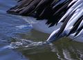
| 07/24/2005 01:25:17 AM |
Pelican Paddleby roadrunnerComment: Oh goodness, it took me a moment to realise what it was.... the water is very good looking and clear (for the depth) in this image, I like it a lot! The feathers are crisp and clear, the foot itself is very nicely shown. All is good in this image. |
 Photographer found comment helpful. Photographer found comment helpful. |
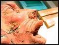
| 07/24/2005 01:20:49 AM |
Heartbrokenby anthonyczajaComment: Woah, that's some serious stress going on on that statue... Strong textures on it, good blend in background, fantastic emotion, phenominal complete picture |
| Photographer found comment helpful. |
| 07/24/2005 01:15:44 AM |
Red Onionby danderson107Comment: Woah! Uhm *searches for where to start* that's some unusual, and cool details on it, I like it. It looks like it almost, or does, follow the thirds rule, at any rate, its' pleasing to the eye. The contrast is beautiful. I like it |
| Photographer found comment helpful. |
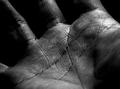
| 07/24/2005 01:09:44 AM |
Palmistryby wsteynComment: Ah! the first black and white I've seen on this contest, and I must say, it serves it's purpose quite well! I think it has a full range of colors from black to white... it's very clean and defined where it's supposed to be... etc... very good, I like :-) |
| Photographer found comment helpful. |
| 07/24/2005 01:00:21 AM |
Of A Good Hatby holdingtimeComment: nice placement of the hat, and good texture on the hat... however, either the color scheme or the focus seem to make the woman wearing the hat very bland... maybe if she were bolder and more a part of the picture... |
| Photographer found comment helpful. |
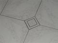
| 07/24/2005 12:57:20 AM |
tilesby coolbrother84Comment: Hm.... it seems a little bland to me... although, with a deeper look into it, I can see the star (I guess) in the tile.. maybe if you'ld made that bolder? and followed the rule of the thirds for the location of the diamond.... Good try, though :-) |
| 07/24/2005 12:52:20 AM |
Slick Rubberby ezekiel8Comment: The diagonal lines give this image a sense of depth that is quite nice. The emblem is in a good position, I think.... although it may have been better somewhere else.... I'd have to play with that myself, however... the fading is good, although the depth of focus is..... a little too small to me... |
| Photographer found comment helpful. |
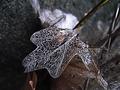
| 07/24/2005 12:45:12 AM |
The dying leaf...by jprelucioComment: An amazing catch, the background is clean and out of focus just enough to emphasis the center-piece without taking away. The texture of the leaf is definetly a find and in good focus, I'm impressed with it |
| 07/08/2005 10:23:55 PM |
Flying Saucerby marc21Comment: The mood and mystery of this image are fantastic. I could see this as my desktop background. |
| Photographer found comment helpful. |
| 07/08/2005 10:18:26 PM |
Cooking on gas!by PixelstateComment: I've been looking for this image ever since I saw it in the previews. This is fantastic. Very clean, very clear, good colors good... everything.... the only thing that hurts it is that one little red dot in the centre... everything else is great, though! |
| Photographer found comment helpful. |
Home -
Challenges -
Community -
League -
Photos -
Cameras -
Lenses -
Learn -
Help -
Terms of Use -
Privacy -
Top ^
DPChallenge, and website content and design, Copyright © 2001-2025 Challenging Technologies, LLC.
All digital photo copyrights belong to the photographers and may not be used without permission.
Current Server Time: 06/16/2025 05:58:07 PM EDT.