| Image |
Comment |
| 02/14/2006 12:43:02 AM |
Broken childhoodby jsonComment: That's just creepy ... too quote my 9 yr old ... looking past the creepy to vote a well executed image. |
 Photographer found comment helpful. Photographer found comment helpful. |
| 02/14/2006 12:41:41 AM |
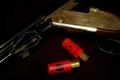
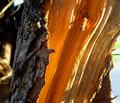
Beyond Repairby KaizerComment: Need more light on the "broken" highlight of the image, amazing tear in the metal. |
| Photographer found comment helpful. |
| 02/14/2006 12:01:23 AM |
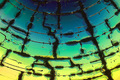
"Lines, Shapes & Colors"by aaronb532Comment: Yes, wait no, I've never done the microwave thing before, but yes I like your outake with a wider color range and unusual tilt better. I gave you a 6 for the record. Disliked your title because you were semi-quoting the challenge details. I resort to the dictionary for ideas regarding titles. Congrats on your 27th place in a most tough challenge. |
| Photographer found comment helpful. |
| 02/11/2006 08:21:09 PM |
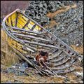
Abandonedby OdieComment: This is an awesome example of broken, usually I look for a color boost in many outdoor pics, however, I think this particular composition would be more dramatic without the intense yellow, 7. |
| Photographer found comment helpful. |
| 02/11/2006 08:18:49 PM |
|
| Photographer found comment helpful. |
| 02/11/2006 08:17:44 PM |
Broken Innocenceby sarimiliComment: Nice portrait, but the straw mat does nothing for her beautiful skin tones, maybe black or white background, and I don't really get "broken" from her expression. |
| Photographer found comment helpful. |
| 02/11/2006 08:11:10 PM |
The Monarchby linda12201Comment: Ohh, would I love a close up of this ... the textures, the colors, this is awesome. I would have cropped a little tighter because the subject can stand alone, without the grasses and branches to distract, 7. |
| 02/11/2006 06:25:19 PM |
75 Year Stormby EvaanComment: Beautiful orange on the inside, very natural light. I might have cropped a little tighter, maybe gotten rid of the white burn-out up top. |
| Photographer found comment helpful. |
| 02/11/2006 06:22:57 PM |
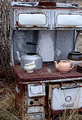
Broken Artifactsby apprenticeComment: This is an excellent idea, however, it could have been set-up much better IMO. Here goes ... the backround material is distracting, sand or a plain earthy color might show off the arrowheads more. The pieces should have been placed closer to the center, I like the circle composition, and the top one shouldn't have been cropped out. Lastly more color !! I'd like to see your "unbroken" artifacts someday. My husband and I have walked many miles and seen a lot of country in search of these little treasures. |
| 02/11/2006 06:16:05 PM |
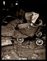
--__Forgotten__--by Sunshine86Comment: The carriage is a nice subject, I like the broken flooring in the foreground too, and the tones represent the aged look well. Only part that doesn't click for me is the totally black upper right corner, it does makes the carriage top stand out but seems as though part of the picture is missing. |
| Photographer found comment helpful. |
Home -
Challenges -
Community -
League -
Photos -
Cameras -
Lenses -
Learn -
Help -
Terms of Use -
Privacy -
Top ^
DPChallenge, and website content and design, Copyright © 2001-2025 Challenging Technologies, LLC.
All digital photo copyrights belong to the photographers and may not be used without permission.
Current Server Time: 08/26/2025 05:02:48 AM EDT.