| Image |
Comment |
| 08/03/2006 12:08:59 PM |
Please Don't Cry....by GivemeashotComment: Good and sharp. The drop in the mid-upper left catches my eye first, and the others appear sometime later as I study it. You captured the texture very well, and the tears do compliment it. |
 Photographer found comment helpful. Photographer found comment helpful. |
| 08/03/2006 12:06:52 PM |
NIght out on the town 083 (Edit).jpgby GivemeashotComment: Nice leading lines. This could be neat if it were darkened, so that it looked as if you were following the walkway into darkness, instead of the reflections off the doors. Maybe even grunge it, just for fun :-) It's one of those images that's spot on, and fun to play with. |
| Photographer found comment helpful. |
| 08/03/2006 12:05:09 PM |
Love Chapter 13.4by GivemeashotComment: I have always wanted to try this. I like the color tones used, but cutting off the top of the filter bugs me. I guess I'd have to see it both ways to decide for sure. |
| Photographer found comment helpful. |
| 08/03/2006 12:03:05 PM |
A Frozen Feeling...by GivemeashotComment: Psychadelic! You're right, there is a lot of depth, from varying your distance from the camera - something a lot of these type of shots lack. It's distorted and confusing, but appears to mirror a state of mind. It might be fun to see it as a high-contrast B&W. |
| Photographer found comment helpful. |
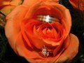
| 08/03/2006 12:00:21 PM |
Rings Of Loveby GivemeashotComment: This is unique, I've not seen one like it before. It's a shame the flash reflection is so strong on the groom's ring. It's a little soft (maybe intentional?), but personally, I think I'd like it sharpened a bit. Heck of a neat idea! |
| Photographer found comment helpful. |
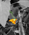
| 08/03/2006 11:45:50 AM |
Still bright in the midst of it's on deathby albc28Comment: What might have worked better for you here would be to not totally desaturate the whole image, but to leave a wash of color. Maybe set the saturation slider at -65ish, and then mask out the single flower, as you did, and boost it back up to full, or even a more than full (+25ish?). |
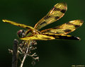
| 08/03/2006 11:43:54 AM |
dragonfly edited (resize).jpgby albc28Comment: The contrast between colors and darks and light makes him jump right out. If you DoF had been just a little larger, with the other wing more in focus, it'd be perfect. But even as it is, it's very good, and the detail in the wings is amazing - especially like the light glinting off it. |
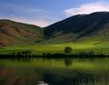
| 08/03/2006 11:40:21 AM |
Serenityby dwterryComment: Aptly named. My only suggestion would be to maybe try applying Contrast Masking to the shot, to balance the brights and darks a bit more, as overall the scene appears a touch dark. |
| Photographer found comment helpful. |
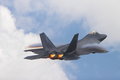
| 08/03/2006 11:38:30 AM |
06-10-06 13-58-07 20D_1-01.jpgby dwterryComment: I love this shot, between the aircraft itself, the engine glow, and the vapor rolling off the wings, it's just great. The F-22 is my favorite (hence the numbers in my username) and you've really captured the essence of it here. |
| Photographer found comment helpful. |
| 08/03/2006 11:34:50 AM |
IMG_9647.jpgby dwterryComment: She looks like she's enjoying herself, but the background here is also different from the normal portrait shots - the marsh grass (?) in the bg brightens the shot up, and really helps offset her and her dark hair. |
| Photographer found comment helpful. |
Home -
Challenges -
Community -
League -
Photos -
Cameras -
Lenses -
Learn -
Help -
Terms of Use -
Privacy -
Top ^
DPChallenge, and website content and design, Copyright © 2001-2025 Challenging Technologies, LLC.
All digital photo copyrights belong to the photographers and may not be used without permission.
Current Server Time: 08/06/2025 12:46:44 AM EDT.