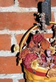
| Author | Thread |
|
|
08/03/2006 11:45:50 AM |
|
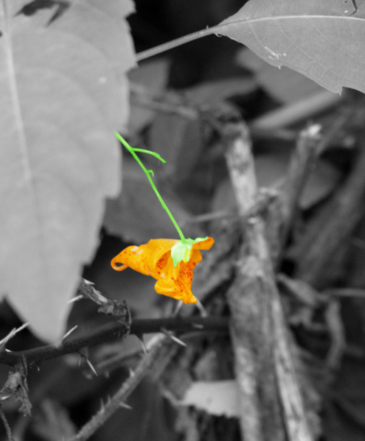
What might have worked better for you here would be to not totally desaturate the whole image, but to leave a wash of color. Maybe set the saturation slider at -65ish, and then mask out the single flower, as you did, and boost it back up to full, or even a more than full (+25ish?). |
|
Comments Made During the Challenge  |
|
|
07/08/2006 12:12:29 PM |
|
I think the selective desaturation would have worked better if the subject that is in color were a bit less saturated so that it did not look neon. I like the idea and title for the picture though. |
|
|
|
07/07/2006 07:31:43 AM |
|
The flower is not very pretty, I guess that's why it doesn' make this image great, otherwise the desaturation would work really well IMO. |
|
|
|
07/07/2006 12:20:27 AM |
orange jewelweed (Impatiens capensis Meerb.)
a lovely little bloom.... awash in a morass of gray desaturation. |
|
|
|
07/05/2006 05:50:54 PM |
|
I'm not sure the selective coloring works for me here. It makes it look really overprocessed. Maybe if the rest of it had not been completely desaturated it would work better. |
|
|
|
07/05/2006 04:51:20 PM |
|
Great photo. Colors are really nice. Great job! |
|
Home -
Challenges -
Community -
League -
Photos -
Cameras -
Lenses -
Learn -
Help -
Terms of Use -
Privacy -
Top ^
DPChallenge, and website content and design, Copyright © 2001-2026 Challenging Technologies, LLC.
All digital photo copyrights belong to the photographers and may not be used without permission.
Current Server Time: 06/28/2026 07:36:10 PM EDT.