| Image |
Comment |
| 10/27/2005 06:49:34 AM |
Angelicby BalkoComment: The flower seems too white - so detailst almost gets lost in the background - a bit overexposed/lightened too much in processing? |
| 10/27/2005 06:47:00 AM |
Wolfby manuComment: I like the way you did the background - but I wish the details of his face stood out more. |
| 10/27/2005 06:46:02 AM |
White Knightby dw_photoComment: While I know you did it to light the piece better, I don't care a lot for the double shadow. A softer light migh have worked better for me - or more overhead light to kill the shadows. |
 Photographer found comment helpful. Photographer found comment helpful. |
| 10/27/2005 06:44:42 AM |
My dads tennis ballby floipComment: I'm still debating it - but the name brand sticks in my face a bit too much and thus detracts a bit from the image. So I wonder if it might look better if it was not so centered or could not be seen. |
| 10/26/2005 12:13:39 PM |
Shapes and linesby neehaiComment: I like this take on the challenge - the gradual transition from dark to ligh without overdoing the light works well for me. |
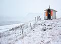
| 10/26/2005 12:10:51 PM |
Guiding Lightby bbrightComment: To me it looks like the fence splits the image into two and I'm torn between which part to look at - the shed or the beach and the mountain. Thus I lose a central focus for the image. |
| Photographer found comment helpful. |
| 10/26/2005 12:05:55 PM |
'You're A Daisy If Ya Do'by QartComment: Very well done. The shadow inside the flower make for a nice transition and the sharpness of the flower is well done. It does look like an atrtifical flower though and I'm a bit partial to the real ones. |
| Photographer found comment helpful. |
| 10/26/2005 12:03:39 PM |
Maxxby angela_packardComment: I think it would have worked better to get the dog out of the center - move him a bit to the right as that side of the image seems wasted. |
| Photographer found comment helpful. |
| 10/26/2005 12:02:41 PM |
canna in canby striveComment: The whites seem a bit over exposed and the water drops on the flower in this case don't work for me. |
| Photographer found comment helpful. |
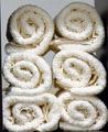
| 10/26/2005 12:01:03 PM |
Soft & Cleanby lolor275Comment: worked well for me, just don't like the lack of light at the top of the pile. Both the transition and the sharpeness of the transition in the light distract me from the image itself. |
| Photographer found comment helpful. |
Home -
Challenges -
Community -
League -
Photos -
Cameras -
Lenses -
Learn -
Help -
Terms of Use -
Privacy -
Top ^
DPChallenge, and website content and design, Copyright © 2001-2025 Challenging Technologies, LLC.
All digital photo copyrights belong to the photographers and may not be used without permission.
Current Server Time: 08/06/2025 09:23:55 AM EDT.