| Author | Thread |
Comments Made During the Challenge  |
|
|
11/01/2005 05:18:10 PM |
|
|
|
11/01/2005 06:23:00 AM |
|
Feels slightly tilted clockwise, but it might be an illusion. |
|
|
|
10/30/2005 12:52:41 AM |
|
|
|
10/29/2005 08:49:30 PM |
|
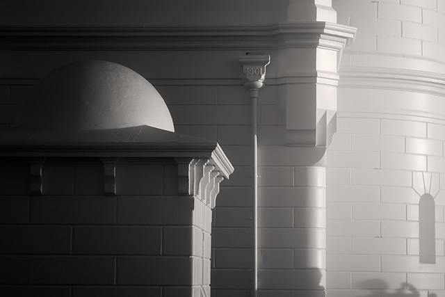
so far, my favorite. reminds me of a city of some pure fantasical future. or possibly a metaphorical heavenly city. I like the shadows in the bottom right corner, because instead of the automatic "crop!", I want to understand more about this location. |
|
|
|
10/29/2005 01:51:34 AM |
|
Man I love this pic. I only wish it fit the challenge better (not as bad as mine, tho). 6. |
|
|
|
10/28/2005 01:27:56 PM |
|
this looks flawless, is there really a building that perfect? |
|
|
|
10/28/2005 05:28:37 AM |
|
Good one. A bit difficult these lines if you don't have the right eqipment. |
|
|
|
10/28/2005 12:43:45 AM |
|
I really like the contrast in this. |
|
|
|
10/27/2005 09:25:58 PM |
|
Very soft and detailed. Clean, sharp image. 8 |
|
|
|
10/27/2005 08:36:10 PM |
|
Remarkably good photo considering the lighting. I'm not sure how to rate it for this challenge. The shadows make it so difficult to interpert, its light, white I would guess, but there dark. I have to go neutral -5. Good eye. |
|
|
|
10/27/2005 02:06:55 PM |
|
IMO the right side is overexposed and the left side underexposed, which is distracting. I think it would look much better if the only things to focus on were the lines and shapes. I do not feel that this meets the challenge. |
|
|
|
10/27/2005 12:59:29 PM |
|
Visually interesting and arresting..great image. |
|
|
|
10/27/2005 10:53:26 AM |
|
not sure this is a "light" color on a white background, right side seems washed out |
|
|
|
10/26/2005 04:06:38 PM |
|
nice tonal study - but waaaay too dark for this challenge. |
|
|
|
10/26/2005 12:21:12 PM |
|
Love this shot. The soft glow from the right and shadows from the left really make this picture seem almost ethereal. |
|
|
|
10/26/2005 12:13:39 PM |
|
I like this take on the challenge - the gradual transition from dark to ligh without overdoing the light works well for me. |
|
|
|
10/26/2005 01:38:38 AM |
|
It's a beautiful image, but there's way too much darkness in this for me to see it as "light on white" |
|
|
|
10/26/2005 01:11:47 AM |
|
No focal point- great saturation and detail even in the brightest area. Nice |
|
Home -
Challenges -
Community -
League -
Photos -
Cameras -
Lenses -
Learn -
Help -
Terms of Use -
Privacy -
Top ^
DPChallenge, and website content and design, Copyright © 2001-2026 Challenging Technologies, LLC.
All digital photo copyrights belong to the photographers and may not be used without permission.
Current Server Time: 06/29/2026 05:59:14 PM EDT.