| Image |
Comment |
| 03/02/2003 04:18:28 PM |
|
 Photographer found comment helpful. Photographer found comment helpful. |
| 02/20/2003 11:30:14 PM |
Playground Rhythmby zadoreComment: The subject is indecipherable, so it is an abstract shot. However, the colors and shapes of the image aren't strong enough to be an effective abstract, so the result ends up rather dull. 3 |
| Photographer found comment helpful. |
| 02/19/2003 10:22:07 PM |
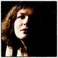
Silhouetteby GraciousComment: I'm not really sure if this is an example of rhythm, but I'm not docking for it. Something about this shot seems missing or off to me, but I can't really put my finger on it. I think the crop is just too tight for my tastes. 5 |
| 02/19/2003 08:40:32 PM |
|
| 02/19/2003 08:39:26 PM |
A rhythmical sunsetby bcncrazyComment: Your exposure is too dark to make out the boats at the bottom of the shot. The sunset and sky themselves lack color or interesting patterns to add to the shot. This seems like a good location for a sunset shot, so I'd try it again. Experiment with different angles and zoom levels and I'll bet you could get a very cool shot. Good luck. |
| Photographer found comment helpful. |
| 02/19/2003 08:32:33 PM |
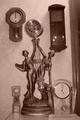
Tick-tock Tick-Tockby ladpupmoeComment: The exposure seems too dark (especially on the upper right hand clock) and needs more contrast. Your center clock, because it is asymetrical itself, seems to throw off the balance of the shot (which I think is vital to this shot). The door frame on the right side should have been avoided. It seems the shot is also tilted to the left. The idea had some potential but the shot needs a lot of technical work. Good luck. 3 |
| Photographer found comment helpful. |
| 02/19/2003 08:28:43 PM |
|
| Photographer found comment helpful. |
| 02/19/2003 08:27:27 PM |
Rooftopby jjbeguinComment: Nice texture, colors, and multiple lines and patterns. I like it. 7 |
| 02/19/2003 08:24:59 PM |
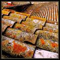
temple roof tiles wet in winter rainby kenboComment: I don't think we get enough of the edge of the roof in the top right corner to add to the shot. I'd either go wider and show more of the roof edge to give it more context, or else crop it to just the shingles themselves, which have enough pattern and color variation to stand completely on their own. I think I'd prefer the latter. And that white stripe at the bottom of the shot has got to go, although I assume it's there accidentally. Great subject though. A 9 or 10 with a better crop. But I'll give you an 8 because I could stare at those patterns all day even so. |
| Photographer found comment helpful. |
| 02/18/2003 08:43:37 PM |
escapeby tomzinhoComment: I like the concept. I think you should either leave enough of the street level in the shot for the viewer to really see what is going on or else cut it out completely. I personally would probably crop the bottom boarder a little higher to reduce the clutter that shows up at the bottom. 5 |
Home -
Challenges -
Community -
League -
Photos -
Cameras -
Lenses -
Learn -
Help -
Terms of Use -
Privacy -
Top ^
DPChallenge, and website content and design, Copyright © 2001-2025 Challenging Technologies, LLC.
All digital photo copyrights belong to the photographers and may not be used without permission.
Current Server Time: 08/25/2025 01:38:25 PM EDT.