| Image |
Comment |
| 05/03/2003 05:28:34 PM |
|
 Photographer found comment helpful. Photographer found comment helpful. |
| 05/03/2003 05:26:03 PM |
|
| 05/03/2003 05:24:55 PM |
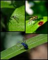
Oriental Breezeby bruster54Comment: I really like the center frame and how it shows up in minimalist ways only, however, it doesn't really fit into the tone of this sequence very well, since the other two show up very clearly and strongly. I think putting the center shot against a white background would have created an interesting contrast with the other two shots, but still maintained the same tone as the other shots. 7 |
| Photographer found comment helpful. |
| 05/03/2003 05:17:13 PM |
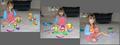
Three Stages of Mr. Potato Headby deckyonComment: I suppose these shots are intended to have a candid feel to them, but the result isn't very visually appealing. The cluttered background and pretty much expressionless child detract from the shot. The Mr.Potato Head concept was a good idea, and if you had simplified the shot and done close up shots of different stages of potato head construction I think the result would have been very interesting. |
| 05/03/2003 05:10:06 PM |
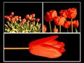
Thoroughbred Parkby RLSComment: Well, it's an interesting image. The top and bottom shots frame the middle shot pretty well. The effect here is effectively applied, and applicable to the shot, as it is intended to display motion. So I'd say this is more than just photoshop for the sake of photoshop, however, I wouldn't really say this is a photograph so much as a piece of art that used a photograph as it's basis, so I'm not as inclined to score it as highly in a photography contest. Good luck. 5 |
| Photographer found comment helpful. |
| 05/02/2003 08:16:50 PM |
DPChallenge Logo on Wooden Trash Binby orussellComment: It's somewhat more unique than just a plain logo, but in fact it becomes less clearly visable than a plain logo, and the new texture doesn't really connect in any way with the site or make this a more appealing design. The beveled, drop shadowed url is a bit over processed I think. Plain black text would probably have been more effective. |
| Photographer found comment helpful. |
| 05/02/2003 08:11:23 PM |
create. submit.by helgihelgiComment: I love the style of this one. It is simple, stark, but also attention getting. I'm not sure if it gives enough information (something about digital photography or a contest might have helped) to draw in a good potential user, but I love the general appeal of this. 9 |
| Photographer found comment helpful. |
| 05/02/2003 08:08:06 PM |
sticker project 1c by jjbeguinComment: Excellent shot. The shutter effect ties perfectly to the website, the sky is an effective backdrop. The design is eye catching and simple, and gives all the necessary information. 10 |
| Photographer found comment helpful. |
| 05/01/2003 12:40:25 AM |
Untitledby PHOTOCHlXComment: cool design, but it's kind of odd to use a roll of film to advertise a digital only photo site. |
| Photographer found comment helpful. |
| 05/01/2003 12:39:01 AM |
|
Home -
Challenges -
Community -
League -
Photos -
Cameras -
Lenses -
Learn -
Help -
Terms of Use -
Privacy -
Top ^
DPChallenge, and website content and design, Copyright © 2001-2025 Challenging Technologies, LLC.
All digital photo copyrights belong to the photographers and may not be used without permission.
Current Server Time: 08/26/2025 11:13:30 PM EDT.