| Image |
Comment |
| 04/30/2003 06:57:33 PM |
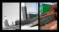
Lazy Dazeby svitalComment: Well, the first thing that catches me here is that the boarder is excessive. I think it would look much better without the large left and right white space. I'm not sure why you chose to use a boarder that dominates the available space so much, especially when your space was already so limited, because it leaves all three of your pictures very small. The details in these shots are hard to see (both due to lack of contrast in parts, and the small size). The center shot seems quite uninteresting as well, since you can hardly see enough to tell that the lion is resting his head in his arm. I think these shots had a lot more potential than this composition shows. Perhaps another atempt at editing them together into a series (and maybe only using the first and last shot) would be worthwhile. 4 |
| 04/30/2003 06:53:08 PM |
groogy dayby JeileenComment: I like the back two shots, but the front shot doesn't seem as interesting or as effective as the other two. It also doesn't seem to flow together with the rest of the composition very well. I do like the idea and I like the back two shots. 5 |
 Photographer found comment helpful. Photographer found comment helpful. |
| 04/30/2003 06:22:43 PM |
Hibiscusby DennisFComment: The boarder doesnt' seem to complement the shots very well. The first and second shots are pretty good, but the third shot is the most vital shot in the series (as the others lead up to it). Yet the third shot lacks enough clarity. I realize that the depth of field was supposed to be shallow, but in order for that to be an effective technique in this shot, the foreground needed to be in crisp, sharp focus, but it is somewhat blurry as well. This really hurts the series, because the finale is very anti-climactic. Good luck. 4 |
| 04/30/2003 06:11:33 PM |
Alishaby sherryk471Comment: The effects applied here don't seem to serve a valuable function. I think they end up detracting from the shot a lot. 3 |
| Photographer found comment helpful. |
| 04/30/2003 06:09:53 PM |
Anchoredby RemieComment: I applaud the creativity of progressing from black and white to color, but I'm not sure if it's effective in this composition. The color is vital to the shot on the right, and makes it interesting. The middle shot ends up looking somewhat cheesy with the color fading in from left to right. And I do like the composition of the shot on the left (particularly the chain), but I think it woudl be greatly helped by the strong colors that make the right shot so effective. I think your changing perspection of coming closer and closer to the boat would offer enough of a progression of theme in this series, the change in color seems both unnecessary and harmful to the shot. Of course that's just my opinion. Good luck. 5 |
| 04/30/2003 06:02:14 PM |
Ebb and Flowby KarenBComment: I like the progression from water, to water and sand, to sand. However, none of these shots strike me as particularly powerful to me. Each one seems rather muted or dull for some reason. The first shot looks like it needed a little shorter exposure as well. 5 |
| Photographer found comment helpful. |
| 04/13/2003 10:04:44 PM |
Rainbow Lightby briphotoComment: Looks a little oversaturated. A little too much post processing I think, but I like the angle and the contrast between the sky and the light. |
| Photographer found comment helpful. |
| 04/13/2003 09:54:29 PM |
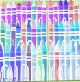
Dare To Be Differentby gpflmanComment: I must say, the upsidedown "flake" crayon is a wonderful touch, but the colors here just don't seem appealing.. it's all too bright for my tastes. Perhaps reducing the brightness a bunch on this shot would work well. 5 |
| Photographer found comment helpful. |
| 04/13/2003 09:36:08 PM |
|
| Photographer found comment helpful. |
| 04/13/2003 09:31:16 PM |
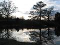
Golden Sunsetby mperez74Comment: This doesn't seem particularly applicable to the color challenge, but it is a nice reflection. The pic is a bit small though. 5 |
Home -
Challenges -
Community -
League -
Photos -
Cameras -
Lenses -
Learn -
Help -
Terms of Use -
Privacy -
Top ^
DPChallenge, and website content and design, Copyright © 2001-2025 Challenging Technologies, LLC.
All digital photo copyrights belong to the photographers and may not be used without permission.
Current Server Time: 08/27/2025 12:03:35 AM EDT.