| Image |
Comment |
| 04/30/2003 07:49:40 PM |
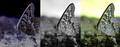
DP Lifeby K-RobComment: Nice, simple, amusing series. Your boarder on the left shot seems off though, not as wide as the other two. The overall boarder might be a bit excessive as well, particularly due to the already small size of the photos. Less boarder and larger photos would have helped I think. There's really nothing spectacular about this series or any of the individual shots, but I did enjoy it. 5 |
| 04/30/2003 07:45:46 PM |
|
 Photographer found comment helpful. Photographer found comment helpful. |
| 04/30/2003 07:42:25 PM |
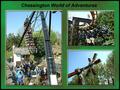
Theme Parkby marboComment: The overall series is well composed and flows together well, but the individual images here have problems. All of them seem to lack a necessary amount of detail, especially the top right one, followed by the left side one. The bottom right one is my favorite of the three, because the composition doesn't rely on the details of blurred out people, it relies on the structure of the ride and the treeline and sky. The other two shots just aren't particularly effective. Good concept, but it didn't quite work out. |
| Photographer found comment helpful. |
| 04/30/2003 07:36:09 PM |
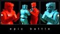
ROCKem SOCKemby scab-labComment: I like this one. The two outside shots work great for demonstrating the two sides of the battle. The reversal of sides in the center frame forms great color contrast. The amusing nature of the shot is demonstrated effectively. The shots flow together well. Beautiful. 9 |
| Photographer found comment helpful. |
| 04/30/2003 07:33:22 PM |
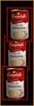
Mushroom Soupby eikidigiComment: It's skillfully framed, but this shot just doesn't do anything for me. The can seems over processed, and isnt' an interesting enough subject to appear identically three times in the frame. I'm not quite sure what you were going for here, but it didn't work for me. |
| 04/30/2003 07:31:18 PM |
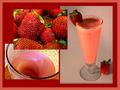
Add Milk and Honey and Blend Wellby GraciousComment: The boarder on this shot is overpowering. I'm not sure why the strawberry shot is overlapping the other two. The right side shot comes off dark and drab (which doesn't seem fitting to the subject). And these images don't really seem to flow from one to the next, with the strawberrys shot especially standing out as not really fiting into the sequence (it seems different in style and in tone). |
| 04/30/2003 07:27:49 PM |
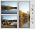
A Place to Ponderby casualguyComment: In the top left shot the water looks layered. Instead of gradually changing color it changes in waves.. and it ends up looking unnatural. (it seems like a product of photoshop but I couldn't say so for sure) |
| 04/30/2003 07:25:22 PM |
Heineken: Smooth and Refreshing!by BigSmilesComment: These pictures have an obvious tie together, but the composition doesn't really seem to flow together well. It feels unbalanced and somewhat random. Perhaps having the large bottle in the center and the multiple bottles on the left would have made the composition seem more even (and perhaps more sequential: 5 bottles, one bottle, glass). The shots in this series are each crisp and individually pretty well done, but they don't seem to form one cohearent composition here. 5 |
| Photographer found comment helpful. |
| 04/30/2003 07:14:29 PM |
Rite of Passageby DougPazComment: This series seems compositionally unbalanced. I see how you were trying to achieve a rough symmetry here, but by doing so you lose the chronological theme that you present, as it is highly unnatural to look first at the left frame, then the right, and then the center. This is especially difficult to see as valuable because the result isn't truly symmetrical anyway, due to the partial blooming of the third frame. Also, the framing of this shot seems somewhat awkward, with the excess of white space above the shots. I do like the red background, which provides a good contrast for the flower. Individual these shots aren't enough to stand out as unique, and I admire the attempt at a unique presentation, but I don't think it worked out very well. 4 |
| 04/30/2003 06:59:27 PM |
Suds 'n Sonby tcherringComment: This is an intersting piece of photoshop work, but it ends up looking very fake and rather cheesy. 3 |
| Photographer found comment helpful. |
Home -
Challenges -
Community -
League -
Photos -
Cameras -
Lenses -
Learn -
Help -
Terms of Use -
Privacy -
Top ^
DPChallenge, and website content and design, Copyright © 2001-2025 Challenging Technologies, LLC.
All digital photo copyrights belong to the photographers and may not be used without permission.
Current Server Time: 08/27/2025 09:53:13 AM EDT.