| Image |
Comment |
| 05/03/2003 05:10:06 PM |
Thoroughbred Parkby RLSComment: Well, it's an interesting image. The top and bottom shots frame the middle shot pretty well. The effect here is effectively applied, and applicable to the shot, as it is intended to display motion. So I'd say this is more than just photoshop for the sake of photoshop, however, I wouldn't really say this is a photograph so much as a piece of art that used a photograph as it's basis, so I'm not as inclined to score it as highly in a photography contest. Good luck. 5 |
 Photographer found comment helpful. Photographer found comment helpful. |
| 05/02/2003 08:16:50 PM |
DPChallenge Logo on Wooden Trash Binby orussellComment: It's somewhat more unique than just a plain logo, but in fact it becomes less clearly visable than a plain logo, and the new texture doesn't really connect in any way with the site or make this a more appealing design. The beveled, drop shadowed url is a bit over processed I think. Plain black text would probably have been more effective. |
| Photographer found comment helpful. |
| 05/02/2003 08:11:23 PM |
create. submit.by helgihelgiComment: I love the style of this one. It is simple, stark, but also attention getting. I'm not sure if it gives enough information (something about digital photography or a contest might have helped) to draw in a good potential user, but I love the general appeal of this. 9 |
| Photographer found comment helpful. |
| 05/02/2003 08:08:06 PM |
sticker project 1c by jjbeguinComment: Excellent shot. The shutter effect ties perfectly to the website, the sky is an effective backdrop. The design is eye catching and simple, and gives all the necessary information. 10 |
| Photographer found comment helpful. |
| 05/01/2003 12:40:25 AM |
Untitledby PHOTOCHlXComment: cool design, but it's kind of odd to use a roll of film to advertise a digital only photo site. |
| Photographer found comment helpful. |
| 05/01/2003 12:39:01 AM |
|
| 05/01/2003 12:33:21 AM |
Open Your Eyesby mciComment: Hah.. now come on, this is a cheap way of sending two submissions. The bottom is the better of the two if you ask me. (the top looks like a recycling ad) |
| 05/01/2003 12:29:37 AM |
|
| 04/30/2003 07:57:21 PM |
Breaking Free by FranziskaLangComment: Wow. I\'m not sure there\'s anything I can recommend to improve. The contrast and crispness is wonderful. The images flow together with each other perfectly. Each individual image is powerful, yet is more powerful in the presence of the others. The composition of the multiple images into one is excellent. If I wore a hat, it would be off to you. Beautiful work. 10 without a single second thought. I hope this wins. |
| Photographer found comment helpful. |
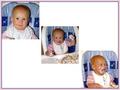
| 04/30/2003 07:53:31 PM |
1st Birthdayby rll07Comment: The top left to bottom right appraoch here doesn't seem to serve any purpose, and it turns your final product into more white space than photos. Going straight across would have been a better idea I think. The photos themselves have a snapshot quality to them without any of them standing out as particularly impressive photos on their own. However, together they do tell a story very effectively, which is more than many entries achieved. 3 |
Home -
Challenges -
Community -
League -
Photos -
Cameras -
Lenses -
Learn -
Help -
Terms of Use -
Privacy -
Top ^
DPChallenge, and website content and design, Copyright © 2001-2025 Challenging Technologies, LLC.
All digital photo copyrights belong to the photographers and may not be used without permission.
Current Server Time: 08/27/2025 02:36:08 AM EDT.