| Image |
Comment |
| 05/04/2003 03:08:59 AM |
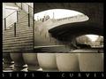
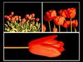
Downtownby ursulaComment: The top left image looks over cropped (blurry, low resolution). The top left, and bottom images are somewhat interesting, although not particularly drawing. However, the top right image is excelent. The curves and lines work quite effectively in it, and I think it would be better as a stand alone image than this is as a multi-image. |
 Photographer found comment helpful. Photographer found comment helpful. |
| 05/03/2003 06:30:36 PM |
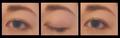
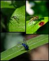
In the Blink of an Eyeby StevePaxComment: The colors here look washed out and the eye isn't in sharp focus. The concept has some potential, but the presentation lacks oomph. I'd have tried different angles and probably more dramatic lighting, as this ends up rather drab. |
| Photographer found comment helpful. |
| 05/03/2003 06:26:08 PM |
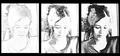
Story of a portraitby bcncrazyComment: I like the first frame, but I think the other two are less effective. I think this concept would be better illustrated if the final frame were a normal looking portrait, as this one still ends up looking unfinished. |
| 05/03/2003 06:23:15 PM |
Another Timeby TarbiniComment: This really strikes me as a single frame shot that was forced into a multi-frame format. I don't really see much purpose in dividing it up. I do like the sort of hazy oversaturated effect you have created here. It gives it a dreamlike feel. 6 |
| 05/03/2003 06:20:29 PM |
golfby buzzrockComment: The first shot seems like an awkward fit for the sequence, since the other two shots have the same perspective but the first is different (without any particular reason for being different). Also each of these shots are really too small to be effective.. with such limited space in the first place, you might have been better off using a much smaller boarder. |
| 05/03/2003 05:29:52 PM |
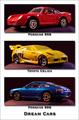
Dream Carsby orussellComment: Heh.. how did a toyota celica get in there with two porsches? |
| Photographer found comment helpful. |
| 05/03/2003 05:28:34 PM |
|
| Photographer found comment helpful. |
| 05/03/2003 05:26:03 PM |
|
| 05/03/2003 05:24:55 PM |
Oriental Breezeby bruster54Comment: I really like the center frame and how it shows up in minimalist ways only, however, it doesn't really fit into the tone of this sequence very well, since the other two show up very clearly and strongly. I think putting the center shot against a white background would have created an interesting contrast with the other two shots, but still maintained the same tone as the other shots. 7 |
| Photographer found comment helpful. |
| 05/03/2003 05:17:13 PM |
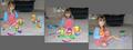
Three Stages of Mr. Potato Headby deckyonComment: I suppose these shots are intended to have a candid feel to them, but the result isn't very visually appealing. The cluttered background and pretty much expressionless child detract from the shot. The Mr.Potato Head concept was a good idea, and if you had simplified the shot and done close up shots of different stages of potato head construction I think the result would have been very interesting. |
Home -
Challenges -
Community -
League -
Photos -
Cameras -
Lenses -
Learn -
Help -
Terms of Use -
Privacy -
Top ^
DPChallenge, and website content and design, Copyright © 2001-2025 Challenging Technologies, LLC.
All digital photo copyrights belong to the photographers and may not be used without permission.
Current Server Time: 08/27/2025 03:18:51 AM EDT.