| Image |
Comment |
| 07/06/2005 02:54:42 AM |
Tunnel into darknessby EmmyComment: The colors are great, as is the lighting. If this was a prop, or set up image, I would suggest that next time you take the time to look for things like dust and hairs, like the one along the right edge of the frame. Not a biggie, but it is the little details that make the difference between a good image, and a great image. |
 Photographer found comment helpful. Photographer found comment helpful. |
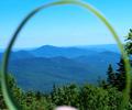
| 07/06/2005 02:49:01 AM |
View through a circleby mariegbeveComment: very unique idea. I would suggest cropping just enough off the bottom to remove the bright blurry object near the center bottom. Without that distraction there, the eyes look at the rest of the image, as opposed to being drawn to that bright thing at the bottom. |
| Photographer found comment helpful. |
| 07/06/2005 02:40:17 AM |
|
| Photographer found comment helpful. |
| 07/06/2005 02:38:35 AM |
Feng Shuiby dockieComment: This photo seems very 'cluttered' or busy to me. You have so many elements, it is hard to know where to look. I would suggest some cropping to focus in on one major element, perhaps the center chair (?) by cropping the right side with the window and person in it off, as well as the mirror ball on the left. |
| Photographer found comment helpful. |
| 07/06/2005 02:32:57 AM |
Circles of Lifeby protophotoComment: I would try re-taking this shot, but in a location that did not have the harsh contrast between the sunlight and the shadows, as well as a more flat backdrop, as opposed to the pile of bricks.
The sunlight creates a very stark and high contrast image that could be greatly improved upon with even lighting for the entire subject. |
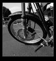
| 07/06/2005 02:29:09 AM |
Re-inventing the wheelby Travis99Comment: I would suggest a different point of view so the clutch was not breaking the lines of the tire and disc brake, as well it would improve the backdrop. |
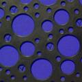
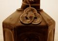
| 07/06/2005 02:24:54 AM |
Medallionsby kiropracticComment: very nice photo. Would suggest perhaps a more vertical image, as I think the subject is more suited to a vertical point of view. still a great photo tho. |
| Photographer found comment helpful. |
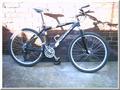
| 07/06/2005 02:21:32 AM |
|
| Photographer found comment helpful. |
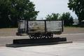
| 07/01/2005 06:23:13 PM |
Coal Carby BrigidComment: nice subject, but I would suggest a tighter crop - eliminate the un needed 'space' around your image. This will remove the house on the right side, as well as some of the extra forground. With your subject filling the frame more, it will also solve the dead center 'snapshot' look of the photograph. |
| Photographer found comment helpful. |
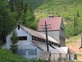
| 07/01/2005 06:18:08 PM |
The Ore Houseby RDEittreimComment: Very nice building for the subject, but a different point of view would help remove the telephone pole from being dead center infront of the building, detracting fron the overall image. Also, a little bit of cropping on the right side to eliminate the distracting detail would help. |
| Photographer found comment helpful. |
Home -
Challenges -
Community -
League -
Photos -
Cameras -
Lenses -
Learn -
Help -
Terms of Use -
Privacy -
Top ^
DPChallenge, and website content and design, Copyright © 2001-2025 Challenging Technologies, LLC.
All digital photo copyrights belong to the photographers and may not be used without permission.
Current Server Time: 08/03/2025 08:31:31 AM EDT.