| Image |
Comment |
| 07/12/2005 03:41:30 PM |
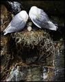
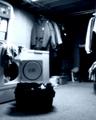
Growing familyby PippiComment: I like the shot but, I think there is too much non productive empty space at the bottom. To me a significant amount of that could be cropped , make your picture more focused and you wouldn't loose anything. |
| 07/12/2005 03:37:19 PM |
|
| 07/12/2005 03:35:57 PM |
|
| 07/12/2005 03:27:53 PM |
|
 Photographer found comment helpful. Photographer found comment helpful. |
| 07/12/2005 03:27:36 PM |
|
| Photographer found comment helpful. |
| 07/12/2005 03:27:10 PM |
|
| Photographer found comment helpful. |
| 07/12/2005 03:26:50 PM |
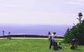
Picnic with a Viewby nick800Comment: a bit overexposed ... the sky is too burnt out ... I think the excessive amount of space on the left side is an attempt to apply the rule of thirds in a situation where it really doesn't help the shot. |
| 07/12/2005 03:25:46 PM |
|
| Photographer found comment helpful. |
| 07/12/2005 03:24:40 PM |
|
| Photographer found comment helpful. |
| 07/12/2005 03:24:15 PM |
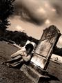
Judithby esdarbyComment: The angle is an interesting one. The sepia tone does go with "gothic" theme of the shot. I think it would have been a more powerful shot more tightly cropped with less of the distractions in the background. |
Home -
Challenges -
Community -
League -
Photos -
Cameras -
Lenses -
Learn -
Help -
Terms of Use -
Privacy -
Top ^
DPChallenge, and website content and design, Copyright © 2001-2025 Challenging Technologies, LLC.
All digital photo copyrights belong to the photographers and may not be used without permission.
Current Server Time: 08/13/2025 12:33:08 PM EDT.