|
|
|
Showing 261 - 270 of ~1521 |
| Image |
Comment |
| 04/25/2008 07:49:55 AM | Blue Dayby rinacComment: Pentax have actually invented an intelligent time-correction sensor. The camera looks at the photos and surroundings, taking into account fashions and cultures, etc, and adjusts the time accordingly. Unfortunately this function has been having some problems in NZ, where the results have been mis-calculated up to 15 years in the past. Pentax are still working on this problem, and apolgise for the inconvenience. :) (Tee hee hee)
|  Photographer found comment helpful. Photographer found comment helpful. |
| 04/25/2008 07:19:20 AM | IMG_7891-colorborder.jpgby timfythetooComment: Nice composition, and good lighting balance between foreground and background. Overall a nice picture...except for the fact that she's giving you that "Hey you, get yourself and your camera outta my kitchen" look, and the guy is thinking "I'm just cuttin' up these rolls, I'm not getting involved. Yep, this is me, just cuttin' rolls.". Sorry, I couldn't resist. :) | | Photographer found comment helpful. |
| 04/13/2008 04:51:50 AM | Brightby cjoconn22Comment: Nice. I like the simple lines and composition. There's a slight bluish spot in the lamp, which is slightly odd, but overall very nice.
| | Photographer found comment helpful. |
| 04/08/2008 07:44:52 AM | Josh and Caitlynby surfdabblerComment: Originally posted by Melethia:
Fun shot and VERY cute kids. I like the softness of the foreground area. Did you use a flash to fill on this? I can't really tell, but the light seems just a bit hard to reconcile because of the shadows on the rocks behind them. |
The late afternoon sun was behind me, but also behind a large mountain, so this is essentially in the shade, but with a huge semi-spherical blue soft-box overhead. On-camera fill flash was used (you can see the shadow under his arms). There's a fair bit of dodging and burning on this shot, which is probably what makes it tricky to work out. A similar re-edit of this shot is hanging on our wall, and it does look slightly 'studio-ish' due to the lighting. |
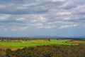
| 04/08/2008 07:00:52 AM | Serenityby ChinabunComment: Here's a critique for you...
Well, this is a photo of some blue and some green. To really hold the viewers interest, a landscape needs to have some promiment feature or interesting lines to make the composition. This photo has one straight line across the horizon, with blue and clouds above and green below. The colour of the green grass is very lush, but that's all this photo has in it. Find something interesting to add to the foreground, and make use of more depth to join the foreground object to the background. | | Photographer found comment helpful. |
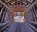
| 04/08/2008 03:41:56 AM | Under The Covered Bridgeby ZeppKashComment: Hi Jason, a critique for you...
Nice HDR work without going overboard on the HDR. :) This seems to reflect well what you probably saw when you were there. The texture and shape of the bridge seems to be making a frame. It's a nice pattern of lines and the perspective directs the eyes to the picture in the centre of the frame. Unfortunately that picture within the picture is very small, and there's not a lot there, and I think this is where the picture is lacking. Maybe if you walked further along the bridge, it would open up a nicer scene behind? Or mabye make it a portrait location for somebody in winter clothing, sitting against the wall, or walking in or out. This shot doesn't quite work as a standalone landscape, but it makes a nice location, and is just waiting for the addition of an interesting subject. Message edited by author 2008-04-08 03:43:27. | | Photographer found comment helpful. |
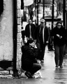
| 04/08/2008 03:36:27 AM | Smoker's Havenby bradshawComment: Hi Ian, here's a critique for you...
The wide aperture does a reasonable job of seperating the foreground from the background, but to help this further, you could lighten the lady and darken the background a little. The high-contrast isn't really working in the foreground, and she looks like a newspaper printed cutout stuck onto the street.
It looks like the background is artificially blurred by editing. This shot would have been better taken at f/2.8 to get some genuine DOF blur, although you probably wouldn't get as much seperation as this unless you have a 5D with an 85 f/1.2 lens. :) Anyway, I like the feel you were going for. | | Photographer found comment helpful. |
| 04/08/2008 03:25:33 AM | Morning Glowby gwe21Comment: Hi Erica. This shot is nearly a PB, so you can't complain there. :) This is a nice shot of this flower. When you are using a spray bottle, try to spray softer for larger drops, rather than blasting at full squeeze with lots of little drops. The exposure is pretty good, although I'd like to see a little more light on the green leaves, and a reflector would help to lighten the front of the flower too. I don't like the border at all. The red-on-black colour scheme is a very strong passionate scheme, and doesn't quite reflect the relaxation of 'morning glow'. Perhaps some orange sunlight falling across some pillows, or a cottage porch or rustic fence or something like would help to convy the relaxation of morning glow a little better? Just some thoughts, but in the end, well done on getting a top-2 image! (Oh, I just read the other comments, and I hadn't even realised this was 2 flowers! I thought it was all 1 flower, because they merge together) | | Photographer found comment helpful. |
| 04/08/2008 03:18:25 AM | Dying of Thirst!by Dirt_DiverComment: Hi Joseph - here's a critique...
Nice graduated background colours, and the blue contrasts well with the red flowers - almost too well that the flowers are almost disconnected from the background in a disconcerting way. The blown highlight would be improved by moving the light further from the background, and maybe snooting it to get the edge shadows back. The dying flower is almost a silhouette here, making it lack interest next to the live flower. The crop is also wider than it needs to be, so the flowers get a bit lost in the big frame. So, a little more front fill-light on the wilted flower, a little less back light to remove the blowout and a slightly closer crop, and this image would be much improved. I also think it would be better a little smaller. Some images benefit from using the full 720x720 pixel size, but I do think some images just get lost in the maximum size, and this is one of them that would actually look more at home at 640x640. | | Photographer found comment helpful. |
| 04/08/2008 03:11:06 AM | Remembranceby breadfan35Comment: Hi Chris, a critique for you...
I quite like this image. The partial desat and the limited DOF work well. I think the row of bricks and the rock on the ground are a little conflicting with the feel of the shot, and are a distraction. There's also a strange closed in feeling in the shot, and the viewer starts at the flowers, and is pushed down onto the blurry floor. It's not until the third or fourth jump back up the image that they might have time to read the name before their eyes fall back to the floor. Looking at this image is a bit like trying to climb a slippery wall. :) The left 3rd of the image never even gets a look-in. But as I said, I do quite like the effect and colours. | | Photographer found comment helpful. |
|
Showing 261 - 270 of ~1521 |
Home -
Challenges -
Community -
League -
Photos -
Cameras -
Lenses -
Learn -
Help -
Terms of Use -
Privacy -
Top ^
DPChallenge, and website content and design, Copyright © 2001-2025 Challenging Technologies, LLC.
All digital photo copyrights belong to the photographers and may not be used without permission.
Current Server Time: 08/06/2025 03:49:51 PM EDT.
|