| Image |
Comment |
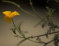
| 05/02/2008 08:52:58 AM |
Blowing in the windby jnenvirComment: Nice and simple. Would be nice to see the flower more front on, and not quite so close to the edge of the frame. |
 Photographer found comment helpful. Photographer found comment helpful. |
| 05/02/2008 08:52:21 AM |
Surrenderby littlegettComment: Well, this image certainly stands out from the crowd. The high contrast coloured lighting is a little bit much for me, and the composition is trying to be centred, but doesn't quite make it with the misaligned chain. Great setup, and certainly has promise for a fantastic image though. |
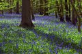
| 05/02/2008 08:49:49 AM |
Bluebell Woodby marboComment: Lovely flowers. I can't help wanting to see more at the top of the image though. |
| Photographer found comment helpful. |
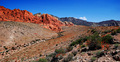
| 05/02/2008 08:49:02 AM |
Red Rockby maynerd12Comment: This has that slightly oversaturated, too-sharp, postcard look about it. But as a saturated sharp postcard, it's not bad. :) A more prominent foreground subject would help. Crouch down and go closer to one of those red bushes, and use that as foreground interest with the mountain backdrop. |
| Photographer found comment helpful. |
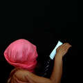
| 05/02/2008 08:46:39 AM |
Glintby SnapperLComment: Nice colours in this high-key portrait. The editing is a little rough on the background though. Her eye whites are also a little bluish. I would also crop just a little off the top of the image to hide the bump in her hair. Then print it out and give her a copy. She'll love it. |
| Photographer found comment helpful. |
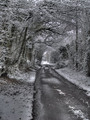
| 05/02/2008 08:43:28 AM |
Snowby ingridblueComment: Nice shadows! This has a very interesting, slightly HDR look about it, while still looking very natural. If you know how to do dodging and burning, do it to this photo. If you don't know, learn, so you can do it. If you already did, then it looks good, but do more. :) This image would also benefit from a slightly bolder border. A few pixels of black would really help it stand out. |
| Photographer found comment helpful. |
| 05/02/2008 08:40:10 AM |
Master of Puppetsby BlackboxComment: Tricky to vote on this one. The composition and the idea are quite nice, but the image clarity is bad, and the 'historical' effect doesn't do the image any favours. It's also slightly crooked. Then again, the technical flaws and the overall effect do make it stand out from the crowd. |
| Photographer found comment helpful. |
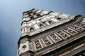
| 05/02/2008 08:37:37 AM |
Omaggio a Magritte: Gli amantiby Rino63Comment: It took me a while to work out what this was. It would be better if there was some more light to define his shape. There is also a blue-cast which should be fixed in editing. Nice idea though. |
| Photographer found comment helpful. |
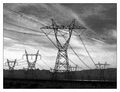
| 05/02/2008 08:35:24 AM |
Florenceby JamesAComment: Nice angle and leading lines, but the lines don't lead anywhere, except away from the area of interest. |
| Photographer found comment helpful. |
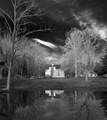
| 05/02/2008 08:34:34 AM |
Impending Stormby ErikVComment: The storm really doesn't stand out in this shot, so the title doesn't fit. With the BW, it actually looks like it was a blue sky with a polarising filter. :) Nice scene though, and the dark sky does help to focus the viewer onto the cottage and trees. |
| Photographer found comment helpful. |
Home -
Challenges -
Community -
League -
Photos -
Cameras -
Lenses -
Learn -
Help -
Terms of Use -
Privacy -
Top ^
DPChallenge, and website content and design, Copyright © 2001-2025 Challenging Technologies, LLC.
All digital photo copyrights belong to the photographers and may not be used without permission.
Current Server Time: 08/05/2025 05:55:27 PM EDT.