| Image |
Comment |
| 06/17/2005 01:26:32 AM |
Mundeeby mamcgComment: yes, i like this. i might have preferred just a taaaad lighter, but only a smidge. i think your subject says darkness plenty on his own and an *very* dark image wasn't needed. |
| 06/17/2005 01:25:29 AM |
|
| 06/17/2005 01:25:10 AM |
|
| 06/17/2005 01:24:37 AM |
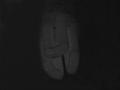
almost deadby xantangummiComment: i would have preferred to see the stem go to the edge of the picture or not see it all. i love the flower. although, this screams "black and white" and not so much, 'darkness' to me. |
 Photographer found comment helpful. Photographer found comment helpful. |
| 06/17/2005 01:23:29 AM |
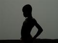
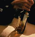
Falling of Darknessby Kunta1974Comment: i would like it better if the differences between the amount of light on his chest and his face. i can make out some of the surface of his chest but his face is a total sillohouette...either one or the other but not both. for me, it makes his head look kind of un-real compared to his body. IMHO, of course. |
| 06/16/2005 11:59:18 AM |
|
| 06/16/2005 11:09:51 AM |
|
| 06/16/2005 11:09:26 AM |
|
| 06/16/2005 11:06:42 AM |
|
| Photographer found comment helpful. |
| 06/16/2005 11:06:16 AM |
|
Home -
Challenges -
Community -
League -
Photos -
Cameras -
Lenses -
Learn -
Help -
Terms of Use -
Privacy -
Top ^
DPChallenge, and website content and design, Copyright © 2001-2025 Challenging Technologies, LLC.
All digital photo copyrights belong to the photographers and may not be used without permission.
Current Server Time: 08/24/2025 05:00:04 AM EDT.