|
|
|
Showing 181 - 189 of ~189 |
| Image |
Comment |
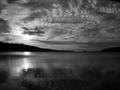
| 07/14/2005 02:43:48 PM | Dark Daysby tristaliskComment: B/W Group -
Except for the things in the water (which can easily be gotten rid of), I love this image. The tones, the details in the water and sky, the textures ... everything. To me, this is beautiful, and yes, I do honestly, like it better than the color image. :)
-Christine
|  Photographer found comment helpful. Photographer found comment helpful. |
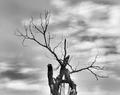
| 07/14/2005 12:11:40 AM | Deadwoodby TruegshtComment: B/W Group -
For some reason a Tim Burton film comes to mind when I look at this tree. :)
Would personally love to see either the full tree or if moved closer, to se more detail, because what I am able to see, I like.
I agree with Rob, maybe shifted one way or the other would make it pop more for me. As far as colors go, the contrast of light and dark is there, but I would like to see the sky play into the image more, since it is a prominent feature. Would love to see this image processed and made to shine even more than it does. :)
-Christine | | Photographer found comment helpful. |
| 07/13/2005 12:44:39 AM | Intimate Settingby aboutimageComment: B/W Group -
Since you say, that you do like this image, and I think it is a nice, little busy, but still nice, why not try to blur out the background house/roof? I think if blurred that the foreground objects, including ironworks would stand out a little more.
If it were mine, and not for challenge, I would probably keep the slight rose coloring, except on the flowers. Those to me, maybe dodge a smidge to lighten them up. Not sure. As for the brighter areas not on the glass round, maybe a little burn, so that they do not stand out so much and give extra definition to the edge of the glass.
I do like the setup composition with the ironwork, makes me think of sitting on balcony in Paris. Without the house in background of course though. ;-) | | Photographer found comment helpful. |
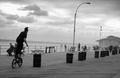
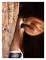
| 07/13/2005 12:10:04 AM | coney island slalomby muckpondComment: B/W Club
If this wasn't for a challenge, and just for personal collection, my honest opinion would be to first try and carefully clone out the watchers sitting on the bench. Think of it as photo restoration. ;-)
Fixing the slight tilt is no problem, although it really doesn't bother me. What I would love to see though is a little more definition/depth to the sky, without altering the rider and pier. Would have to be done carefully, so as to not mess up the rest of the image, yet look natural.
If changing the sky is not option, then just getting rid of the onlookers on bench would be improvement in my book.
I'm just amazed that he is able to do that on wooden pier! :) |
| 07/11/2005 06:07:47 PM | The Thinkerby KaveyComment: B/W Club
I'm going to agree with muckpond on this. Your image is great, but kind of... the same all over, if that makes sense. I looked at mp's version, and I do like that there is more a difference within the blacks, whites and greys. More definition. However, I'm not sure I like the starkness of the shadows.
I'll come back to this one, after I finish my exams tonight, see if I can show what I mean.
-Christine
| | Photographer found comment helpful. |
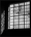
| 07/11/2005 05:59:32 PM | Old Panesby KaveyComment: B/W Club
Forgive me Kavey if I do this wrong. :)
First, I love the texture of the panes, it reminds me of brushed ice. I also think that it did lend itself to B/W. I think it would have lost some of it's WOW factor otherwise.
Not crazy about the 'whiteness' to side of panes, but read your comments, so understand why it's there. I do however, like the reflection of the textures onto the wall.
I'm not sure how well it would do here, but to me, this could pass for a low-key image.
The textures obscuring what is on the other side, just make me want to keep looking to see if I can figure out what is there. Without reading that it is buildings, I get to use my imagination as to what is hidden.
-Christine | | Photographer found comment helpful. |
| 07/11/2005 12:23:21 AM | Shyby gaurawaComment: Wonderful image, with a perfect title! | | Photographer found comment helpful. |
| 05/31/2005 09:47:46 AM | Forgottenby dahkotaComment: This is a beautiful image. The spot by your foot is a little distracting, but reading your comments, fully understand it! Been there, done that! ;)
What really struck me though, is when looking at this image, my first thought was, how the heck did she get Lorena McKennitt to pose for her!
Lorena McKennitt - The Visit | | Photographer found comment helpful. |
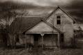
| 05/30/2005 07:12:24 AM | Dorothy’s Reality.jpgby dustin03Comment: This one caught my attention. The feelings I get are desolation, sadness, unwanted. What further drew my attention though is the second story window. A little trick from shadows and light, but can almost see a face above the broken window. :-) Very nice. -Christine |
|
Showing 181 - 189 of ~189 |
Home -
Challenges -
Community -
League -
Photos -
Cameras -
Lenses -
Learn -
Help -
Terms of Use -
Privacy -
Top ^
DPChallenge, and website content and design, Copyright © 2001-2025 Challenging Technologies, LLC.
All digital photo copyrights belong to the photographers and may not be used without permission.
Current Server Time: 08/20/2025 06:19:42 PM EDT.
|