| Image |
Comment |
| 05/01/2006 07:17:46 AM |
|
| 05/01/2006 07:16:45 AM |
|
 Photographer found comment helpful. Photographer found comment helpful. |
| 05/01/2006 07:14:55 AM |
~ Rhythm ~by yankoComment: Hot Salsa!!! .... That is an amazing professional-looking image. The light here is exquisite (sun, I presume) The treatment is great - She looks like a diamond among the rough commoners (the baseball hat guy is a nice juxtaposition for me) :) The blur in the hand is my only exrtremely picky criticism because it make the hand look huge. 8 |
| Photographer found comment helpful. |
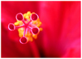
| 05/01/2006 07:11:09 AM |
Seed by MudHutComment: Wow -great colors and beautiful organic subject. |
| Photographer found comment helpful. |
| 05/01/2006 07:10:28 AM |
Popby glodaComment: This is the kind of idea I like to see here!!!! The striking "pop" art colors and in-your-face subject sorta blends with a post-modern ambiguity that makes the viewer question the purpose of the image altogether. I'm gonna give this lots of critique because I LOVE IT!!!! First of all the idea and set-up are exquisite .... I have been looking it over for several minutes. Technically-speaking, the photo is above average: The colors and white background make this a ggood studio quality shot. The shallow DOF misses the tongue, teeth/braces and lolly-pop - this isn't necessarilly bad, but my eye is disappointed when looking at it the bottom part of the image :) The nose is difficult to distinguish from the lip - again, this isn't necessarilly bad, just an observation ... The bokeh is beautiful and intriguing since the model seems covered in the sprinkles. The earing and bangs of the hair are merely distractions that keep this image frm being perfect. But If I were to do anything to this it would be to reduce the yellow overall especially in the eyes (which are well-lit and beautiful). This assumes the model has since removed the sprinkles and there's no re-shoot scheduled LOL. Overall, I love this and it's a favorite --literally. 8 |
| Photographer found comment helpful. |
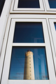
| 04/29/2006 08:52:52 PM |
Ghost of the lighthouseby HauxonComment: I think a less centered image would be much more dramatic and mysterious. I really do like this however with the white windows and relections. |
| Photographer found comment helpful. |
| 04/29/2006 08:38:33 PM |
|
| 04/29/2006 08:38:20 PM |
|
| Photographer found comment helpful. |
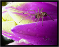
| 04/29/2006 08:37:54 PM |
.by JPRComment: Like the spider but he doesn't seem too complimenting. |
| Photographer found comment helpful. |
| 04/29/2006 08:36:58 PM |
|
| Photographer found comment helpful. |
Home -
Challenges -
Community -
League -
Photos -
Cameras -
Lenses -
Learn -
Help -
Terms of Use -
Privacy -
Top ^
DPChallenge, and website content and design, Copyright © 2001-2025 Challenging Technologies, LLC.
All digital photo copyrights belong to the photographers and may not be used without permission.
Current Server Time: 07/29/2025 08:43:36 PM EDT.