| Image |
Comment |
| 05/08/2006 02:06:10 AM |
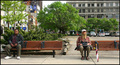
Two worlds - One bus stopby timfythetooComment: I like this photo quite a bit. I read your comments before posting this comment. As far as I am concerned, "photojournalism" is a broad enough catagory to include this picture. It would have been nice if the background were not quite so distracting...but we don't get to place our bus stops where we like them. : )
Good crisp focus and colors. Since this wasn't posed I guess you got lucky with the umbrella and tennis ball. I love their body language too. I would have voted a 6 on this one, 7 if the background wasn't so busy. |
 Photographer found comment helpful. Photographer found comment helpful. |
| 05/05/2006 03:40:26 AM |
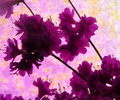
Profiles of Purpleby KelliComment: Beautiful purples, but the complementary yellow color seems too washed out. I haven't read any other comments yet, but I suspect "focus" issues predominated. This would have been better, I think, if the yellows were more obvious and the flowers were more sharply focused. I like the composition. Nice use of diagonals. |
| Photographer found comment helpful. |
| 05/05/2006 03:36:04 AM |
Divisionby nards656Comment: Good job. Love the idea and the colors. The vine/wood piece seems slightly out of focus (unless it's my tired eyes that are not focusing). Other than that, I really like this photo and would have scored it a 6 or 7. |
| Photographer found comment helpful. |
| 05/05/2006 03:33:04 AM |
Naturallly Complementedby ericwooComment: Good strong colors here...although the yellowish area of the leaves is a bit washed out on my monitor, I suspect from saturation. The composition is really helpful, too. I like how the flower and the leaves interact...at first glance they almost seem to be spiraling upwards together. The lines formed by the leaves and flowers give this photo a lot of abstract punch. |
| Photographer found comment helpful. |
| 05/05/2006 03:28:39 AM |
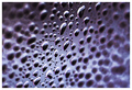
Event Horizonby LouisComment: This picture has terrific DOF and color. It is not obviously a "negative" because of the nature of the subject matter which may have bothered some people. I would have scored this a 6 because of the quality of the shot. It would have needed to be more interesting to score higher with me. Technically it is strong. It just doesn't have enough punch to score higher IMHO. |
| Photographer found comment helpful. |
| 05/05/2006 03:23:30 AM |
Missing Man Formationby MelethiaComment: Wonderful picture. Love the background and the diagonal lines. I have no idea how to improve on this. : ) |
| Photographer found comment helpful. |
| 05/05/2006 03:20:58 AM |
...rorrim ,rorriMby timfythetooComment: Clever idea well-executed. I like the clean/simple background (although I think the horizonal bar would look better if it were lower in the picture to use the rule of thirds and to have relatively more of the dark reflective background bureau (?) mirror that gives added punch and contrast). I love the blue tones generally, too. |
| Photographer found comment helpful. |
| 05/03/2006 04:06:57 AM |
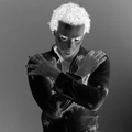
spookyby DanSigComment: Spooky? I'll say. Especially the eyes (which are bordering on mesmerizing). I like the sharp focus (hair on the back of his hands is clear). I don't know what I would do to improve upon this photo. It's already eerie enough. |
| Photographer found comment helpful. |
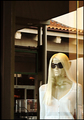
| 05/02/2006 02:35:15 AM |
Reflectively Staring at Her Manby chaliceComment: This shot obviously failed (especially without a tripod to help me sharpen the focus - although the thick plate glass window hinders a sharp focus too). Having said that, this was the intent... I had a polarizer lens on the camera and intentionally left all of the reflections (which most people found distracting) in the image because one of the reflections was the face of "her man" in the lower right corner. I left the line in the glass in the shot (after experimenting with cropping it out) because I wanted an artificial division between the mannequin and the real man...a sort of contrast between artificial person and real person. If I had cropped the line out or reduced the reflection to improve the clarity I would have lost the point of the shot. So I went with this one. I guess the failing is that it doesn't work. I need to rework either the idea or the execution, or both. I knew I would be hammered for this shot (I have tried something similar with a mannequin before and was scored down) but I still wanted to test the idea. Nothing ventured, nothing gained...or even learned. Your comments are appreciated because the learning part is critical for me. Thanks. |
| 05/01/2006 03:30:29 AM |
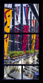
Colorful viewby MelethiaComment: I did not comment on this photo during the voting (I think because it appeared on my monitor near the end when I was a bit rushed) but I remember two things about it: (1) it is very very colorful, which I like, and (2) the shape of the window frame is relatively narrow given the verticle space, which I am not so fond of. I know there is not much you can do about the shape of a window (and this one at least echoes the shapes of the flags) other than to include some of the wall in which the window sits or, perhaps, crop out the bottom pane.
It strikes me that the slatted shutters and the shadows they throw up on the wall, as well as the blue object in the lower right corner, make this picture a bit "busy" for my taste. I think that's why I like the idea of cropping out the bottom pane.
There are many things that I do like. Besides the very vibrant color, which I have already mentioned, I also like the glass windows because they are more muted and allow the flags to take center stage. They are the "canvas" upon which the flags are "drawn" so to speak. I might have even used a polarizer lens to further mute them if possible. I also like the perspective created by the horizontal bands of metal on the glass wall. They give depth to this photo. And I like the black frame of the window itself because the color contrasts nicely with the flags.
All in all, there is much more to like than to question with this photo.
|
| Photographer found comment helpful. |
Home -
Challenges -
Community -
League -
Photos -
Cameras -
Lenses -
Learn -
Help -
Terms of Use -
Privacy -
Top ^
DPChallenge, and website content and design, Copyright © 2001-2025 Challenging Technologies, LLC.
All digital photo copyrights belong to the photographers and may not be used without permission.
Current Server Time: 08/02/2025 05:15:56 AM EDT.