| Image |
Comment |
| 07/11/2006 01:39:53 AM |
Cat on Glassby MelethiaComment: Trading Post comment.
I read your comments...and the list of criticisms you levied on yourself, to which I say...yep, yep, yep, yep and yep to all the technical deficiencies. But this photo isn't really about technique...otherwise the cat would have been wearing a shirt. ;-)
On the other hand, you have "perspective" nailed, humor elevated, and (of course) there is the matter of that twisted metal. Most important..."no animals were harmed during the making of this photo"...and all of that means this photo is worth at least a 6 or 7. Message edited by author 2006-07-11 01:40:34. |
 Photographer found comment helpful. Photographer found comment helpful. |
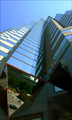
| 07/11/2006 01:28:38 AM |
Glass Towersby timfythetooComment: I like this photo quite a bit. I especially like the lower panels and the reflections in them. I didn't vote in this challenge, but would have scored this a 7. The only change I would consider would be to add a bit more saturation as the picture seems a bit hazy to me because of the pastel sky tones. (of course that could also be my monitor.) |
| Photographer found comment helpful. |
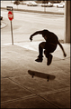
| 07/11/2006 01:25:08 AM |
No Skateboarding Allowedby timfythetooComment: My giving you a critique is like the student correcting the professor...it is seldom warranted. Be that as it may, I will add my 2 cents: I like the stop sign in red and everything about the skate board and rider...the blur is fine. The only thing I might suggest is to crop the line of cars out of the picture at the top and the front of the car on the left. This would mean the stop sign is pretty close to the edge and the one way sign might be cropped out altogether. But when I simulate the crop this way it makes for a cleaner picture and I prefer it that way. |
| Photographer found comment helpful. |
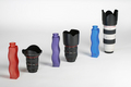
| 07/11/2006 01:14:24 AM |
shapes and sizesby DanSigComment: I like the colors of the bottles and the lighting in this photo. The focus looks a bit soft to me, but I tend to like softness in images. Given the limitations of this challenge I am not sure I would recommend anything else. |
| Photographer found comment helpful. |
| 07/11/2006 01:04:45 AM |
Not Your Basic Beachboysby chaliceComment: I really bailed on this challenge. For some reason I got it in my head that "right out of the camera" equalled "snapshot" - so when this boat went by my home and I saw the name on the side of the hull (I was drinking coffee and reading at the time) I grabbed my camera and took a quick snapshot without any forethought and then put the camera away, thinking I was done. Duh. It never even occurred to me to think in photographic terms such as color, composition, textures, lighting, perspective, etc., etc., etc. Only after I started voting and saw everyone's carefully thought out photos did I realize that I "missed the boat" (pun intended) and narrowly missed the much-reviled brown ribbon. Again, Duh.
PS to Trading post: No need to critique this one. It's not worth your time and attention - I know what's wrong and it's a long list. Message edited by author 2006-07-11 01:07:18. |
| 07/03/2006 01:13:19 AM |
Eye of Godby chaliceComment: Interesting set of comments. Some people loved it. Others were intrigued but puzzled. And still others didn't know what they were looking at and couldn't figure out how I blurred the image (apparently scoring it low). Since explanations are not allowed during voting there is nothing I can do except put a title like "Rotating motion to create blur" or some such thing. "Eye of God" is so much more interesting. Ultimately, I do this for my own enjoyment. Some may like it. Some may not. I appreciate the comments of those who were challenged by this image...and acknowledge the comments of those who felt otherwise, but still were willing to leave a comment. Thanks to all. |
| 07/02/2006 04:06:53 PM |
|
| Photographer found comment helpful. |
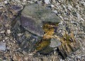
| 07/02/2006 08:44:08 AM |
Cut, Slowly Falling Apartby tngrndreamComment: Trading Post
Background is too busy, competes with the subject of the photo. Since the colors are the same, there is little to distinguish the stump. Overall, this one lacks punch IMHO. |
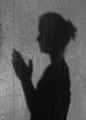
| 07/02/2006 08:41:41 AM |
Almost Bedtimeby tngrndreamComment: Trading Post
I know this has been said before, but I feel the same way. This is a bit flat. The shadow alone meets the challenge but lacks punch. I didn't vote because of my trip, but I would have given this a 5, possibly a 4. |
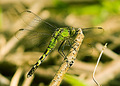
| 07/02/2006 08:39:23 AM |
Dragons Fly?by tngrndreamComment: Trading Post
One of your better efforts IMHO. Meets the challenge well. Good focus. Technically fine. Lighting good. Nothing I can think of to improve this. I was out of town and couldn't vote, but I would have scored this at least a 7. |
Home -
Challenges -
Community -
League -
Photos -
Cameras -
Lenses -
Learn -
Help -
Terms of Use -
Privacy -
Top ^
DPChallenge, and website content and design, Copyright © 2001-2025 Challenging Technologies, LLC.
All digital photo copyrights belong to the photographers and may not be used without permission.
Current Server Time: 08/05/2025 05:38:48 PM EDT.